Autocad Logo
AutoCAD, developed by Autodesk, stands as a premier computer-aided design (CAD) software, facilitating 2D and 3D drawing and drafting. Globally recognized in industries like architecture, engineering, and construction, it aids professionals in creating detailed, digital blueprints. Boasting a robust set of tools, AutoCAD enables precise measurements, modeling, and design customization. Over the years, its adaptability has been proven by specialized versions for distinct fields. In a world that’s digitizing rapidly, AutoCAD remains an indispensable tool for design professionals seeking accuracy and efficiency.
Meaning and history
In 1982, Autodesk introduced AutoCAD, heralding a new era for design and engineering with its innovative computer-aided design (CAD) capabilities. John Walker, the co-founder of Autodesk, played a pivotal role in its creation. Originally designed for Apple Macintosh, it soon transitioned to the burgeoning PC market. AutoCAD 1.0, its first version, was simple but revolutionary, liberating architects and engineers from manual drafting.
Throughout the 80s and 90s, Autodesk persistently enhanced AutoCAD with successive versions, incorporating 3D modeling, improved user interface, and additional tools, reflecting the industry’s evolving needs. With the 21st century’s onset, AutoCAD began supporting web and mobile platforms, promoting flexibility in design and collaboration.
Subsequently, Autodesk released industry-specific versions like AutoCAD Architecture and AutoCAD Civil 3D, ensuring the software catered to diverse fields efficiently. As cloud computing gained momentum, AutoCAD 360 was launched, a cloud-based app permitting users to view, edit, and share their designs anytime, anywhere.
Today, AutoCAD stands synonymous with CAD design, embodying decades of innovation and reflecting the technological advancements of our age. With its continued commitment to adaptability and precision, AutoCAD remains a cornerstone tool for design professionals globally.
1900s
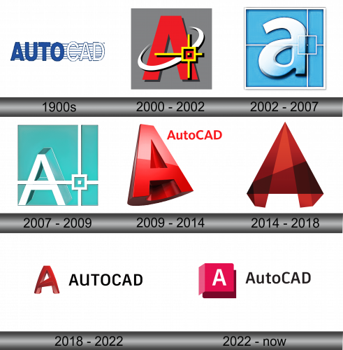
The initial insignia showcased a singular typography set against alternating narrow blue and broad white bands. Presented in hues of blue and white, the term “Auto” was emphasized with prominent blue letters. In contrast, “CAD” was depicted in luminous white with a delicate border. Rather than dividing the name, it was presented cohesively, enhancing its visibility due to the contrasting colors. This pairing not only heightened legibility but also conveyed the software’s integrated functionality and overarching mission. Such a design intricately ties together the essence of the software, reflecting its unified approach to computer-aided design.
2000 – 2002
The creators opted for a significant shift, transitioning from the software’s entire name to a singular letter ‘A’. Rendered in a vibrant shade of crimson, this ‘A’ was encircled by a pristine white trajectory, set within a slanted ellipse. Adjacent to it, a golden star was depicted, reminiscent of a sketch or illustration. This revamped insignia stood out, enhancing the product’s visibility and imprinting its unique identity in the minds of the users. Such a move was not just aesthetic but also strategic, leveraging design to accentuate the brand’s prominence.
2002 – 2007
The emblem underwent a significant transformation: the alphabet “a” now appeared in a more subtle lowercase form, rendered in a dimensional shade of sky blue and bordered with a sleek gray lining. Set against a square backdrop of a deeper blue hue, it was framed with a pale gray boundary. To round off this revamped design, a distinctive white cursor icon was incorporated, adding a touch of modernity and hinting at the software’s interactive nature. This fresh iteration showcased a harmonious blend of contemporary design elements, making the brand more relatable and appealing to its user base.
2007 – 2009
Once more, the brand underwent a visual transformation. The previously blue backdrop evolved into a greenish-blue hue, leaning more towards a fresh green tone. The alphabet “A” reclaimed its uppercase stature, now presented in slender white strokes. Enhancing the design, the inner boundary of the square frame was accentuated with a delicate white band. This renewed design not only retained the essence of the brand but also infused it with a refreshing palette and subtle details, reflecting both its heritage and adaptability to contemporary aesthetics. The choice of colors and design elements symbolized growth, innovation, and a commitment to progress.
2009 – 2014
A revamped emblem saw a resurgence of the color red: the letter “A” is presented in a 3D perspective, leaning towards the left. The deep-hued backdrop accentuates its volumetric appearance, giving it depth and dynamism. This innovative design showcases a blend of traditional hues with modern design elements. The choice to tilt the “A” offers a sense of movement and progression, indicating the brand’s forward-thinking nature. The depth provided by the dark background serves to highlight the letter, making it pop and immediately drawing the viewer’s attention, signaling a fresh yet familiar direction for the brand’s identity.
2014 – 2018
The character “A” underwent a transformative redesign, being reimagined as a three-dimensional pyramid structure. This revision adeptly mirrored the dynamic capabilities of the design software. The pyramid shape suggests stability and a solid foundation, aligning with the robust features of the program. Additionally, by presenting the “A” in a multi-dimensional form, it emphasized the software’s versatility and depth, encapsulating its intricate design tools and functionalities. This symbolic representation not only offers a visual appeal but also conveys the brand’s commitment to innovation and cutting-edge design. The new form signifies evolution while remaining rooted in the brand’s core essence.
2018 – 2022
The letter “A” is artistically rendered in a three-dimensional format, showcasing a unique gradient transition from a deep brown hue, through fiery red, to a soft pink. Accompanying this captivating design is the program’s official designation, “AutoCAD”, presented in striking red typography against a pristine white backdrop. This representation not only accentuates the brand’s identity but also emphasizes its innovative essence. The harmonious blend of colors, combined with the distinctive typeface, underscores the software’s blend of creativity and precision. Such a design approach speaks to both the aesthetic sensibilities and functional capabilities the software brings to its users. It’s a visual journey that encapsulates the program’s rich features and vibrant evolution.
2022 – Today
The AutoCAD emblem underwent a transformation, mirroring changes seen across various products under the AutoDesk umbrella. This holistic rebranding aimed to foster unified branding, amplifying the company’s collective identity. Interestingly, the revamped logo bears a striking resemblance to another one of the company’s offerings, 3ds Max. This design showcases a three-dimensional graphic that conjures an image of a cube, accompanied by textual branding to its side. Within this vivid pink cube, a pristine white “A” is centered. Adjacently, the brand’s name is penned in a typeface bearing a close likeness to Anant Grotesk Bold by Gunjan. This renewed aesthetic not only aligns with the company’s broader rebranding efforts but also symbolizes its commitment to advanced design solutions.


