AXE Logo
AXE is a brand of men’s hygiene products originally from France. The marque includes shampoos, scents, shower gels and scrubs, as well as aftershave means. Most of the AXE’s products are primarily marketed towards younger men, willing to attract a girl’s attention. It’s spread widely across the world under various regional names such as LYNX in UK, China and other countries or EGO in South Africa. The brand was founded in 1983 by Unilever, a British consumer goods international.
Meaning and history
AXE fragrances appeared in France in 1983. Throughout the 80s, AXE was using different names in its marketing campaigns, which were also the names of the scents used in deodorants. In the 90s, the entered the other markets, primarily in Europe, using geographical names for its products. After encountering great success in Europe, the brand was performed in the US in 2002. Alongside this, they launched their deodorant sticks product line in 2004 and other bodycare products in 2005-2013. Marketing across the world, AXE had to use different names to market globally, to avoid trademark issues.
Ever since the brand’s show up, it alluded to younger male and female audience, often using teen-spirit content in the marketing campaigns. From the 90s, many ad materials presented a very clear audience persona – a young 15-25 man willing to feel more comfortable with women via AXE’s ‘manly’ fragrances. They often invited pop musicians and social influencers in their ads to attract teen audience. Their official logotypes, used since 1983, although being just the wordmarks, reflected the teen vibe in their style.
What is AXE?
AXE is a marque of men’s hygiene products, including shower and shaving goods, deodorants, and sprays. The brand was established in France in 1983 by a London-based company, Unilever, which specializes in customer products. In the years to come, the brand entered other markets, changing its name. In UK, China and other countries, the brand is marketed as LYNX.
1983 – 1999
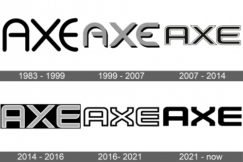
The very first signature showed the uppercase nameplate, using a semibold typeface with streamlined and smooth characters. The letter ‘a’ had an unusual appearance, reminding of a circular arch with a horizontal bar starting in the right edge of the letter, but separated from the left one by a small gap. The ‘e’ symbol was a vertically-oriented semicircle with a small central bar.
1999 – 2007
For the new century, the AXE’s design team developed a new design, mostly based on the original logo. The lettering became wider and flatter. The ‘a’ letter’s horizontal bar was cut down a bit, while the lower right tip was rounded and the left one became straightforward. The same thing happened with the other characters. Moreover, the upper and lower tails of ‘e’ were elongated. They also painted all letters bright gray.
2007 – 2014
In 2007, the brand design team completely went from semicircular letters in the logotype and introduced a black inscription with a heavy typeface. It featured blocky letterforms with angular corners. Sharp and straight tips of the bars made the logo look powerful, while a double black and white contour for each letter made them look even more stylish.
2014 – 2016
During the 2014-2016 period, there was used a logotype, looking almost the same as the previous one, except for several features: the inscription became a bit narrower, was repainted gray with a white contour, and the ‘x’ lower left wing was cut off from the rest of the letter.
2016 – 2021
Sometime later, the graphical identity team proposed a new logotype, having some new features, affecting both the script and the coloring. They gave a special form to the ‘x’ glyph, which now had its tips curved. Also, the ‘e’ letter got all of its horizontal bars straightforward (previously, the central bar was rounded). Finally, the letters changed their color to white and got a bold black outline.
2021 – today
This contour would then be removed, while the letters would turn to black shade.
Color
Since the foundation, the brand’s color code has overgone through several dramatics. The artists played with the coloring, preparing the new logotypes. For example, the AXE’s first logo was fully black, while its successor had a bright gray coloring. They went back to the gray coloring in the 2014 logotype, adding a white contour to the letters. Many other wordmarks were painted black and/or white.
Font
As for the typeface, so there was no a general typeface in the AXE logo history. They changed the forms of the letters in almost every logotype. The script’s style evolved from rounded lines to blocky symbols with heavy straightforward lines. However, there are some unchanging aspects in the inscription: first, the letters were always sans-serif, and uppercase.

