Baltimore Orioles Logo
The Baltimore Orioles, a distinguished Major League Baseball (MLB) team, hail from Baltimore, Maryland. Established in the late 19th century, they boast a rich history, punctuated with multiple World Series titles. Their emblem, showcasing a chirpy oriole, is symbolic of Maryland’s state bird. Camden Yards, their iconic home ballpark, offers a nostalgic nod to baseball’s golden era. Renowned for their passionate fanbase and a legacy of great players, the Orioles stand as a testament to baseball’s enduring spirit in the American sports landscape. Their vibrant orange and black uniforms are instantly recognizable, embodying their timeless spirit.
Meaning and history
The Baltimore Orioles, an esteemed name in Major League Baseball (MLB), have roots that trace back to the late 19th century. Originating from Milwaukee as the Brewers, the franchise relocated to St. Louis in 1902, becoming the Browns. After more than half a century there, they found their permanent home in Baltimore in 1954 and embraced their new identity as the Orioles, inspired by Maryland’s state bird.
Throughout their tenure, the Orioles have seen periods of both triumph and challenge. The 1960s and early 1970s marked a golden era, with the team clinching several American League pennants and winning multiple World Series titles. Legends like Cal Ripken Jr., Brooks Robinson, and Frank Robinson donned the Orioles’ vibrant orange and black during these peak years, leaving an indelible mark on the franchise’s history.
Camden Yards, the team’s home since 1992, is an architectural gem, blending modern amenities with classic ballpark aesthetics. It has become a central figure in Baltimore’s cultural and sporting scenes, hosting countless memorable moments.
The Orioles’ fanbase, known for its unwavering support, has been pivotal in the team’s journey. Their “O’s” chants and sea of orange during home games encapsulate the city’s deep-rooted connection to the team. Despite challenges and championship droughts, the Baltimore Orioles remain a symbol of resilience, determination, and the unyielding spirit of baseball in America.
1901
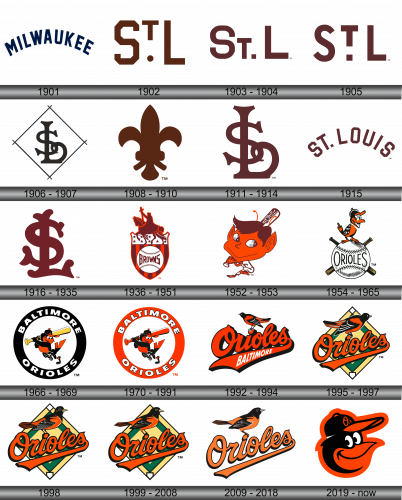
In the early 1900s, the common practice among sports squads was to utilize the name of their home state or city as their emblem. As a result, the initial insignia of the Milwaukee Brewers prominently featured the city’s moniker, crafted in a distinctive blue hue. This tradition was prevalent, perhaps because teams wanted to emphasize their local roots and connection to their communities. The simplicity of such designs also made them easily recognizable, fostering a sense of pride and identity among fans. Over time, as branding evolved, many teams opted for more intricate logos, but the nostalgic charm of those early wordmark emblems remains undeniable.
1902
Back in 1902, the squad bore the name “St. Louis Browns.” As a reflection of this moniker, their emblem prominently showcased the city’s abbreviation “St. L” rendered in a deep brown hue. During this era, teams often leaned towards simplicity in their logos, opting for straightforward representations of their names. This not only made them instantly recognizable but also underscored their deep-rooted ties to the local community. The use of color, particularly brown in this case, was symbolic, drawing a direct line to the team’s title. As times evolved, so did branding strategies, but the connection between a team’s name and its emblem remains a significant aspect of sports identity. The essence of such straightforward designs offers a nostalgic glimpse into the bygone days of baseball history.
1903 – 1904
The emblem showcases a distinct combination of letters arranged in a singular formation. Dominated by a deep burgundy hue, a bold, curvaceous “S” gracefully winds its way from the top left, flowing downward and looping back up toward its origin. Adjacently, a crisply rendered “T” stands, its crossbar intersecting the middle section of the “S”, further enhancing the interconnectedness of the design. To the right, a period signifies a brief pause before introducing the “L”, a tall, upright character stretching vertically, with its base meeting the emblem’s bottom edge. A trademark symbol, “™”, subtly resides at the bottom right, indicating the logo’s proprietary nature. The entire assemblage emanates a sense of modern simplicity while retaining a touch of elegance.
1905
The visual emblem displays a harmonious arrangement of characters, each bathed in a rich, mahogany hue. Starting from the left, a sinuous “S” cascades downwards, its curves resembling a gentle river meander, capturing attention with its fluid design. Beside it, a sturdy “T” stands tall, characterized by clean lines and a squared top, offering a sense of stability. Further right, a modest dot punctuates the space, serving as a visual break before leading the gaze to a statuesque “L”, extending vertically with a sharp right-angle at its base. To finalize the ensemble, a diminutive trademark sign, “™”, is positioned at the far bottom right, subtly marking the design’s exclusivity. Collectively, these elements evoke a feeling of understated sophistication and contemporary flair.
1906 – 1907
During the 1906-1907 campaign, the team’s attire featured a particularly intriguing emblem. Within the confines of a baseball diamond shape, one could see the letters “STL” artfully interlaced with each other. Despite the addition of this design, the foundational color scheme persisted. It’s fascinating how teams during this era showcased their identity, merging tradition with subtle creativity. The letters, representing the city’s initials, were a nod to locality, while their intricate design captured attention. It was an era where blending simplicity with a touch of flair was the norm, and this uniform symbolized that delicate balance. The continuity of the base color, on the other hand, indicated consistency and allegiance to their roots.
1908 – 1910
In the year 1908, the team underwent a significant transformation in its branding. They opted to replace the familiar “STL” initials with a rich brown fleur-de-lis, often recognized as a heraldic lily. This choice was quite symbolic, as the fleur-de-lis has deep historical and cultural connotations, representing purity, light, and life in various traditions. Introducing such a design into their emblem might have been an attempt by the club to resonate with a broader audience or to infuse a touch of elegance and tradition into their identity. The rich brown hue of the lily further emphasized a connection to the earth and perhaps to the grounded nature of the team’s ethos. It was a bold and intriguing move that showcased the club’s willingness to embrace change while still paying homage to heritage.
1911 – 1914
The team’s quintessential emblem uniquely blended the intertwined initials “STL”, rendered in a deep shade of brown. This design choice seemed to be a nod to the club’s history while introducing a fresh aesthetic. The interlocking letters symbolized unity, strength, and a collective spirit, essential attributes for any sports team aiming for success. The profound brown hue, often associated with earthiness and reliability, could signify the team’s grounded nature and unwavering commitment to excellence. This logo, serving as the team’s fifth visual representation, beautifully balanced tradition with innovation, subtly conveying a message of evolution while staying true to the roots. It was a testament to the club’s journey, capturing its essence and projecting its aspirations.
1915
1916 – 1935
In the year 1916, the squad opted for a revamp of its emblem, choosing to omit the letter “T” and instead, prominently featured just “SL” in a rich brown hue. This rendering appeared with a soft, diffused look, almost reminiscent of a watercolor painting. This particular design became synonymous with the St. Louis Browns, enduring for nearly two decades until 1935. This era signaled the conclusion of the team’s longstanding tradition of employing city initials and names within their symbolic representation. The shift showcased the squad’s willingness to embrace change and highlighted their journey of continuous evolution, always striving for fresh ways to encapsulate their spirit and identity.
1936 – 1951
The emblem underwent a transformation, adopting a fresh palette of white, black, and fiery orange hues. Central to the design was a depiction of the revered St. Louis statue, for whom the city was named, majestically seated on his steed, brandishing a blade. This iconic figure was elegantly positioned over a protective crest adorned with eight glistening brown stars crowning its upper portion, and alternating bands of vivid orange and deep brown below. Nestled at the heart of this crest was a pristine white baseball, proudly bearing the inscription “BROWNS,” symbolizing the team’s spirit and core essence amidst the rich tapestry of symbols and colors.
1952 – 1953
Fifteen years on, the emblem underwent a complete transformation. No longer resembling its previous designs, the new icon prominently featured a whimsical, animated elf’s visage, bathed in a vibrant shade of orange. This playful creature, with its mischievous eyes and cheeky grin, symbolized a fresh chapter for the team. The choice to shift to such a distinctive and lively image reflected the evolving spirit and direction of the organization. Embracing change, they ventured into a more modern and playful representation, hoping to resonate with a broader audience and perhaps infuse a touch of magic and charm into their brand’s identity.
1954 – 1965
When the team made its move to Baltimore, a fresh identity was embraced, leading them to be rechristened as the Baltimore Orioles. This transition warranted a novel emblem. During the initial nine seasons post-relocation, the Orioles showcased a jovial, animated oriole, painted in shades of black, orange, and pristine white, perched atop a gleaming white baseball. In the backdrop, twin bats intersected in an X formation, adding a dynamic touch to the design. Elegantly scripted across the baseball’s center was the word “ORIOLES,” signaling the team’s rebirth and newfound spirit in their new home city. The design aimed to capture both the heritage and the future aspirations of this rejuvenated squad.
1966 – 1969
Maintaining a playful and animated style in their visual representation, the Baltimore Orioles opted for a design showcasing a resolute oriole bird, poised with a baseball bat, encompassed within a dark ring for the year 1966. This decision was auspicious, as the Orioles soon clinched a World Series title. However, by 1970, feeling the winds of change and possibly influenced by their triumphant victory, they decided to give a fresh spin to the logo. They revamped the shade of the surrounding circle, perhaps signaling a new chapter in the team’s storied journey, while still preserving the heart of their beloved emblem.
1970 – 1991
The subsequent emblem representing the Baltimore Orioles underwent a subtle transformation. By 1989, the squad felt a refresh was in order, and while the design largely retained its foundational elements, there was a notable shift in the palette. The hues transitioned from their earlier versions to more vivid and lively iterations. The black took on a richer depth, and the orange erupted with a more luminous glow. This modification was emblematic of the team’s desire to keep evolving while staying rooted in their iconic identity. The brighter shades invigorated the emblem, reflecting the team’s renewed energy and optimism for the seasons ahead.
1992 – 1994
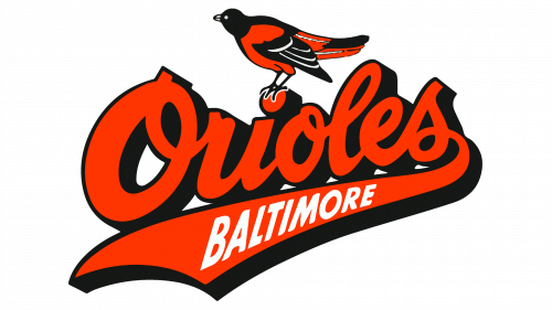
In the year 1992, the Baltimore Orioles decided on a fresh transformation for their emblem. The encompassing circle was done away with, giving way to a more realistic representation of an orange oriole, its striking black wings unfolding gracefully. This bird elegantly perched atop the letter “i” within the team’s name, “Orioles.” Intricately nestled within the vibrant orange plumage of the bird’s tail was the city’s namesake – “Baltimore.” The city’s moniker was delicately scripted in a pristine white hue, ensuring it complemented the overall design, paying homage to the team’s proud origins and its longstanding connection with the city.
1995 – 1997
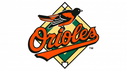
In a refreshing twist, the team unveiled an updated emblem. The avian figure, symbolic of the team, maintained its poised stance atop the letter “i” in the elegantly scripted word “Orioles.” However, this time, its direction was shifted, gazing towards the right. The vibrant orange calligraphy was beautifully contrasted against a backdrop inspired by the hues of a sunny day at the ballpark – a blend of sun-kissed yellow and lush green, reminiscent of a well-maintained baseball field. This new design harmoniously fused the essence of the game with the iconic bird, creating a visual treat for fans and spectators alike.
1998
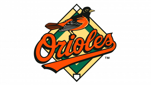
For the 1988 season, the team decided to make nuanced alterations to their emblem. While the modifications were subtle, they were also profoundly significant. The avian figure, which has always been the centerpiece of their branding, underwent a transformation. The newly designed bird bore a striking resemblance to an authentic oriole, showcasing its distinctive orange and black hues. This approach aimed at capturing the essence and realism of the bird, making it resonate more with nature and authenticity. By making this shift, the team not only embraced a touch of realism but also paid a genuine tribute to the iconic bird after which they are named. This refreshed look was a nod to nature’s beauty and the authenticity of the oriole’s majestic presence.
1999 – 2008
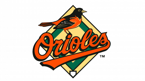
The fifteenth iteration of the Baltimore Orioles’ symbol maintained its core essence but underwent subtle refinements. The most noticeable alteration was the vivid intensification of its color palette, breathing fresh life into the emblem. Additionally, the depiction of the oriole was given a meticulous touch-up, bringing forth crisper and more pronounced features. This rejuvenated design not only highlighted the bird’s striking characteristics but also showcased the team’s dedication to maintaining authenticity while adapting to modern design nuances. This careful blend of tradition and innovation echoed the team’s legacy while signaling their forward-thinking approach, embracing the past and the future in one harmonious blend. The updated badge was a testament to the Orioles’ commitment to evolution while staying true to their roots.
2009 – 2018
The most recent emblem of the Baltimore Orioles underwent significant modifications in 2009. The backdrop, which previously featured a baseball diamond, was entirely omitted.
Moreover, the fiery red hue was transitioned to a more subdued shade of orange. While the iconic oriole, adorned in its signature colors of black, white, and orange, maintained its presence, its vibrancy was slightly toned down compared to its predecessor. This refreshed design symbolized a blend of the team’s rich legacy with a modern outlook. By balancing classic elements with contemporary adjustments, the logo encapsulated the Orioles’ journey through the years. The shift in color tones and design elements was indicative of the team’s evolving spirit, a testament to their adaptability while holding onto their core identity. It was a subtle nod to the past, yet an unmistakable stride into the future. The redesigned emblem showcased a harmonious merger of time-honored tradition and contemporary flair, reflecting the Orioles’ enduring essence in the ever-changing world of baseball.
2019 – Today
The latest iteration of the Baltimore Orioles emblem emerged in 2019, building upon the foundation of its precursor from the 2012-2018 era. Instead of a complete overhaul, the designers opted to adapt an alternative emblem previously utilized for promotional endeavors, elevating it to the team’s primary visual representation.
Rather than a lifelike depiction, the emblem showcases a stylized version of the oriole. Only a section, primarily the head, is depicted against a pristine white backdrop, viewed in partial profile. The bird’s countenance is warm and approachable, underscored by its gentle smile causing a slight upward curve at the end of its beak. Adding to its friendly demeanor is a dark-toned baseball cap, offset by a lighter brim. Emblazoned on the cap is a distinctive badge featuring a capitalized “O” intertwined with a smaller “s”, signifying the team’s enduring identity. This emblem echoes the spirit of the team, merging tradition with contemporary charm, resonating with fans old and new.
