Bank of Baroda Logo
Bank of Baroda is a prominent Indian multinational banking and financial services company. It offers a wide range of banking products and services, including retail and corporate banking, wealth management, and international banking. The bank operates globally, with a strong presence in India and key international markets.
Meaning and history
Bank of Baroda, one of India’s oldest and largest banks, has a rich history that dates back to its establishment during the British colonial era.
Bank of Baroda was founded on July 20, 1908, in the princely state of Baroda (now Vadodara) in Gujarat, India. Its founders were Maharaja Sayajirao Gaekwad III, a visionary ruler, and Sir Vithaldas Thakersey, a prominent industrialist. The bank’s primary aim was to serve the banking needs of the princely state.
In 1969, the Government of India nationalized Bank of Baroda, bringing it under state ownership as part of a broader initiative to consolidate and strengthen the country’s banking sector. This move significantly expanded the bank’s reach and influence across India.
During the 1970s and 1980s, Bank of Baroda embarked on a path of international expansion. It established branches and subsidiaries in various countries, with a particular focus on serving the Indian diaspora. This strategic move transformed the bank into a global financial institution.
Over the years, Bank of Baroda diversified its services to encompass retail banking, corporate banking, wealth management, and international banking. It also played a crucial role in financing various sectors of India’s growing economy.
Bank of Baroda remained a public sector bank in India, with the government holding a significant stake. However, it did not undergo any major change in ownership during this period.
In the 21st century, Bank of Baroda continued its global expansion, establishing a presence in multiple countries worldwide. The bank aimed to cater to the banking needs of both individuals and businesses, facilitating trade and financial services across borders.
Like many banks, Bank of Baroda embraced digital transformation to enhance customer service and efficiency. It introduced online banking, mobile apps, and other digital platforms to make banking services more accessible.
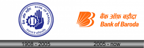
1908 – 2005
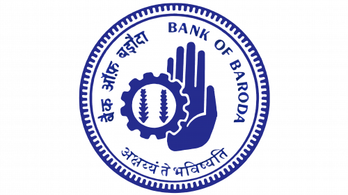
The original emblem of Bank of Baroda showcased the bank’s name in a deep navy blue hue. Positioned in the upper right corner and encircling the border, the letters formed a graceful semicircular arrangement. Two additional inscriptions in Gujarati and Hindi, languages prevalent in the bank’s founding region, completed the circular text. The Sanskrit script conveyed the message “Akshayam te Bhavishyati,” translating to “the future is safe,” reflecting the institution’s aspiration to be a trusted financial custodian.
The encircling blue rings added a distinct touch to the logo. One ring was smooth, while the other featured numerous inward-facing notches at its ends. At the logo’s center, a composition of gears and two stylized ears of corn symbolized industry and agriculture, signifying the bank’s pivotal role in fostering these sectors. On the right side, an open palm with raised fingers conveyed a simple yet profound message: a reassuring gesture, encouraging confidence in the bank’s services.
2005 – Today
In 2005, an anonymous designer crafted the logo for Bank of Baroda, officially unveiled on June 6th. Around the same period, the financial institution inked a deal with Rahul Dravid, famously known as “Mr. Dependable,” to serve as its brand ambassador. These changes were geared toward preparing for groundbreaking reforms, expanding branch networks, and deploying thousands of ATMs in diverse regions. Consequently, the new emblem radiates positivity.
Diverging from its predecessor, the modern logo no longer features sheaves of grain and gears within a circular frame. Instead, it showcases a triple-letter “B” with radiant rays extending in all directions. This “solar” emblem signifies Bank of Baroda’s omnipresence, akin to the sun’s vital role on Earth. The bank operates not only in India but across over twenty other countries, positioning itself as a life-sustaining force. The three “Bs” are interlocked, devoid of any intra-letter gaps. The first and third “B” are vibrant orange, representing the Bank of Baroda’s initials. The central letter, nestled between them, takes shape in the negative white space.
Evidently, the new design targets a younger audience. Often referred to as the “Baroda Sun” due to its white ray-like halo, it symbolizes a source of warmth and light, dispelling darkness—akin to how BoB endeavors to assist people with their financial needs. The bold orange color scheme exudes energy and optimism, featured not only in the stylized “B” but also in the accompanying inscriptions on the right. The top line showcases the brand name in Hindi, while the bottom line is presented in English, rendered in the Univers Condensed Bold font.


