Bank of Montreal (BMO) Logo
The Bank of Montreal (BMO) is a leading financial institution based in Canada, offering a wide range of services including retail banking, wealth management, and investment solutions. It operates predominantly in North America, but also has a presence in select global markets. BMO is publicly traded and owned by its shareholders, with no single dominant owner. The bank’s ongoing mission is to provide innovative financial solutions while maintaining its rich heritage rooted in trust and stability.
Meaning and history
The Bank of Montreal (BMO), established in 1817, holds the distinction of being Canada’s oldest bank. Founded in Montreal by a group of merchants, BMO was instrumental in the nation’s early financial and infrastructural development. Throughout its growth, the bank navigated a series of economic challenges, from recessions to wars, solidifying its role as a leading financial institution.
In the late 19th and early 20th centuries, BMO began expanding its footprint, opening branches across Canada and venturing into the U.S. market. As the decades passed, mergers and acquisitions became a strategy to further consolidate its market position. Notably, BMO acquired the Chicago-based Harris Bank in 1984, marking a significant expansion into the American market.
Over the years, BMO transitioned from traditional banking to offer a diverse range of services, including investment banking, wealth management, and capital markets services. Though publicly traded, BMO’s ownership has remained diverse, with shares held by institutional and retail investors, rather than by a single dominant entity.
In recent history, BMO has placed emphasis on technological advancements, digitizing many of its services to cater to a modern clientele while upholding its legacy of trust and stability. Today, BMO stands as a testament to over two centuries of resilience and innovation in the banking sector.
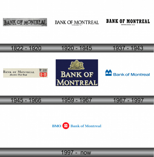
1822 – 1920
Among the earliest emblems, the inscription “BANK OF MONTREAL” was prominently displayed, crafted in slender characters adorned with elongated serifs. Both “O” characters resembled pristine, unblemished circles, elevated above the standard line height. Primarily, the dominant hue was a deep charcoal, yet on occasions, nuances of silver and ivory emerged, especially when this typographic representation was adapted for metallic plaques or insignias. Over time, such intricacies in design demonstrated the bank’s keen attention to detail and its commitment to presenting a refined and distinguished image in its early branding efforts.
1920 – 1945
Elongated, svelte serif characters remained a consistent feature, but with notable variations. Notably, the font was standardized: the previously diminutive “O” was replaced with one that harmonized in stature with its alphabetic neighbors. Beneath the primary text, the creators subtly integrated the bank’s inception year, “1817”. This detail was neatly centered for a balanced aesthetic. The entire emblem adopted a singular, monochromatic hue, offering a minimalist yet powerful representation of the bank’s long-standing history and its unwavering commitment to excellence throughout the years.
1937 – 1943
During this era, the emblem was characterized by assertive block-style lettering, with each character exuding a solid, hefty presence. To ensure clarity and ease of reading, the designers thoughtfully expanded the gaps between each letter. These broad, architectural characters were adorned with boxy serifs and were dipped in a deep black hue. In a nod to design hierarchy, the text at the base was deliberately kept more diminutive compared to the prominently displayed text above, thus creating a layered visual impact that resonated with the audience and reflected the bank’s robust stature.
1945 – 1966
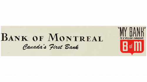
In the transformative year of 1945, the bank’s visual identity underwent a significant metamorphosis. Alongside the prominent display of the BANK OF MONTREAL, a clarifying statement proudly declared its genuine Canadian roots. To the right, a textual emblem, reminiscent of a protective shield, made its debut. This layout was so meticulously crafted that it manifested into a pentagonal-shaped insignia, featuring a distinctive red base. For the inaugural time, an abbreviated reference – “B of M” – graced this section. The typographic choices were diverse and eclectic across the board. From slanted fonts emulating personal script to sleek, thin grotesques, and robust characters adorned with sharp, pinpoint serifs, the variety was evident. Uniquely, no two typefaces mirrored each other, showcasing the brand’s commitment to individuality and distinction.
1959 – 1967
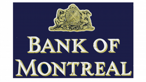
To underscore the bank’s pillars of trustworthiness, stability, security, and enduring legacy, the logo underwent a cohesive transformation. The creative minds behind the redesign amplified the lettering, rendered it in a pristine white hue, and accentuated it with a gray-yellow undertone to its right, imparting a tactile, three-dimensional feel. Crowning the emblem, a tableau unfolded featuring two indigenous figures flanking an elliptical shield. This symbolized the tangible advantages and support the native community garnered from the banking entity. Anchoring the motif at its base was a bounteous horn of plenty, generously spilling out an assortment of fruits, a testament to the bank’s prosperity and its promise of abundance.
1967 – 1997
In the pivotal year of 1967, Arnold Hart Bank’s chief executive rolled out an avant-garde emblem known as the M-Bar. This innovative brainchild was birthed by the renowned Canadian designer, Hans Kleefeld, under the banner of Stewart & Morrison. Kleefeld crafted a distinctive motif, showcasing a prominent “M” ensconced within a rectangular frame. Unique to this design was the emblem’s sharp, angular form, highlighted by the meticulously chiseled edges of the “M”. Adorning this sapphire symbol was a matching blue caption reading “Bank of Montreal.” In this rendition, the typography was sleek, sans serifs, with a notable linkage between the lowercase “t” and “r”.
The unveiling of the M-Bar signified more than just a visual shift. 1967 ushered in a revamped Bank Act, granting the institution the latitude to delve into mortgage services. Seizing this newfound opportunity, the bank’s leadership embarked on an assertive marketing drive, reshaping both the bank’s operational blueprint and brand persona. This strategic metamorphosis was fortuitously timed, celebrating a landmark 150 years of the bank’s financial legacy.
1997 – Today
As the bank’s various offshoots united under the BMO Financial Group umbrella, there was a rejuvenation of the iconic M-Bar emblem. Crafted in pristine white, this emblem was nestled within a vibrant red circular backdrop. Though certain BMO brands had flirted with this emblem towards the latter stages of the 20th century, its ubiquity only truly cemented post the 2002 organizational overhaul.
The “Bank of Montreal” text now dons a refreshing shade of sky blue, accentuated with petite yet pronounced serifs. To the left, “BMO” prominently features, serving as a nod to the collective legacy of the entire conglomerate. In the logo’s condensed version, the designers strategically opted for minimalism, sidelining the bank’s traditional nomenclature and zeroing in solely on the quintessential markers: the concise ticker and the encapsulated emblem.

