Barclays Logo
Barclays is a multinational financial services giant headquartered in London. Currently, it provides a broad spectrum of services, including retail banking, corporate banking, investment banking, and wealth management. Primarily active in Europe, the US, and Asia, it’s among the UK’s major banks. The company is publicly traded on the London and New York Stock Exchanges, implying a diversified ownership by global shareholders. Barclays continues to adapt to evolving financial landscapes, solidifying its stance in both traditional banking and innovative financial solutions.
Meaning and history
Barclays, a British multinational banking institution, traces its origins back to 1690 in London. James Barclay would become a partner in 1736, and the company would later adopt his name. Initially dealing in goldsmith banking, it evolved over the centuries.
In the 20th century, Barclays expanded its reach, acquiring several English provincial banks. This growth was pivotal, making Barclays a nationwide bank. The 1960s saw the bank’s international presence strengthen with operations spanning across continents.
The late 20th and early 21st centuries were marked by further expansion and technological innovation. Barclays introduced the first ATM in 1967, revolutionizing banking. In the 2000s, the bank ventured into investment banking by acquiring Lehman Brothers’ assets, elevating its status in the global financial market.
Ownership has transitioned over the years. Originally a partnership, Barclays became a joint-stock bank in the late 19th century. In the modern era, it’s publicly traded, with ownership dispersed among global shareholders.
Challenges like the 2008 financial crisis tested Barclays, but it navigated through, albeit with some controversies. Today, Barclays stands as a banking titan, a testament to its resilience and adaptability over 300+ years.
1960s – 1970
Unveiled in the 1960s, the logo prominently displays the institution’s title in broad, stretched-out capital letters. Arranged on two levels, the top tier showcases the word “Barclays,” while the lower tier presents the term “Bank” alongside a petite emblematic figure. This icon represents an eagle with its wings wide open and its gaze directed leftward. Incorporated within the eagle are three regal crowns. However, due to the spacing in the bottom row, the overall design gives off an impression of being somewhat weighty and lacking final touches. The choice of the eagle and crowns emphasizes the bank’s deep-rooted British heritage, underlining its legacy and commitment to excellence throughout the years.
1968 – 1970
For a period, this rendition coexisted alongside its predecessor. It incorporates similar components but exhibits them in a refreshed layout. Designers strategically positioned the emblematic eagle centrally, hovering over the bank’s moniker. Additionally, there was a shift in typography. The chosen typeface now featured slender capital letters adorned with subtle serifs, adding a touch of elegance to the overall design. The revamped alignment and font choice breathed a modern flair into the emblem, reflecting the institution’s evolving identity while still paying homage to its rich history and tradition. This design intricately blended the old with the new, showcasing the bank’s adaptability through changing times.
1970 – 1999
In the year 1970, creative minds decided to infuse vibrancy into the emblem by embracing a hue reminiscent of soft azure. Within this cerulean rectangular backdrop, the moniker of the bank is abbreviated, showcasing merely its initial segment. The term “Barclays” stands out in crisp, white, serifed typography, asserting itself with its bold and capitalized letters. Adjacent to this inscription, on the emblem’s left flank, resides a square of a deeper blue shade. It houses a majestic heraldic eagle, distinguished by the trio of crowns it proudly displays. This redesign encapsulated the bank’s legacy while presenting a fresh, modern aesthetic, symbolizing both tradition and progression.
1999 – 2002
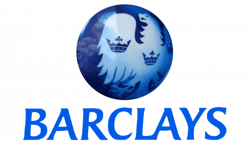
Creative minds embarked on a journey of innovation, playing with form and hue. They elegantly encapsulated a segment of the eagle within a rounded boundary, enriched with gleaming accents and a mesmerizing gradient that flowed from a deep ultramarine to a rich cobalt blue. Positioned beneath this captivating imagery, the financial institution’s moniker was rendered in graceful italics, adorned with extended flourishes. Every element came together harmoniously, ensuring that the emblem stood as a testament to both modernity and tradition, exuding a sense of equilibrium and sophistication that reflected the bank’s prestigious stature.
2002 – Today
The latest iteration of the logo stands as a pinnacle of success, radiating an air of unparalleled officiality when compared to its predecessors. This remarkable transformation was expertly accomplished by the creative minds behind it. To enhance its regal appeal, they chose to eliminate the avian claws that once graced the artwork, opting instead to elongate the majestic tail. Moreover, the design team decided to strip away the symbolic crowns, replacing them with two gracefully contoured protrusions adorning the wings. The emblematic word, “Barclays,” retains its timeless elegance, maintaining the interconnected “L” and “A” at the base just as it did in its previous incarnation.
In this magnificent evolution, the logo undergoes a metamorphosis that embodies sophistication and gravitas. By shedding the avian paws, expanding the majestic tail, and reimagining the wing adornments, the designers achieve an unprecedented level of prestige. “Barclays” retains its iconic charm with the “L” and “A” harmoniously united at the base, ensuring a seamless blend of tradition and modernity. This transformation marks a definitive moment in the logo’s evolution, elevating it to new heights of officiality and visual allure.

