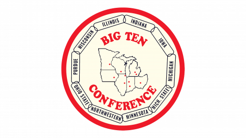
Big Ten Conference Logo
The Big Ten Conference is a prestigious collegiate athletic conference in the United States. It was established by leaders from several universities, primarily to regulate and organize college sports activities. The conference originated in the Midwest, featuring prominent universities that sought to create a unified and competitive sports environment. It emphasizes not only athletic excellence but also academic achievements, making it a cornerstone of American college sports culture.
Meaning and history
The Big Ten Conference, a trailblazer in collegiate sports, was founded in 1896. Its inception in the Midwest marked a new era for university athletics.
Initially, it comprised universities like Chicago, Michigan, and Wisconsin. The focus was to regulate and elevate college sports. Over time, the conference expanded, adding institutions like Ohio State and Penn State. It became synonymous with academic and athletic excellence. The Big Ten pioneered the integration of academics in sports programs. It navigated through world wars and the Great Depression, adapting and growing. The conference led in gender equality in sports, embracing Title IX early on. It also innovated with the Big Ten Network, changing sports broadcasting.
The Big Ten remains a symbol of tradition and progress in college athletics.
What is Big Ten Conference?
The Big Ten Conference stands as a collegiate athletic powerhouse in the United States, renowned for blending top-tier sports with academic excellence. Established in 1896, it unites major universities primarily in the Midwest, setting a high standard in both educational and athletic achievements.
1972 – 1986
The logo captures the essence of the Big Ten Conference with a circular red and white emblem. It encircles a map of the Midwest, pinpointing member states. Each state is home to one or more of the universities that make up this storied league. Names of the participating colleges wrap around the edge, symbolizing unity and competition within the conference. The central placement of “BIG TEN” in bold letters declares the conference’s identity, with the block lettering conveying a sense of strength and tradition.
1986 – 1990
In 1986 the Big Ten Conference logo was redesigned in a minimalistic manner. The slanted shadowed “10” in an elegant classy font was placed on the background of the composition, being horizontally cut, and with the two-leveled serif lettering inserted into the resulting space. Both lines of the wordmark were set in the uppercase of the same typeface, but with the characters of the top level significantly larger and bolder than the ones from the bottom level.
1990 – 2011
This logo for the Big Ten Conference is starkly minimalist, showcasing bold, blocky letters in a deep navy hue. The text is straightforward, with “BIG TEN” prominently above “CONFERENCE,” conveying a modern, no-nonsense image. It lacks imagery or adornment, focusing solely on the name, suggesting a contemporary shift from tradition to a more forward-thinking identity. The simplicity of the design underscores the conference’s confident brand in the collegiate sports landscape.
2011 – Today
The logo transitions to a bold, two-tone design, with “B1G” signifying the Big Ten Conference. The “I” cleverly integrates the numeral “1”, marrying the conference’s name and its encompassing number of members. Black and blue dominate, ditching the previous logo’s single color for a more dynamic contrast. This design is a study in visual brevity, using color blocking to make a striking statement. It’s a contemporary twist, showing evolution while maintaining the conference’s robust identity.


