Triumph Logo
Triumph Motorcycles is a British motorcycle brand that produces motorcycles in a wide variety of classes. The model range of Triumph motorcycles includes about 30 models: from retro bikes to ultra-modern sports bikes. The manufacturer actively uses the achievements of the past years and continues to look for new unique engineering solutions. Today, Triumph has its subsidiaries in the USA, Canada, France, Germany, Belgium, Austria and a number of other countries.
Meaning and History
![]()
The company was founded in 1902 and is now located in Hinckley, UK. A few years after the foundation, the first motorcycle of the Triumph brand was released. In 1928, the company also starts producing cars, continuing to produce motorcycles and bicycles. In 1936, production was taken over by Edward Turner, and in 1973 Norton-Villiers-Triumph was formed, producing motorcycles until 1990. In 1990, the modern history of Triumph began with the arrival of new owner John Bloor.
What is Triumph?
Triumph has been producing motorcycles for over a century and has played a significant role in the development of motorcycle technology, and continues to work in this direction. Over the years, its motorcycles have improved, won races, and gained popularity.
1902 – 1906
![]()
The original logo is elegant and appropriate for that time period. It was a crest with a royal crown on top of it. The name was printed across the top in all uppercase letters of a grey color with a thin border. It was also featured in the center on round shapes with six flags coming out of it at the top. They were meant to represent all the continents on our planet.
1907 – 1914
![]()
This version looks very stylish. It featured just the name of the company written using a cursive font. The name was placed on a diagonal, going upward on the right end. The first and last letters framed the word with swoosh lines above and below it. The letters were black, but the light gray shadow on one side, slightly indented from the letters themselves, gave them some volume and sophistication.
1914 – 1922
![]()
This version added some boldness to the previous logo. The name was set on a black oval shape with a braided border. It was written in almost a straight line with the word “Motors”, which is done in a similar style, added underneath towards the right end. To make the inscriptions not blend with the background, they were done in a light grey color.
1922 – 1932
![]()
Without close comparison, it might seem that this is just a color version of the original emblem. It is done primarily in golden and dark blue colors. There are also black details, which is also used for the inscriptions. The crown on the crest also looks a bit different.
1932 – 1933
![]()
The new logo looks very futuristic and nothing like any of the previous versions. There was one resemblance with the 1914 version as it also featured a black oval base. The name of the company was done in bold, sans-serif white letters with a blue shadow. The most attractive element was a bright, colorful globe that had “All over the world” written above it. There were also some delicate golden framing elements.
1934 – 1936
![]()
The name is written in a serif font featuring bold lines. There is a swoosh line coming from the “R” and crossing the “H” and becoming its horizontal line. Even though this style of writing was previously used by the brand, it was not seen as part of the emblem placed on the motorcycles themselves. Although the first letter was capitalized, all the letters looked uppercase.
1936 – 1990
![]()
To emphasize the strong and sophisticated look of the emblem, the designers added a double outline. It was done by adding a thin black line that was indented to create white space.
1990 – 2005
![]()
The inside of the letters was light blue, while the outline remained white and black. the color change created a completely different feel. It was lighter and appeared to have more details. The font has been modified, but the overall image was preserved.
2005 – 2013
![]()
This version looks more masculine thanks to a deeper shade of blue and thicker lines. The letters were redrawn again, with the main difference being seen in the letters “U” and “H”.
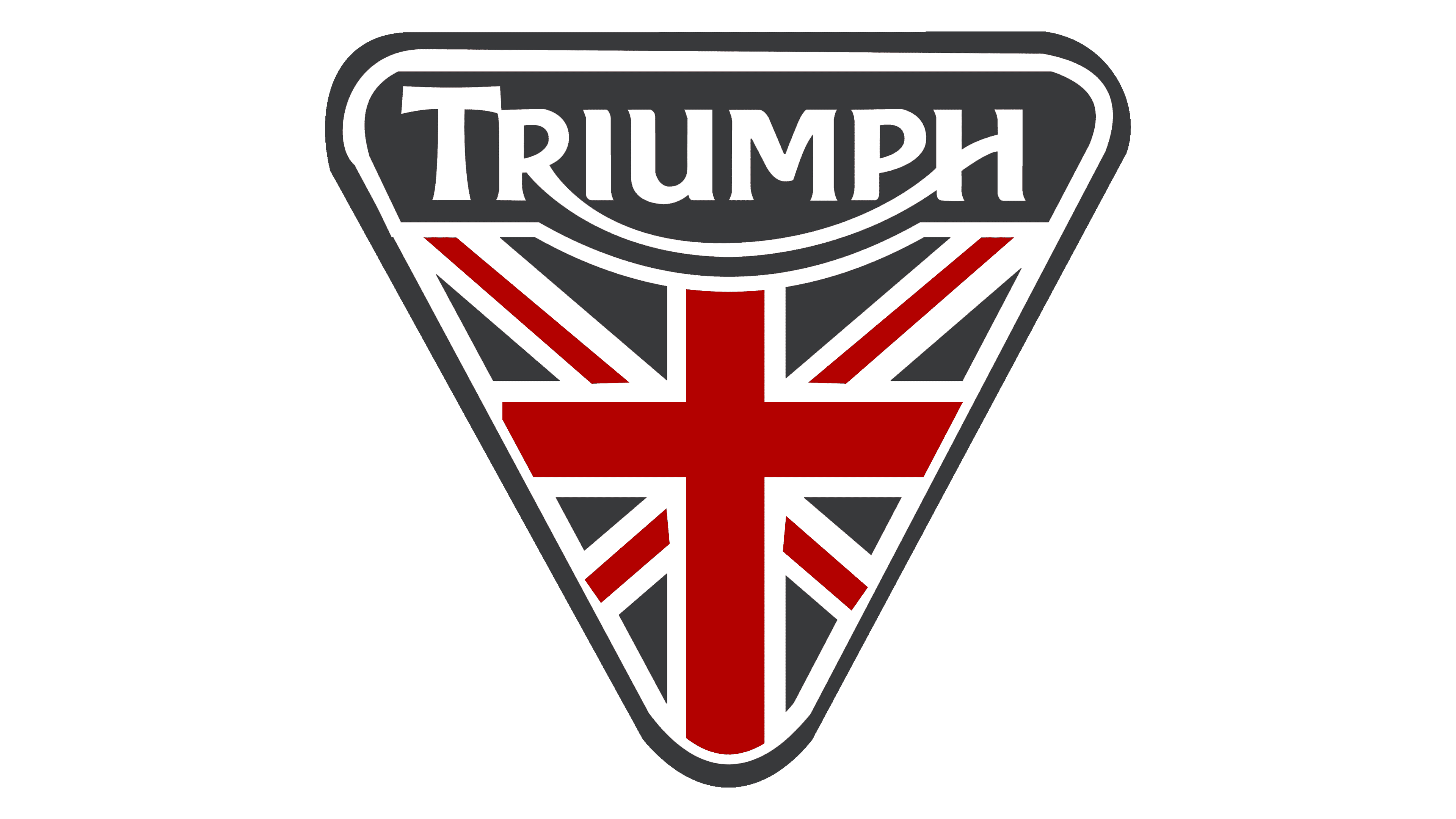
2013 – Today
![]()
The black and white color palette was brought back. Although the brand name inscription underwent minimal changes, there was one new detail not seen before. It was a triangle pointing down with the Union Jack flag being partially depicted on it.
Font and Color
The brand used several fonts to print its name. There were versions with more elegant, cursive typefaces and logos that used a more basic type of font. However, since 1934, all the logos used a modification of one font. It featured all uppercase letters with the first letter being taller than the other (except in the last version) and a letter “R” that swept under the whole word to become the horizontal line of the last letter.


