Bosch Logo
Bosch is a company with a long history. Brand products do not even need excessive advertising as many years in the various markets made them quite recognizable. Product quality, as well as the trust of customers and partners, have always been a priority for Robert Bosch, the founder of the company. Impeccable German quality and a responsible attitude to business strengthened the brand’s image which inspires confidence and trust in its products.
Meaning and History
Bosch was founded in 1886, when entrepreneur and engineer Robert Bosch opened his first store, called “Werkstätte für Feinmechanik und Elektrotechnik”, in Stuttgart, Germany. A successful start was hindered by the economic crisis. The firm revived only in the mid-1890s when it got contracts for the installation of electrical equipment. Bosch had a contract with Gottlieb Daimler, who liked Bosch’s patented magneto. At the beginning of the 20th century, Robert launched two more locations, in France and England, and in 1905 a branch appeared in New York. By 1930, the company had three clear directions of development: automotive (components), industrial equipment (tools), and consumer goods. Since 2013, its activities also included construction equipment and energy technology.
What is Bosch?
The world-famous German company Bosch is a leading manufacturer and service provider. Over its long history, “Robert Bosch GmbH” developed from a modest workshop into the largest concern specializing in equipment and parts for cars, household appliances, and communication devices.
1900 – 1907
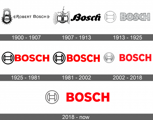
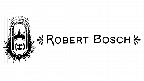
The original log was quite exquisite and detailed. There was an emblem on the left and the name of the founder on the right. The latter was done in an elegant font with unique first capital letters and had two décor elements on both sides. An oval shape with sparkles at the bottom and inside of it as well as a magnet and a simple drawing of a magneto developed by Robert Bosch were all parts of the emblem.
1907 – 1913
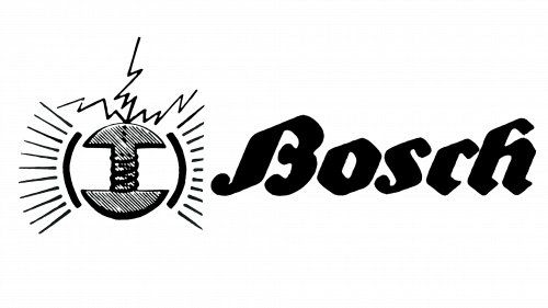
The new design had an updated emblem as well as a different typeface for the wordmark. A sketch drawing of magneto was the center of the emblem. it was framed by two curved lines with lines and lighting bolts reflecting the energy of the mechanism. The word “Bosch” was italicized and done using thick lines. The letters appeared to be written using a calligraphy pen.
1913 – 1925
A very minimalistic drawing of magneto using thin lines was framed by a thin circular border and placed on the left. The wordmark was done using a sans serif font with bold letters. They were barely touching and had a thin outline. It served as the basis for the versions seen throughout the next century.
1925 – 1981
This version took the previous logo to a completely new level. The name was done in a bold red color, while the emblem on the left acquired thick lines. It looked very impressive and professional.
1981 – 2002
The font in the wordmark was slightly modified, making the letter “C” less curved. The letters also appeared bolder, darker, and closer spaced apart. Moreover, there was also a minor change in the emblem, which also looked bolder. The horizontal bar was drawn shorter, while the two elements on the sides got a bit bigger.
2002 – 2018
The company kept the wordmark unchanged. However, the emblem was given a silver metallic appearance. Thanks to various shades, it had a 3D appearance.
2018 – Today
In 2018, the brand decided to go back to a bolder shade of red. It also brought back a simple outline of the emblem. This time, though, it had a dark grey color.
Font and Color
For about a century, the company used fonts that looked very similar. They resemble Typold Condensed Extra Bold and FF Mark W1G Narrow Heavy. The straight, bold lines in combination with the red color gave the logo a powerful and energetic look. The font made the company look confident and professional. There was also black for contrast and balance. A dark grey instead of black in the latest logo further created a less dramatic appearance, making the name the key element of the emblem.
