Bostik Logo
Bostik is a renowned global company specializing in adhesives and sealants. A French chemist established the company in the suburbs of Paris. Initially, Bostik was formed to produce industrial adhesives for manufacturing and construction. The brand is known for its innovation and quality products across various industries.
Meaning and history
Bostik began its journey in 1889, when its founder recognized the need for reliable adhesive products in the burgeoning industrial sector. Over the years, Bostik has marked significant milestones. For instance, in 1990, the company expanded its reach by acquiring several smaller adhesive firms, enhancing its market presence and product range. Another key date was in 2015, when Bostik became part of Arkema group, a major player in specialty chemicals and advanced materials, boosting its research capabilities and market access.
What is Bostik?
Bostik is a leading manufacturer of adhesive and sealing solutions. Their products are essential in everyday items and industrial applications. Bostik stands out for its commitment to sustainable development and innovation.
Before 2000
The Bostik logo features bold, blue typography. The letters are solid and robust, exuding confidence and stability. The font style is sans-serif, contributing to a modern and clean appearance. Each character is uniformly thick, ensuring high visibility and readability. The ‘B’ is prominently larger than the other letters, emphasizing the brand name. The blue color symbolizes trust, professionalism, and reliability. The simplicity of the design makes it instantly recognizable. There are no additional graphics or embellishments, keeping the focus on the brand name itself.
2000 – 2004
The Bostik Findley logo introduces significant changes. A new graphic element features a bold red “A” within a stylized shield, combining blue and white for dynamic contrast. The typography is updated to all uppercase letters, using a thick, bold, sans-serif font that conveys strength and modernity. Uniformly blue letters maintain brand consistency, with tighter spacing for a compact look. The design integrates text and symbol, enhancing recognition. The shield graphic adds security, while the red “A” draws attention, adding vibrancy. This evolution reflects a sophisticated, cohesive brand identity, retaining blue for reliability and adding red for dynamism. The design is visually appealing and memorable, ensuring strong brand presence.
2004 – 2013
The updated Bostik logo introduces notable design changes. The red “A” and shield element are removed entirely. The focus is now on the brand name alone. The typography retains a sans-serif style but appears more italicized, adding a sense of motion and dynamism. The letters are still bold and blue, ensuring consistency with previous versions. A new red swoosh encircles the text, creating a sense of completeness and forward movement. This swoosh starts thick on the left and tapers off to the right, emphasizing direction and progress. The letter “B” is prominently larger than the rest, maintaining brand identity. The overall design is simpler, focusing on the brand name’s visual impact. The red swoosh introduces energy and modernity, enhancing visual appeal. This iteration reflects a streamlined and contemporary brand identity. The logo remains easy to recognize, thanks to its bold colors and clean lines.
2013 – 2021
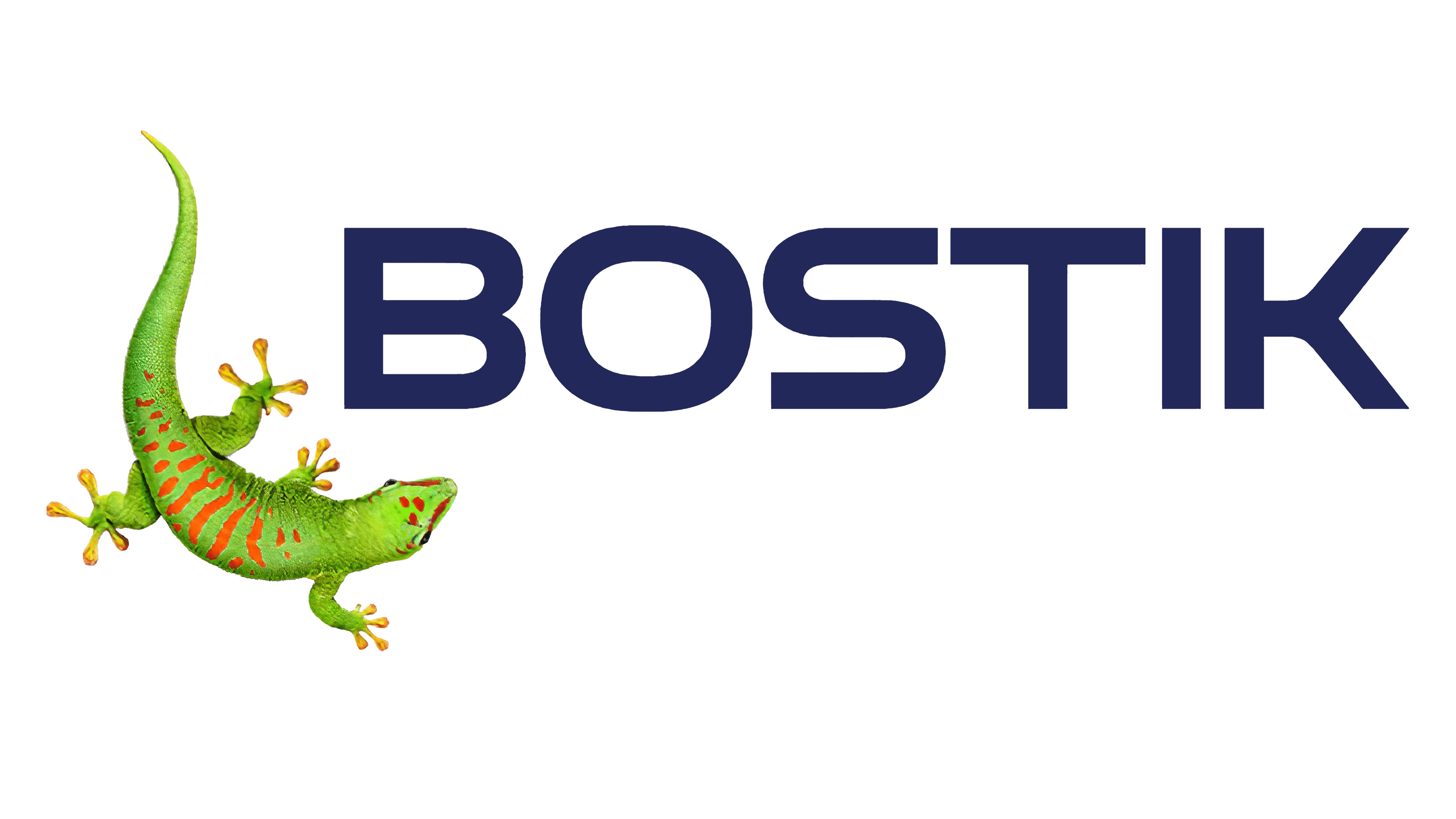
The Bostik logo introduces a vibrant green gecko. The gecko is positioned on the left, adding a dynamic element. The typography is modernized, featuring a thicker, sans-serif font. The letters are dark blue, maintaining brand consistency. The italicized style is removed, opting for a more stable and straightforward appearance. The red swoosh is completely eliminated. This design focuses on simplicity and a fresh, natural look. The gecko symbolizes innovation and adaptability. The overall logo is cleaner, more engaging, and visually appealing. The new design emphasizes both brand heritage and a forward-looking approach.
2021 – Today
The latest Bostik logo maintains the green gecko, but the typography has changed. The font is now a more geometric, sans-serif style, providing a modern and sleek appearance. The letters are dark blue, consistent with previous designs. The overall layout is more balanced and cohesive. The design is minimalist, focusing on brand recognition and simplicity. The changes emphasize clarity and modernity, aligning with the brand’s evolving image.


