Bratz Logo
A new, completely original series of dolls has appeared in 2001. They were produced by a brand named Bratz and immediately stood out against well-known Barbie dolls and very clumsy baby dolls. Bratz dolls looked like real teenage rebels. Dolls invented by Carter Bryant changed the idea of what a doll should look like. Manufactured under the brand name Bratz, these original dolls along with merchandise made it possible for teenagers to see themselves in toys.
Meaning and History
Bratz dolls went on sale in 2001. In just a year, these dolls conquered the doll market around the world and became serious competitors of another toy company that produced Barbie dolls and other toys under this brand. Five years later, Bratz products represented almost half of the girls’ fashion doll market.
What is Bratz?
Bratz is the name of a new series of dolls MGA Entertainment introduced in 2001. The series initially counted only four dolls that looked like teenagers. Features that set Bratz from other products on this market were skinny bodies with relatively large heads and eyes with bright and attractive makeup.
2001 – 2009
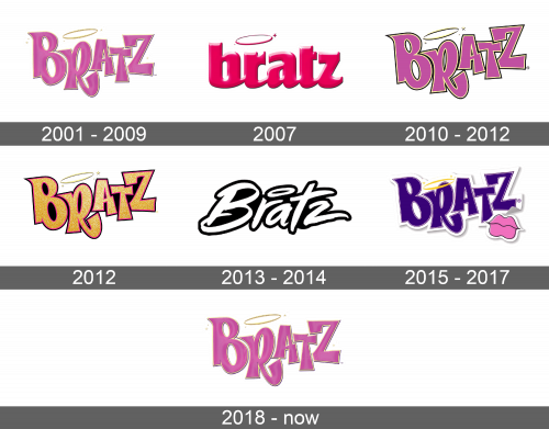
The original Bratz logo had bright pink lettering. The uppercase letters were placed at a different height, slightly overlapping each other in some spots. The letters appeared to have a volume and had a golden and darker pink outline. Golden stars were placed around the letters with a golden halo above the letter “R” finishing the bold logo.
2007
During the year 2007, Bratz introduced a different logo that was featured in a comedy film about the famous line of dolls. The word was written in lowercase cursive letters linked to one another. It was a different shade of bright pink. An appearance of volume was created with black shadow and white light spots. The halo had the same pink color as the letters and only two stars were left next to the opposite sides of the halo. Some products were also manufactured featuring this logo.
2010 – 2012
Bratz slightly adjusted the original brand logo. The font was barely changed and one might not even tell the difference unless the two versions are set side by side. The color gradient has disappeared and the color had more purple shade to it than pink. In addition to the golden outline, the letters acquired a black outer outline. The golden halo also had a black shade. Similarly to the previous logo, there were only three stars drawn close to two opposite ends of the halo.
2012
During the year 2012, the brand gave its logo completely different colors. The sparkling gold letters had a pink and black outline. The black color also filled in the gaps between and inside the letters. The halo remained the same.
2013 – 2014
Bratz changed its logo and slogan in 2013. The logo barely resembled any of the previous versions. The word itself was written in white using a unique font and had a thick black outline. The first letter was capitalized. There were no stars, but the brand kept the halo above the letter “R”.
2015 – 2017
The brand decided to give back its logo some bright color. Instead of pink, the lettering featured dark blue color and had a thin pink outline. The font looked very similar to what Bratz originally had. The golden halo with three stars was lowered right onto the top of the “R”. The word itself was created in the form of a sticker with a white background and had an additional element – a sticker with pink lips outline with black that was positioned slightly covering the bottom of the letter “T”.
2018 – Today
In 2018, the world saw the original logo again. The brand realized that the bright and bold design perfectly represents its dolls and other products and attracts the attention of children and teenagers.
