Buffalo Wild Wings Logo
Buffalo Wild Wings, a chain of sports-themed casual dining establishments, has gained widespread notoriety for its mouth-watering buffalo-style chicken wings. With over 1,300 locations worldwide and a distinctive winged bison emblem, the restaurant has become a go-to destination for sports aficionados and foodies alike. The eatery’s menu also includes burgers, sandwiches, salads, and an assortment of appetizers. Currently, the franchise is under the ownership of Inspire Brands, a holding company with a portfolio of other restaurant chains.
Meaning and history
![]()
Commencing with furnishing light refreshments and ale to fans at sundry contests and games, the founders James Disbrow and Scott Lowry, who chanced upon each other at a non-professional figure skating competition in Kent, Ohio, in 1980, conceived the possibility of establishing a more comfortable environment for observing sports programs and culinary consumption at that juncture. Following two years, their first eatery materialized in Columbus, and one year later, sports fans could savor the proprietors’ signature dish in the Westerville restaurant, quaffing wings with ale while observing sports broadcasts, interacting with acquaintances and coworkers of sports interest, exchanging recollections and viewpoints regarding specific matches.
The chain earned its inaugural designation – Buffalo Wild Wings & Weck – due to the exceptional love and admiration of the owners for the chief sports crew from the identically named town in upstate New York and the primary dish offered to patrons. The corporation leased its primary office in Cincinnati.
The two eateries did not yield considerable earnings, but they enabled a noteworthy surge in popularity among sports enthusiasts. This instigated the originators to mull over starting work on the franchising system. The outcome surpassed all expectations, which necessitated reconsidering the company’s designation.
In 1998, it rebranded as Buffalo Wild Wings Grill & Bar. The novel name entailed crafting a new image. This year, a trademark was established, which was favorably evaluated by nearly all visitors to the establishment.
By 2015, the establishment owned 485 athletic taverns and 585 franchises, which encompassed all American states.
The development of the establishment enabled the inauguration of various new eateries in Canada. Presently, it is an established brand and a prevalent franchise with a web of restaurants in ten countries.
What is Buffalo Wild Wings?
Buffalo Wild Wings, a popular franchise of dining establishments with a sports theme, has earned a reputation for its delicious chicken wings, prepared in the Buffalo style. The restaurant’s iconic emblem features a bison with wings and can be spotted at over 1,300 locations worldwide. A favorite among sports enthusiasts and food connoisseurs alike, the menu offers a variety of delectable options, including burgers, sandwiches, salads, and a range of appetizers. Currently, the franchise is in the hands of Inspire Brands, a holding company with a diverse portfolio of other restaurant chains.
1982 – 1998
![]()
The initial insignia of the enterprise failed to stand out from the crowd. It had a circular configuration and was embossed on drink mats. It portrayed the silhouette of a bison inside a petite black ellipse, with an eye-catching “bw-3” scribed in lowercase, where the three letters corresponded to the brand’s initials, and the digit three paid homage to the three “W”s that constructed the company’s name. Following the margin of the little circle, the complete name was inscribed in capital letters accentuated in a ruby hue on its outer rim, with the words “The Real Wing” scribbled underneath.
1998 – 2012
![]()
Following the company’s name change in 1998, a more striking and iconic logo was introduced, the basic form of which remains unchanged today. A light yellow color now fills the circular area outlined by a black border, with a black buffalo silhouette positioned inside. The buffalo stands confidently on a black plate covering the lower half of the circle, with a white chicken wing featuring black edging extending beyond the circle. The primary name is rendered in white capital letters within the plate, while the “Grill & Bar” inscription is executed in slim capital letters, flanked by two yellow comets on either side.
During the same time, the company initiated market research, delving into visitor opinions and demand to expand its customer base. Social networks, including Facebook, were leveraged for these purposes due to limited budgets. The aim was to generate more interest in the company, thereby driving sales during the off-season from May to July when sports events slow down and patron activity dwindles. This endeavor proved fruitful, revealing that sports aficionados showed nearly equal enthusiasm for sports and BWW’s offerings. In some cases, wings with nineteen sauce options surpassed the level of interest in sporting events. These insights factored into the owners’ decision not to modify the logo.
As a result of such research, the company employed a marketing stratagem by introducing several advantageous discount and bonus offers, markedly increasing their social media presence, generating original topics for discussion, and devising innovative solutions to entice patrons to visit the bar during the summer sports lull. By 2011, sales of wings had doubled from May to July, concurrently with a twofold increase in footfall across all BWW restaurants and franchises.
2012 – 2018
![]()
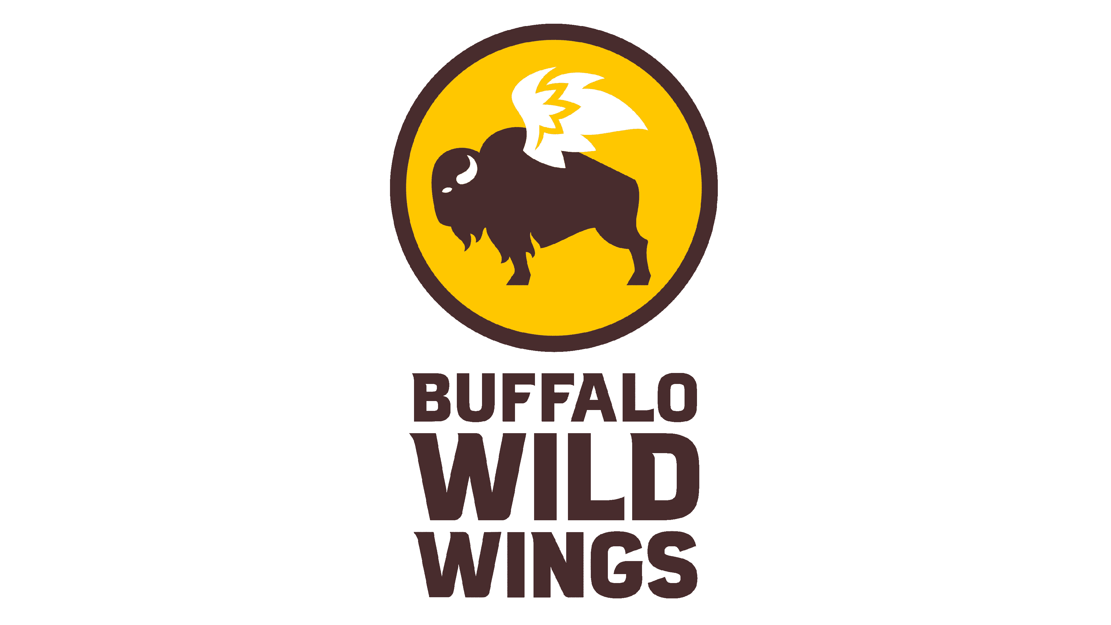
The entrepreneurs’ desire to display the triumph and the new path of their undertaking triggered a transformation of their unique visual symbol. Nonetheless, the founders’ reverence for their company’s image prevented them from undergoing any significant modifications to their emblem over time. Hence, the current design of the logo still features the same fundamental constituents, namely, a circular shape with a buffalo and a wing. However, the buffalo now occupies the entirety of the circle. The black platter has been eliminated. The company name, located on the left of the circle, is the only element preserved from the previous text. The name is written in capital letters, with each word placed beneath the other. The initial word is the smallest, while the second word, “Wild,” is the largest, and “Wings” is slightly smaller than the former.
2018 – today
![]()
The current iteration of the company’s logo bears distinct dissimilarities from its predecessor. The genesis of the updated emblem was sparked by extensive deliberations with seasoned web artisans. The logo’s evolution was prompted more by the exigency to guarantee its resplendent digital legibility. Innovations in modern technology have enabled novel demands for self-promotion, the culmination of which can be currently beheld on the Buffalo Wild Wings logo.
Color
The emblem, while reminiscent of the 2012-2018 version, has undergone noticeable modifications. The brown hue now dominates the image, replacing the previous black. The bison has been repositioned, appearing to be in mid-flight, symbolizing a sense of freedom and adventure. The wings are more subtly integrated into the design, their outlines faded against the light yellow circle field, giving the impression of a natural and organic feel.
Font
The latest typographical style of the script utilized in this brand symbol is situated in an identical sequence and on the equivalent flank as the antecedent emblem. Its application has enhanced comprehensibility and lucidity, predominantly when positioning an illustration online.