Cracker Barrel Old Country Store Logo
American network of restaurants and gift stores with a Southern country feel is called Cracker Barrel. These restaurants have their unique menus, mostly consisting of handmade dishes presented in an old-fashioned setting. There are trinkets to buy, clothes, dinnerware, and, of course, yummy dishes to enjoy right there. Food is supplied to guests based on their own customized recipes. Pancakes, drinks, oatmeal, and branded biscuits are served during breakfast. A variety of meat dishes, side dishes, ham, and chicken are served for lunch. Before you get to the dining space, you must first pass through the store, which reminds visitors of a gift shop with old-time notes. You can buy a variety of items inside, including knick-knacks, country music records, Christmas ornaments, and an impressive collection of candy.
Meaning and history
Dan Evins started the business in 1969. Lebanon, Tennessee, hosted the grand opening of the first shop. Unknown to most people, a sales agent for Shell Oil launched it with the goal of increasing gasoline sales. It became somewhat of a roadside eating establishment in a certain way because many still stand right close to the exit to the major highways. By the 2000s, it has spread throughout the country. For over $35 million, Cracker Barrel purchased the Maple Street Biscuit Company in 2019. At the time, Cracker Barrel possessed more than 650 locations and was serving people in 45 states. The name comes from the soda cracker barrels that were sold in small-town stores in the American South in the early 1900s; people would come together around the barrels to chat and catch up, which is what they can do in Cracker Barrel – “Eat, Shop, and Relax”.
What is Cracker Barrel?
Cracker Barrel is a network of gift shops and restaurants. The menu is focused on Southern food, and the place has a unique design that pays homage to a classic general store. Every restaurant has a porch with a stone fireplace, rocking seats, and artwork to enhance the country feel.
1969 – 1977
It was not right away that the chain had its own unique logo. Initially, it was just “Cracker Barrel Old Country Store” printed in two lines. A light brown color was a typical choice for the banner. What made it somewhat unique was the use of a rather fancy font with bifurcated serifs on the ends as well as serifs midway down the stroke. The font choice surely gave the old-fashioned and traditional feel.
1977 – 2006
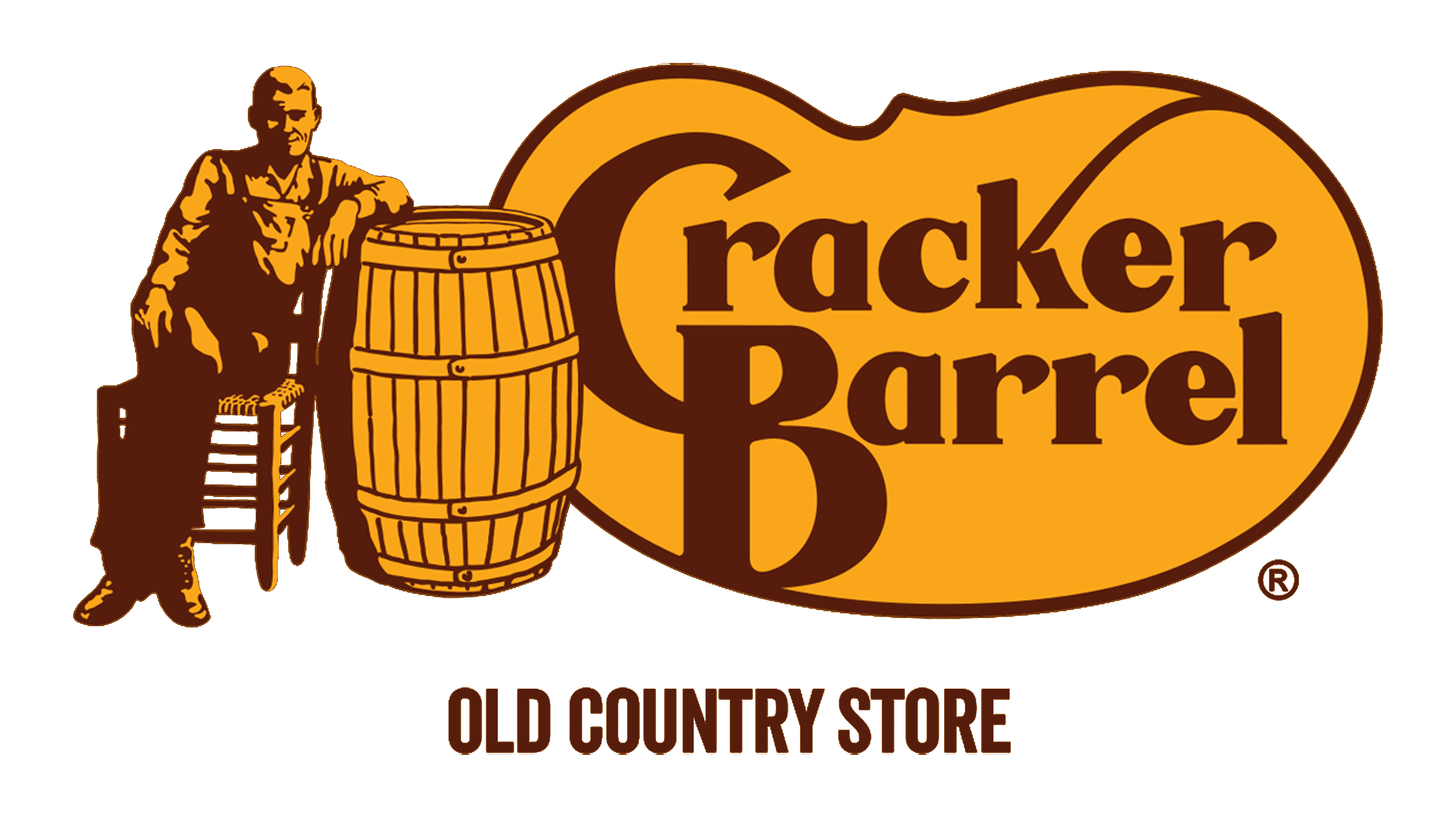
The logo we know today appeared when there were more than ten locations. The most prominent element is the name printed in two lines with the first letters being interlocked. The shape of the base for the inscription resembles a pinto bean while the lines that connected the two letters in the name remind of a lasso used by cowboys. In fact, these curved lines created a lot of controversy. However, the owners claim that there was no object in mind when drawing it. To the left of it, there is a quite realistic drawing of a Southern man in overalls sitting on a wooden chair. His position with crossed legs and arm on a barrel (those country-store barrels actually contained crackers) shows that he is relaxing and ready for a conversation. The whole emblem is done in an orange and brown color palette.
2006 – 2015
The logo of the chain is just as welcoming and symbolic. Actually, the designers simply played with the details of the previous version. They added more contrast and made the barrel look more detailed. In addition, the inscription base now had its own thin outline that went well with the curves of the letters.
2015 – Today
There were a few changes made to the logo. First of all, the inscription was printed using a slightly different font with curved lines being almost gone. It was surely a company’s way to eliminate any tell-tales and controversies about the meaning of its logo. In addition, the male figure does not look the same as he appears to be sitting straighter and taller. Although he did not look as relaxed, it also appeared that the individual was already more rested and ready to meet the new challenges and reach new goals.
Font and Color
The original logo features a fancy bold old-style font with bifurcated serifs on the ends of the strokes as well as down the middle. Later, it was replaced by a custom font without serifs. It featured a high stroke contrast. The interlocking of the first two letters and elegant curved lines made the logo appear fancier. The “Old Country Store” line, though, is printed using a rather simple Helvetica Bold font.
The designers used a muted orange in combination with brown to create the brand image. The first is considered an optimistic and adventurous color with a note of warmth, while the latter gives a feeling of comfort, reliability, and stability.


