Hungry Jack’s Logo
Hungry Jack’s is a fast food franchise in Australia. Jack Cowin founded it. Its creation happened in Perth. The goal was to provide a local variant of the Burger King franchise.
Meaning and history
Hungry Jack’s began its journey in 1971 when founder Jack Cowin negotiated with Burger King to create a franchise. The name “Hungry Jack’s” was adopted due to trademark issues with the “Burger King” name in Australia. Its first store opened in Innaloo, Perth. By 1991, it had expanded widely, necessitating a major branding change that solidified its identity distinct from Burger King. In 2003, a significant legal battle ensued with Burger King Corporation, which Hungry Jack’s won, affirming its position in the Australian market.
What is Hungry Jack’s?
Hungry Jack’s is a prominent Australian fast food chain known for its burgers. It operates as the master franchise of the Burger King Corporation in Australia. The franchise boasts a variety of burgers, desserts, and breakfast items.
1971 – 1995
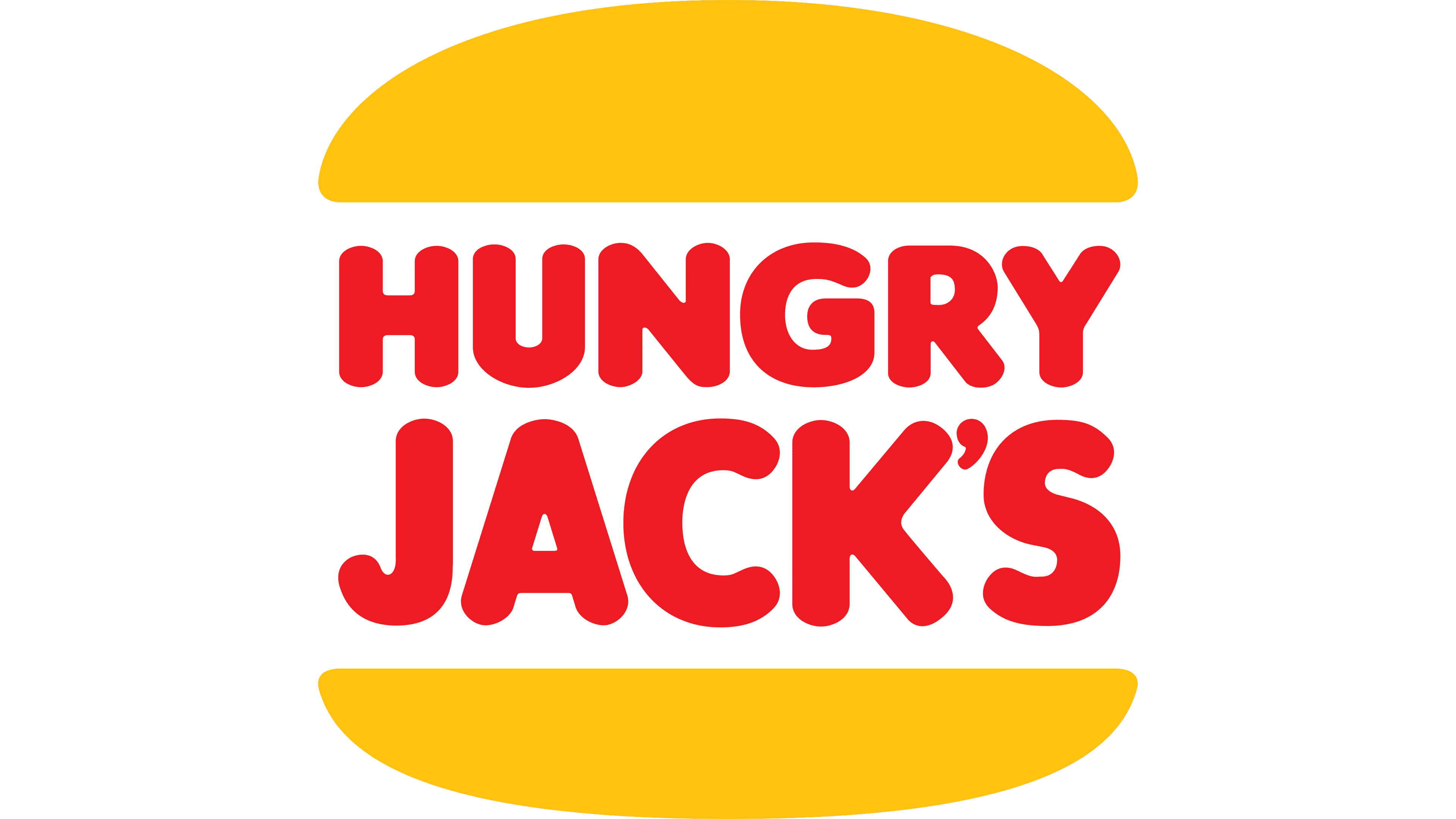
The logo displays the name “Hungry Jack’s” in bold, chunky red letters with a playful character. White outlines enhance the text, creating a pop against a mustard-yellow background. This color choice evokes warmth and appetite stimulation, key for a fast food brand.
1995 – 1997
The logo morphs into an emblem of appetizing simplicity: “Hungry Jack’s” is ensconced in a burger bun silhouette. Bright orange and red hues interplay, igniting a sense of hunger. The text retains its boldness. The overall effect is more cohesive, directly linking the visual to fast food.
1997 – Today
The logo evolves again, now capturing the essence of minimalism. Vibrant yellow hues form a burger bun around the name “Hungry Jack’s”. The font is vivid red, bold, and upright, signaling a fresh and energetic feel. This redesign strips away the previous tilt, opting for a straight, balanced alignment. The trademark symbol is still present, small yet significant. The overall design speaks to a classic fast-food vibe, straightforward and instantly recognizable.
2001
The logo transforms, now encircled by a dynamic blue swoosh that implies motion and zest. Above and below, golden buns glisten, sandwiching the red “Hungry Jack’s” text. This adds a layer of fluidity, suggesting a global reach. Colors are bolder, the font is confident, and the design speaks to a modern, fast-paced world. This visual leap embodies an upbeat, forward-moving brand.


