Capri Sun Logo
Capri Sun is a large German manufacturer of juices and juice-based beverages. Being a vast business, they export their products all over the Europe and even into America. There are many variations of their drinks, and they mostly include the usual ingredients, although there are also wilder flavors.
Meaning and History
Capri Sun first surfaced in 1969. In Germany they are known as ‘Capri Sonne’ – which is the same thing, except in their native language. The emblems are still predominantly in English. What the name refers to is the island of Capri near Italian mainland – an iconic resort for many Europeans.
1969 – 1980
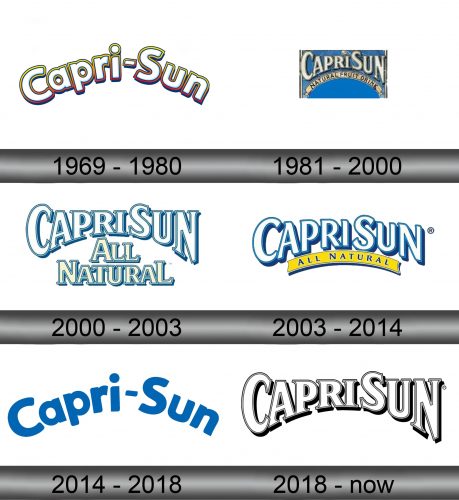
The initial logo featured the company named written as ‘Capri-Sun’ (or ‘Capri-Sonne’ for inner market). It was a mellow, almost cartoonish script. They wrote the whole thing in white and outlined it in a yellow-turning-pink gradient. There is also some curvature coming from below, although here it’s rather too sharp.
1981 – 2000
The 1981 logo was instead a more official. It was a much less fluid serif font, now written without the dash. This time, they curved the lower tips of the letters but left the top ones straight. What’s more, they added a beige ribbon alongside the curvature with the writing that said ‘natural fruit drink’ in black.
2000 – 2003
This look was largely taken from the 1981 logo. The brand name looked the same, except for the coloring. It was now white with blue outline. The ribbon was dispensed with – instead they used the additional writing with the same style. It said ‘all natural’ in two lines.
2003 – 2014
The concept stayed, although they toned down on curvature, gave the main piece more depth, changed the type to a more fluid sans-serif and brought the ribbon back. Although, this time it was yellow with the blue ‘all natural’ inscription over it.
2014 – 2018
This is largely a replica of the very first logo, except it’s now completely blue with nothing else added or changed.
2018 – today
Similarly, they reused the 2003 logo for this once with just a few changes. The depth was scaled back (which meant thinner ‘sides’ on the letters) and changed the slogan to ‘no artificial colors or flavors’ in much the same style.
Emblem and Symbol
The ‘Capri Sonne’ variation of the emblems includes just a few examples. Notably, they made the German version for the first logo that was largely the same, except for that second word. There was also a minor red-colored serif emblem that said ‘Capri Sonne’, and it was meant for labeling inside the country, albeit for a short time.
