Pepsi Logo
Alongside Cola and Fanta, Pepsi is the beverage of choice for virtually the entire world. No matter where you are, there’ll always be a variation of this soda somewhere. It’s not as everywhere as Coke, of course, seeing how the latter dumps a lot of money into careful branding. It doesn’t mean, however, that Pepsi isn’t as interesting in this aspect.
Meaning and History
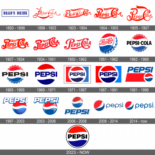
Pepsi was brought to light in 1898, 12 years after Coca-Cola was released, and it was initially called ‘Brad’s Drink’. It didn’t catch on, obviously, which is why they renamed it ‘Pepsi’ – after ‘pepsis’, which means ‘digestion’ in Ancient Greek. It was sold as a remedy for stomach issues at first, hence the name.
1893 – 1898
We have some records of the ancient ‘Brad’s drink’ logos, which were overwhelmingly just long rectangular stamps with the brand’s name of them. They were usually blue and sported the usual typographic font, nothing too special.
1898 – 1903
When the name was changed to ‘Pepsi Cola’, so did the logo. This time they decided to use the red coloring, which was probably derived from the universal medicinal color scheme – red and white. The writing itself was pretty odd – thin, sprawling and uneven.
Some parts looked handwritten, and others resembled cogs and gears. It was the usual look for the logos of that time, after all.
1903 – 1904
The redesign of the Pepsi badge, held in 1903, has introduced an emboldened version of the previous badge, with more distinctive and thick lines, looking elegant and sleek. The red lettering got thickened ribbons at the top and bottom, with the small additional inscriptions in white written over them.
1904 – 1905
In 1904 the lines of the Pepsi logo became thicker and stronger, with the additional white lettering getting larger and more visible. This badge stayed in use by the brand for just a few months but became a basis for several future redesigns, and one of the brightest logo versions of the first Pepsi era.
1905 – 1907
The third logo attempt made the emblem more readable, fortunately. It still retained some previous design choices. For instance, the two first letters of the words were much larger and sprouted several twirls – most notably, on the lower end of the ‘C’ letter, which was carried onto even the 60s.
In general, the letters became thicker and clearer, although they were still positioned oddly and had twirls all over the place. Some were also designed weirdly – for instance, the ‘e’ looked like sigma.
1907 – 1934
The redesign of 1907 was based on the Pepsi logo, created in 1904, but with stronger contours and a more powerful mood. The thick red lines of the letters made up a confident and professional badge, which represented the brand at its best.
1934 – 1951
The same year, they made the letters even thicker. More importantly, they were positioned almost on the same level. There were still some old details from the previous designs. For instance, the top of the ‘C’ letter sprouted some sort of a banner for some reason (there was a word ‘drink’ on it).
1950 – 1962
By 1940, they made it even clearer. The color red became a bit brighter, and they also removed the weird notches and edges of some of the letters. The twirls and waves were still a huge part of the design, though.
1951 – 1962
This was the last we saw of this design. They didn’t change much, but they did put the usual metal bottle cap on the logo, and then they tilted it sideways (to the left) a bit and put the writing emblem right in the middle of it – on the white space between the red on top and blue below.
1962 – 1969
The redesign of 1962 has created a more modern look for the Pepsi cap badge, drawn in a blue, white, and red tricolor palette. The cap got turned straight, with the blue cursive lettering from the previous version, replaced by a black uppercase wordmark, executed in a heavy geometric sans-serif font.
1965 – 1969
For this one, they took the bottle cap again, but made it face the onlooker directly and removed the red writing in favor of the plain black drink name – all in uppercase. They also enlarged the writing, so it suddenly started to dominate the image. They just rotated this new writing across several backgrounds afterwards.
1969 – 1971
The Pepsi badge, created in 1969, has introduced a laconic Pepsi globe version of the logo, with the clean distinctive contours of the tricolor roundels and no additional framing. The wordmark on the cap turned blue, with the typeface a bit changed — the characters got narrower and taller.
1971 – 1987
In the core, it’s the same design. They removed the edges of the cap, so it now looked just like an ordinary circle. Then, the writing became smaller and narrower, as well as dark blue instead of black. Lastly, they put a rectangle behind. The circle and its outline occupied the entire middle, while the left remainder was red, and the right one was blue.
1987 – 1991
They didn’t do much for the 1987 style. The colors weren’t as pale anymore, and the writing in the middle was enlarged slightly, but that’s about it.
1991 – 1996
They continued to use the ‘cap’ emblem, and they do even now. In 1991, the designers made it closer to the contemporary variant, in that the white space became way smaller.
They also put a red trail of sorts to the left of it, which looks like a trapezoid, but the right part of it is concealed by the circle itself. Then, they took the writing element, made it bright blue, tilted it to the right side and here you go.
1997 – 2003
They continued to experiment with the volume, and for this design they took both the circle (which is now a ball with shading and a lot of gradient), as well as writing, which is now tilted (again) and heavily outlined by blue.
The positioning is not set in stone, but the name is usually just on top of the ball and slightly to the left.
2003 – 2006
In 2003, the blue outline on the name became thicker, and the ball basically became cartoony – mostly in the lighting department. It’s still glinting, but that glint is unrealistic and is basically white blobs in key places.
2006 – 2008
They did tone down on cartoonish design in 2006, which meant they made the blobs more hazy and added gradient, and that’s about it. The name also moved to below the ball and got painted blue, and that’s about it.
2008 – 2014
There was a massive overhaul in 2008 that saw several key changes.
The text remained blue, but it was now lowercase, very thin and pretty simplistic (in contrast to the previous blocky and imposing style). They usually put it just to the right of the ball.
The ball itself changed coloring a bit. They tilted the look counterclockwise and made the red part more dominant. In addition, they aren’t symmetric anymore, and the white part grows from left bottom to the top right. That makes it look like a smile a bit, which probably was the intention.
And lastly, all the volume, shading and gradients are gone, which arguably is a massive improvement.
2014 – 2023

In 2014, they made the letters thicker, and that was the only real change.
The redesign of the Pepsi badge, held in 2014, has simplified the graphical part of the logo, removing the double outline of the sleek brand’s globe, and thickening up the lines of the lowercase inscription. The style and color palette of the concept remained untouched.
2023 – Today
This logo is instantly recognizable as it has become a global symbol of a popular beverage brand. It features a circular badge with a tri-color scheme of red, white, and blue, which are typically associated with the American flag, thereby hinting at the brand’s origins. The red cap and the blue base encase a white wave that slices through the center, giving the design a sense of motion and fluidity.
The brand name is centered within this graphic in bold, capitalized letters, creating a clear and impactful presence against the white background. The typeface is modern and sans-serif, with strong geometric shapes that suggest a contemporary and approachable brand personality.
The logo’s simplicity allows for versatility across various mediums, while the bright and contrasting colors are designed to pop out in the marketplace, ensuring high visibility. Overall, the logo conveys a message of youthful energy, refreshment, and American spirit. It has stood the test of time due to its simplicity, recognizability, and the strong emotions and memories it often evokes in consumers worldwide.
Emblem and History
The original choice of colors was red with some white, which is an obvious choice if you’re making a home remedy drink. However, the addition of the blue in the 30-40s was most likely due to patriotic reasons. The blue, however, didn’t really associate with the brand until only the 90s, when they basically privatized the color blue.
