Car Brands That Start With E
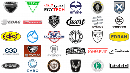
In the realm of automobile manufacturing, the distinction and character of each brand are intricately woven into their emblems. These logos, far more than mere symbols, encapsulate the essence and lineage of the marque they represent. This article turns its lens on the intriguing world of automotive logos that commence with the letter “E,” unearthing the elegance and emblematic significance behind this alphabetical choice.
Embarking on a journey from the historic hallways of the Edsel brand, noted for its unique narrative in the annals of car manufacturing, we traverse to the pioneering paths of Exagon Engineering, lauded for its groundbreaking foray into electric sports car production. Every logo in this series narrates a distinct tale, intertwining the aesthetics of design with the deeper ethos and evolutionary journey of the brands.
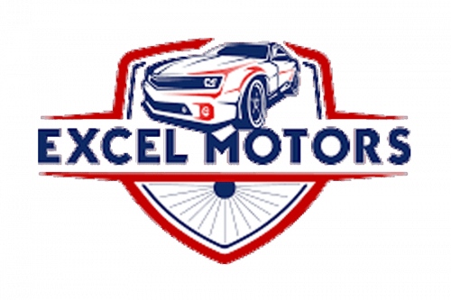
Take, for instance, the emblem of Eterniti Motors, which artfully marries classical motifs with contemporary flair, mirroring the brand’s dedication to custom-crafted luxury and exceptional performance. In contrast, Excel Motors’ emblem exudes an aura of dynamism and vigor, perfectly capturing the quintessence of velocity and potency, which are central to their high-performance vehicles.
The logos of Eucort and Excelsior serve as visual odes to their rich heritage and enduring appeal, marking significant epochs in the chronicles of automotive innovation. Eucort’s gracefully flowing script and Excelsior’s captivating radial design transcend mere visual appeal, symbolizing the lasting impact and legacy of these brands in the automotive sector.
Even lesser-celebrated marques like E-Z-GO, with their minimalist yet impactful design, prove that a logo can effectively distill and communicate a brand’s fundamental principles – in this instance, the virtues of simplicity and dependability.
Each emblem, a unique blend of design and history, adds its thread to the intricate fabric of the automotive universe. These insignias are not just corporate identifiers; they serve as visual anchors, linking us to the narratives, innovations, and aspirations that propel the automobile industry. Delving into the stories behind these logos, we uncover a rich tapestry of artistic vision and strategic purpose, celebrating the emblematic icons of the automotive landscape.
E One
The E One logo represents the pinnacle of technological advancement in fire-fighting equipment. The emblem’s oval shape symbolizes continuity and resilience, essential qualities in emergency response. The metallic silver outline mirrors the sheen of polished fire trucks, while the textured black background evokes the ruggedness of firefighting environments. The “E” in the logo, larger and in a lighter shade of silver, stands for “Emergency,” highlighting the company’s primary focus. The “ONE” in a darker tone emphasizes unity and teamwork, core values in emergency response. The hyphen symbolizes the link between technology and human skill. The logo’s modern, sans-serif typeface conveys a sense of professionalism and efficiency, mirroring the company’s commitment to producing state-of-the-art fire apparatus.
Eagle
Eagle’s logo encapsulates the spirit of innovation and adventure that characterized the brand. The shield shape is not only a symbol of strength but also of heritage, hinting at the long history of automotive excellence under the Chrysler Corporation. The bold, modern font used for “EAGLE” conveys a sense of forward-thinking design, a hallmark of the brand. The abstract eagle’s head, depicted in dynamic lines, represents speed and agility, reflecting the performance characteristics of vehicles like the Eagle Talon. The metallic black and silver gradients give a nod to the sophistication and sleekness of the vehicles. The eagle’s sharp, triangular eye symbolizes the brand’s vision for the future of automotive design, focusing on precision engineering and all-wheel-drive technology.
Ecosse
The Ecosse logo is a blend of traditional elegance and contemporary flair. The shield’s design, inspired by heraldic symbols, conveys a sense of history and prestige. The prominent white “X” against the blue background is a direct homage to the Scottish flag, reflecting the brand’s name and its connection to Scottish heritage. This emblem, combined with the modern graphics, illustrates the fusion of classic craftsmanship with modern motorcycle engineering. The grey metallic outline suggests the strength and endurance of the motorcycles, while the words “ECURIE” and “ECOSSE” encircle the shield in a stately manner, adding to the logo’s distinguished aura. The use of a bold, sans-serif font for the text aligns with the brand’s emphasis on modernity and bespoke design, highlighting Ecosse’s commitment to creating motorcycles that are not just vehicles, but personalized works of art.
Edag
The EDAG logo embodies the company’s commitment to engineering innovation and automotive excellence. The bold, uppercase sans-serif font used for “EDAG” conveys strength and modernity, resonating with the company’s cutting-edge approach to automotive design. The gradient grey color of the letters suggests the precision and sophistication of metalwork, a core aspect of automotive engineering. The stylized symbol to the left, with its five horizontal lines of varying lengths, is an abstract representation of speed and aerodynamics, key elements in car design. This symbol, evoking movement and efficiency, aligns perfectly with EDAG’s focus on developing innovative concepts like the Light Cocoon. The overall simplicity and assertiveness of the design underscore the company’s focus on functionality and forward-thinking solutions, mirroring its ethos of industrial sophistication and innovative spirit.
Edfor
The Edfor logo is a vibrant tribute to the brand’s legacy in the early 20th-century European automotive scene. The elliptical shape with its bright yellow background embodies energy and vivacity, reflecting the brand’s dedication to crafting elegant and exclusive vehicles. The brand name “Edfor,” presented in a bold, stylized, lowercase purple font, suggests fluidity and movement, echoing the smooth lines and luxurious design of Edfor’s vehicles. The ingeniously merged ‘d’ and ‘f’, along with the extended ‘o’ that swirls into an r-like shape, add a touch of artistic flair, symbolizing the brand’s creative approach to car manufacturing. The inclusion of “PORTUGAL” in a simpler, uppercase font below the brand name grounds the logo in its heritage, highlighting the brand’s proud Portuguese origins. The striking contrast of yellow and purple speaks to Edfor’s commitment to innovation and creativity, capturing the essence of a brand that blended luxury with traditional craftsmanship.
Edran
The logo of Edran, a purveyor of hand-built, luxury sports cars, is a testament to the brand’s focus on power and exclusivity. The use of capital letters in a classic, heavy sans-serif font for “EDRAN” projects a sense of boldness and authority, mirroring the impactful design and performance of cars like the Edran Spyder. Set against a bright yellow elliptical background, the name stands out strikingly, with the yellow symbolizing energy, power, and a sense of thrill associated with high-performance sports cars. The thick, dark outline surrounding the ellipse adds a visual weight to the logo, reinforcing the brand’s emphasis on robustness and quality. This combination of yellow and the strong font style is perfectly aligned with a brand known for its distinctive, high-end sports cars, encapsulating Edran’s dedication to blending luxury with unparalleled performance.
Edsel
The Edsel logo, representing a short-lived yet memorable marque of the Ford Motor Company, encapsulates a blend of ambition and cautionary tale in automotive history. The target-like design with concentric circles symbolizes the brand’s initial aim for precision and market targeting. The central green circle, prominently featuring a large white “E,” signifies the brand’s core identity. The white “E” against the green backdrop creates a striking contrast, highlighting the brand name amidst the complexities of its market presence. The varying shades of gray in the concentric circles add depth and dimension, suggesting a multi-faceted approach to design and marketing. This logo design, while simple, carries a historical weight, reflecting the brand’s innovative spirit and its unfortunate timing and reception in the market.
EGA (Emirates Global Aluminium)
The EGA logo, representing one of the UAE’s industrial giants in the non-oil sector, embodies the essence of modernity and global leadership. The stylized “EGA” letters are designed to convey a sense of unity and interconnectedness, reflecting the company’s expansive reach and its role in connecting different markets and industries. The logo’s design elements, with their sleek and professional look, represent the company’s innovative approach to aluminum production and its commitment to maintaining a leading position in the global market. The color scheme and font choice further enhance the logo’s corporate identity, symbolizing EGA’s professional ethos and its pivotal role in the UAE’s industrial landscape.
Egy Tech Engineering
The logo of Egy Tech Engineering, an Egyptian firm known for its engineering prowess, is a vivid representation of the company’s focus on technology and innovation. The bold, capitalized lettering, with “EGY” in black and “TECH” in red, creates a strong visual impact, reflecting the firm’s dynamic and forward-looking approach to engineering solutions. The contrast of black and red not only draws attention but also symbolizes power, energy, and passion, aligning with the company’s dedication to electrical and mechanical engineering excellence. The inclusion of Arabic text above the English inscription adds a layer of cultural identity, emphasizing the company’s roots and its role in the regional engineering sector. The overall design of the logo, with its stark colors and geometric shapes, reinforces the brand’s commitment to cutting-edge technology and innovative solutions.
Elcar
The Elcar logo, hailing from the historic Elkhart Carriage and Motor Car Co., encapsulates a blend of luxury and tradition. The monochromatic black and white color scheme imparts a classic, timeless feel, appropriate for a brand known for its high-quality sedans and coupes. At the heart of the logo, the stylized pegasus atop a ribbon banner symbolizes grace, power, and freedom, qualities reflected in Elcar’s luxury vehicles. The old-style font used for “ELCAR” on the banner adds a touch of elegance and history, resonating with the brand’s early 20th-century roots. The shield, outlined with decorative elements, is reminiscent of vintage car badges, further emphasizing the automotive heritage. This heraldic design, combined with the mythical pegasus, conveys a narrative of legacy and craftsmanship, capturing the essence of a brand that once stood for automotive excellence and innovation.
Elfin
The logo of Elfin Sports Cars, Australia’s distinguished sports car maker, is a dynamic representation of speed and performance. The circular design with a silver rim creates a sense of wholeness and continuity, echoing the brand’s long-standing history in car manufacturing. The bold, uppercase yellow letters of “ELFIN” at the top, contrasted with the smaller “Sports Cars” inscription at the bottom, emphasize the brand’s focus on high-performance vehicles. The central image, an abstract face resembling a warrior’s helmet, symbolizes strength, agility, and the competitive spirit inherent in racing. The helmet’s sharp lines and futuristic design suggest innovation and advanced engineering. The color palette of yellow, black, and silver imparts a modern, professional look, aligning perfectly with Elfin’s reputation for crafting top-tier race and road cars.
Elva
The Elva logo reflects the British car manufacturer’s legacy in producing lightweight, agile sports and racing cars. The bold, green typography within an inverted triangle is both striking and symbolic. The name “ELVA,” presented in thick, modern sans-serif capital letters, dominates the upper section of the triangle, asserting the brand’s strong identity. The inverted triangle shape, a distinctive choice, could represent upward momentum or progress, resonating with the brand’s forward-moving ethos. The green color, vibrant and lively, is often associated with vitality and growth, aligning with Elva’s focus on performance and speed. This logo design, with its unique geometry and bold color, encapsulates the essence of Elva’s commitment to innovation, agility, and the spirit of racing.
ELVO
The ELVO logo, representing the Hellenic Vehicle Industry, is a symbol of technological sophistication and precision. The stylized letter ‘E’ at the center of concentric circles is crafted with thin blue lines, evoking the imagery of a circuit or electronic connections. This design element is indicative of the company’s focus on advanced technology and innovation, particularly in the field of military vehicles and buses. The circular motif suggests continuity and protection, aligning with the brand’s commitment to creating reliable and secure vehicles like the Leonidas armored fighting vehicle. The brand name “EABO,” presented in a clean, sans-serif typeface below the emblem, adds to the modern and high-tech feel of the logo. The use of blue, a color often associated with depth and stability, aptly reflects ELVO’s reputation for dependability and engineering expertise in a demanding sector.
EMF
The EMF Company’s logo is a nostalgic nod to its early 20th-century American automobile manufacturing heritage. The ornate emblem, with its classic feel, features intertwined letters “EMF” set against a white background, symbolizing the company’s focus on craftsmanship and tradition. The circular border, in tones of brown and white, adds a touch of earthiness and simplicity, perhaps reflecting the straightforward yet pioneering spirit of the early automotive industry. The inclusion of the full brand name and location, “MFD. BY THE E-M-F CO. DETROIT MICH., U.S.A.,” encircling the central monogram, reinforces the brand’s historical context and its roots in Detroit, a city synonymous with automobile manufacturing. This logo design, echoing the aesthetic of the early 1900s, conveys a sense of storied history and manufacturing legacy, consistent with EMF’s position in the annals of automotive history.
Emme
The logo of Emme, the Brazilian automobile manufacturer, embodies a blend of modernity and elegance. The navy blue circle enclosing a symmetrical, abstract shape that resembles a ‘V’, represents a harmonious balance between geometric and organic forms. This design could symbolize the innovative and sleek nature of Emme’s cars, like the turbocharged Emme Lotus 422T. The choice of navy blue for the emblem denotes professionalism and reliability, key attributes for a car manufacturer emphasizing advanced technology and performance. The brand name ’emme,’ written in lowercase letters in a minimalist sans-serif font below the emblem, emphasizes the brand’s contemporary and simplistic design philosophy. The overall aesthetic of the logo, with its clean lines and modern color palette, reflects the brand’s dedication to precision, detail, and a forward-thinking approach to automobile design.
Engesa
The Engesa logo, embodying the essence of the Brazilian engineering company known for its military vehicles, features a distinctive and dynamic design. The interlocking ‘E’ and ‘E’ within a circle, crafted with sharp angles and straight lines, convey a sense of modernity and precision, resonating with the company’s innovative approach to vehicle engineering. This monogram, bold and black, stands for strength and efficiency, characteristics vital in the field of military vehicle production. The brand name ‘engesa,’ written in a lowercase, sans-serif typeface below the emblem, complements the emblem’s geometric form, adding a touch of simplicity and modernity. The use of black in the logo symbolizes sophistication and elegance, aligning with Engesa’s reputation for high-quality and advanced engineering in vehicles like the EE-11 Urutu and EE-9 Cascavel.
Enterra Vipre
The Enterra Vipre logo captures the spirit of this rare Canadian sports car with its elegant and fluid design. The cursive, handwritten-style typeface used for ‘Enterra’ embodies fluidity and grace, mirroring the car’s sleek design and the smooth integration of American muscle with Canadian engineering. The exaggerated loops and curves in the script suggest flexibility and elegance, traits that are often sought after in sports car design. The handwritten style, reminiscent of signatures, adds a personal and exclusive touch, implying that each Enterra Vipre car is unique and crafted with individual care. The black strokes on a white background in the logo offer clarity and simplicity, highlighting the brand’s focus on pure design and personal touch.
Enzmann 506
The logo for the Enzmann 506, a Swiss sports car known for its innovative design, is as distinctive as the car itself. The elongated script of “Enzmann” flowing across a red rectangle exudes a retro charm, reflecting the car’s vintage and its era of production from 1956 to 1968. The larger, stylized font for “Enzmann” and the smaller, handwritten style for “506” create a striking contrast, emphasizing the brand’s attention to detail and style. The choice of white text on a red background is bold and eye-catching, symbolizing passion, energy, and the dynamic nature of the automotive field. This logo design, with its retro feel and vivid colors, encapsulates the essence of the Enzmann 506, known for its unique fiberglass body and sleek design.
Equus
The logo of Equus Automotive, an American manufacturer known for its luxury muscle car, the Equus Bass 770, exudes elegance and strength. The figure reminiscent of Pegasus wings within a black rectangular background with rounded edges symbolizes freedom, power, and grace, qualities that are central to the brand’s ethos. The choice of silver for the wings against the black background adds a layer of sophistication and luxury, mirroring the unique blend of classic 1960s design and modern technology that Equus vehicles embody. This color scheme conveys a sense of modernity, luxury, and sophistication, aligning with the brand’s commitment to providing high-end, handcrafted automobiles. The overall design of the logo, with its mythological reference and sleek color palette, encapsulates the essence of Equus Automotive’s dedication to luxury and power in car design.
ErAZ
The logo of ErAZ, once a prominent Armenian vehicle manufacturer, is a symbol of simplicity and strength. The graphic image of mountains enclosed within a circle, using blue lines on a white background, represents durability and resilience, reflecting the brand’s legacy in producing robust vans and minibuses. The circular design suggests unity and completeness, a nod to the brand’s comprehensive approach to vehicle manufacturing. The choice of blue, a color often associated with depth, trust, and stability, resonates with the reliability and widespread use of ErAZ vehicles throughout the Soviet Union. This logo could also symbolize the brand’s connection to its geographic origins or a commitment to sustainability and environmental consciousness, aligning with the ethos of a manufacturer deeply rooted in its community and natural surroundings.
Eshelman
The Eshelman logo, representing the American company known for its small cars, is a vibrant expression of energy and innovation. The bold, red lettering of “ESHELMAN,” contained within two thin red horizontal lines, creates a sense of boundary and focus, emphasizing the brand’s attention to detail and purposeful design. The stylization of the letters, with a mix of sharp angles and smooth curves, gives the logo a dynamic and modern feel, reflecting the simplistic yet innovative design of Eshelman’s microcars. The use of red, a color associated with energy, strength, and passion, mirrors the brand’s spirit in creating unique, compact vehicles. This logo design, with its striking color and geometric form, captures the essence of Eshelman’s dedication to providing distinctive, efficient transportation solutions.
Eterniti Motors
The Eterniti Motors logo, representing the boutique British carmaker, skillfully combines classic and modern elements. The shield-like emblem at its core symbolizes protection and tradition, a nod to the heritage of luxury car manufacturing. The top half of the shield features wing-like elements, which could be interpreted as symbols of speed, agility, and freedom, qualities inherent in the brand’s luxury SUV, the Artemis. These wings may also signify the brand’s aspiration to transcend conventional automotive limits. The bottom half of the shield displays a large, stylized ‘E’, anchoring the emblem with the brand’s initial. The font used for “ETERNITI” above the emblem is clean and contemporary, offering a striking contrast to the more traditional shield imagery. This juxtaposition of the old and the new in the logo design mirrors Eterniti Motors’ commitment to blending bespoke customization options and high-performance capabilities with a sense of timeless luxury.
Etox
The logo for Etox, a Turkish automotive company, encapsulates the brand’s unique approach to sports car design. The description provided seems to mistakenly repeat the Eterniti Motors logo description. For Etox, envisioning a logo that reflects its ethos, one might imagine a sleek and modern emblem that resonates with the unique design of the Etox Zafer. This logo could feature a stylized ‘E’, perhaps intertwined with abstract shapes or lines that convey motion and modern aesthetics, indicative of the brand’s fusion of contemporary design with classic sports car elegance. The color scheme could be bold and distinctive, using colors that emphasize luxury and innovation. The overall design would likely be minimalistic yet striking, capturing the essence of Etox’s commitment to creating visually captivating and performance-oriented vehicles.
Eucort
The Eucort logo is a veritable tapestry of automotive history and artistry. This emblem encapsulates the essence of a bygone era of European car design, presented through an intricate cursive script that winds back upon itself like a ribbon caught in a gentle breeze. The script’s flowing lines are reminiscent of a calligrapher’s masterstroke, bold and confident, rendered in a deep, onyx black that stands out against an alabaster white backdrop. This contrast is not just visual but symbolic, representing the blend of tradition and innovation that Eucort has always embodied. The script is nestled within an elongated oval, a nod to the streamlined aesthetics of the mid-20th century, suggesting a fusion of speed and elegance. This logo is not just a brand identifier but a narrative of Eucort’s storied place in automotive lore, a beacon of bespoke craftsmanship and timeless design.
Everus
The Everus logo is a modernist’s dream, a fusion of geometry and symbolism that speaks to the heart of automotive innovation. It consists of layered metallic silver bands that converge to form an abstract ‘E’, a design that is both enigmatic and revealing. These bands vary in width and depth, creating a mesmerizing three-dimensional effect that seems to pulse with the rhythm of modern technology. This design echoes the brand’s ethos of integrating Honda’s cutting-edge technology with distinct Chinese design elements, a melding of cultures and ideas. Beneath this metallic montage, the brand name “EVERUS” is spelled out in a crisp, sans-serif font, underscoring the logo’s contemporary feel. The silver color palette chosen for the logo is not just aesthetically pleasing but evocative of a future where technology and design coalesce to create automotive marvels for the Chinese market.
Exagon Engineering
The Exagon Motors logo is a heraldic emblem, a shield that stands at the crossroads of tradition and tomorrow. It features stylized letters “E” and “G”, interwoven in a dance of lines and curves that suggest both protection and progress. This shield is a symbolic guardian, representing the safety and reliability inherent in Exagon’s electric vehicles, while also embodying the forward thrust of innovation. Above this emblem, the name “EXAGON” is etched in a typeface that is both stark and elegant, with “MOTORS” discreetly placed below, creating a balanced and modern aesthetic. The logo’s monochrome palette speaks to a world where simplicity and sophistication intersect, echoing Exagon’s mission to harmonize classic car design with cutting-edge electric technology. This logo is not just a brand mark; it’s a testament to Exagon’s commitment to forging new paths in the automotive landscape.
Excalibur Automotive Corporation
The logo of Excalibur Automotive Corporation, known for its luxury retro-styled cars, is a testament to its unique blend of classic and modern automotive artistry. The bold circular emblem, with the brand name “EXCALIBUR” inscribed twice along the circular path, creates a sense of grandeur and continuity. The centered sword, extending the full height of the inner circle, is a powerful symbol of nobility, strength, and a storied heritage, drawing a parallel to the legendary sword of King Arthur. The detailed hilt of the sword adds a regal touch, enhancing the logo’s association with luxury and historical elegance. This imagery, combined with the circular border, captures the essence of Excalibur’s commitment to producing cars that marry classic aesthetics with modern technology, echoing the timeless allure of legendary tales.
Excel Motors
The logo for Excel Motors, known for its performance-oriented vehicles, is a vibrant representation of speed, power, and innovation. The dynamic shield emblem, with its red and blue color scheme, evokes a sense of energy and passion, with the red symbolizing power and the blue representing precision and reliability. At the center, the stylized illustration of a car in red, angled as if in motion, underscores the brand’s focus on high-performance vehicles. The radiant pattern emanating from the bottom point of the shield signifies excellence and forward movement, aligning with Excel Motors’ commitment to pushing the boundaries of automotive design. The bold, capitalized letters of “EXCEL MOTORS” surrounding the illustration reinforce the brand’s strong and assertive identity, making a statement of excellence in the field of performance vehicles.
Excelsior
The Excelsior logo, representing the historic British motorcycle manufacturer, is a testament to the brand’s heritage and visionary approach. The intricate, banner-like emblem with a central eye motif and radiating lines harkens back to traditional woodcut designs, embodying the golden era of British motoring. The eye symbol, often associated with vision and foresight, alongside the sunburst pattern, suggests enlightenment, wisdom, and a broader perspective. This imagery aligns with Excelsior’s reputation for reliability and innovative design in motorcycles and bicycles. The bold, capitalized typeface of “EXCELSIOR” within the banner’s folds adds to the logo’s vintage and classic appeal, resonating with the brand’s deep roots and storied history in the motoring world.
E-Z-GO
The logo for E-Z-GO, a producer of electric and gas-powered golf carts, embodies simplicity, reliability, and efficiency. The bold, rectangular shape with a black and white color scheme conveys clarity and straightforwardness, mirroring the brand’s focus on creating practical and reliable vehicles. The stout, sans-serif typeface used for “EZGO” enhances readability and strength, with the connected “EZ” symbolizing ease of use and simplicity, a direct reference to the brand’s name. The spaced “GO” portion of the logo suggests movement and progress, reflecting the carts’ functionality and utility in various settings like golf courses and resorts. The overall symmetry and the stark contrast between black and white create a visually striking and memorable logo that effectively communicates the brand’s commitment to providing straightforward and reliable service.
