Car logos with stars
In the eyes of the people, stars always indicated something far-reaching, something related to exploration, inspiration, infinity, excellence and wisdom. Humankind tried to reach stars, as it would symbolize the development and advancement of its scientific, technological, political, economic, and public potential. Trying to link their brands to these ideas and concepts, companies made the logotypes, emblems, and badges, depicting stars having different shapes and styles. However, they didn’t always follow these connotations – this article explores several logotypes by larger and smaller companies, which chose stars as their signs.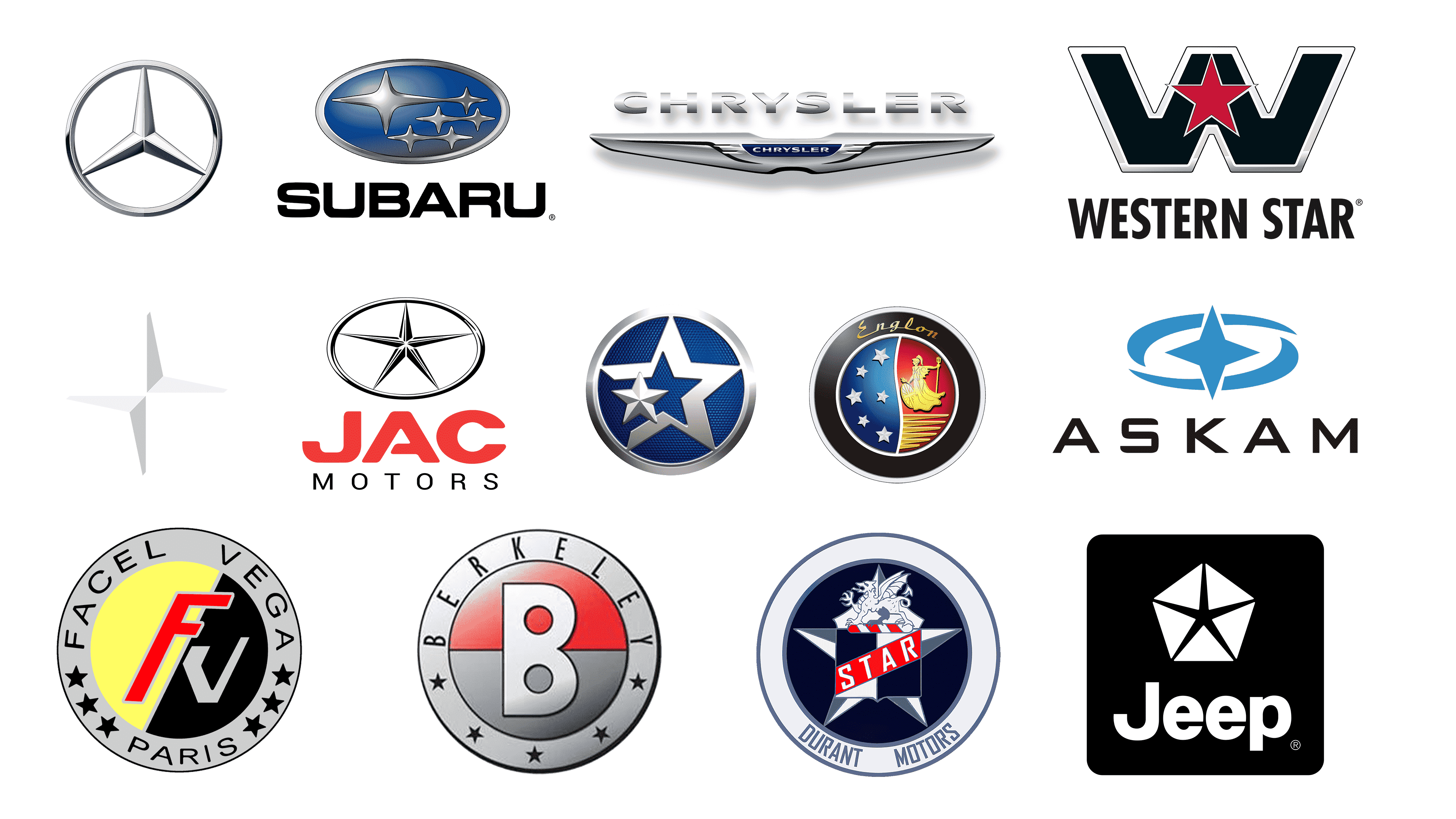
Mercedes-Benz
The iconic badge of the German transnational automobile producer, Mercedes, which is known globally, has a long story and deep significance. Initially, this three-lined star was nothing more than a sign used to point the home of the company owners on the postage card in 1909. Later, it was repainted from blue to silver, incorporated into a laurel wreath and then into a thin circle. By the official explaining on their website, the Mercedes-Benz star badgerepresents sea, sky, and ground – three areas considered to prevail with the company’s high quality motors. It symbolizes the unstoppable motorization of the world’s transportation, began in 1920s with the help of Mercedes-Benz.
Subaru
From Japanese, the ‘subaru’ word translates as ‘unite’. It is also used to describe a group of six stars, known as ‘sisters’, entering the Taurus star assembly. Displaying how the company was established – the merging of five Japanese engineering companies, which united to form an overall Fuji Heavy Industries in 1953, – the company’s brand designers made an iconic oval badge. It shows a constellation of 6 silver stars, structured inside a gradient blue and black oval with a silver frame. Throughout its history, Subaru badge has undergone multiple changes, but the main concept of 5 small stars, representing the funding companies, and one large star, symbolizing their alliance, remained untouched.
Chrysler
Chrysler, or Stellantis North America, refers to such brands which used the star logotype, but then gave preference to a more classic sign of luxury and wealth – silver wings. The ‘Pentastar’ emblem was used between 1962 and 1993, and it depicted a hexagon, split in 5 triangles by a white star put over it. Below it, they wrote the brand’s name in a very bold sans-serif script. Why the ‘Pentastar’? Well, according to the chief designer of this logotype, Robert Stanley, the design team wanted to make a minimalistic, classic, vivid, and stable figure that would be associative with such a delicate and well-spoken product as a Chrysler car.
Western Star
Being an American manufacturer of heavy cargo vehicles with the headquarters in Portland, Oregon, Western Star has a suitable emblem, which, however, didn’t have any drastic changes throughout the company history. Most of the sign is occupied by the wide and bold ‘w’ letter, colored black and having a double white and black outline. Over the character, they drew a red five-ended star, which is contoured white. Below this combination, they usually put the brand name with an angular sans-serif typeface having the capitalized letters spread close to one another. Sometimes, this nameplate can be white, but it depends on the background.
Polestar
Originally founded by Volvo in the middle of the 90s, Polestar is a Swedish brand of electric motors and vehicles. Their name refers to Polstjarnan, which literally means ‘Pole Star’ or ‘Northern Star’ from Swedish. This star always showed the way to the travelers in the Northern Pole. Just as the Northern Star, Polestar Company shows the way in the automobile industry to the people and companies via their high quality products. And the crest fits the name – it shows two equal triangles, both colored one half white, one half gray, and placed oppositely from one another. They shrink to the center, forming a star-like figure.
JAC
Jac, or Jianghuai Automobile Co., is a state-owned Chinese company, producing urban vehicles, such as light cars, commercial cars, trucks, etc. They used a star logotype between before 2016, when the badge was changed to a minimalistic oval with the nameplate. The star insignia featured an oval without any fitting. It contained a five-ended star with long bars, touching the framing. The whole sigil is stylized as a silver shape. Below it, they usually the ‘JAC Motors’ inscription in case if it’s the corporate logotype. It had a capitalized angular typeface without serifs. The ‘a’ character had a small gap, separating the horizontal line from the left bar of the character.
Venucia
Venucia is an electric and petrol automobile marque which appeared in 2010, being founded by Dongfeng Motor Company Limited. Their name derives from the Ancient Greek Goddess Venus, which stood for love, fecundity and other attributes. The Venucia logotype displays a circle with five stars, whereas the largest one is matte white and put at the center. The following four surround it, downsize, and change their colors to blue.The smallest one is located in the right area of the badge, which is highlighted white. What do these stars mean? Well, they symbolize five corporate pillars – concern for consumer, value making, doing the best, products improvement, and dream hunting.
Englon
Englon is a Chinese marque of cars, launched by Geely in 2010. There are many sedans, hatchbacks, and crossover cars badged Englon and released primarily on the Chinese market. One of the most notable cars is TX4 China, a counterpart of a British vehicle, produced in China. The brand name reminds of ‘English’ and ‘London’ words combination. Their logotype can be divided into three areas. The first one is the black ring, contoured silver from the outer and inner sides. At its top, there is the handwritten nameplate, colored golden. In this ring, the area is split between a gradient blue part with 6 metallic stars, and a gradient red zone with a golden girl, located above a wing.
Askam
Founded in 1962 by Chrysler partnering with local companies, Askam is a suspended company manufacturing trucks and trade vehicles in Turkey. They initially released their cars marketing them under Dodge, DeSoto, and Fargo brands, and grew into the largest Turkish business in this sphere, manufacturing cars under their brand. The company sign was the black brand name, written in a semibold typeface with all capital letters wide and angular. To the right, there was a four-ended star put over two circular strokes separated from one another and together forming something like an oval. All elements in this emblem were painted blue.
Facel Vega
Facel Vega Initially specializing in automobile engines, chassis, and other car elements, between 1954 and until its defunct in 1964 Facel Vega sold hand-built extra luxury cars. These cars were marketed using a circular badge with a gray outline, on which the designers put the brand name in a slim capitalized font with wide gaps in between. In this part of the logo, they drew 3 stars to the right part and the other 3 to the left side. Deeper in the crest, there was a yellow and black circle, split in two by a gray diagonal line. At the center, there was the red ‘f’ character. It was capitalized, italicized, and contoured gray. To the right, there was a gray ‘v’ symbol with angular lines.
Berkeley
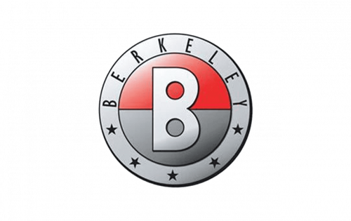
Berkeley was an English car marque, functioning during the second half of the 1950s. They produced mostly sports vehicles, equipped with motorcycle-originating motors and tiny bodies. They were usually performed on the racings and exhibitions. Berkeley products were marketed among limited groups of rich racing car lovers, using a special badge. It depicted a red and gray circle, split in two parts by a horizontal line. Over it, they put the large capitalized ‘b’ letter. The circle was incorporated into a gray frame, featuring the full nameplate and 5 stars, placed at the bottom of the frame.
Durant Motors
Durant Motors The badge with stars was used on the grills of Durant Motors cars at the brand’s beginning period between 1922 and 1928, when the so-called Four Star vehicle was in production. This was a circular crest with a white frame, at the bottom of which was the capitalized brand name. It contained a dark blue fitting with several elements. The uppercase ‘four’ word was in the lower area; a central rectangle was split in several sections: the ‘star’ word on a diagonal stripe serving as the core of the rectangle, and two triangles, both divided in two by the blue and darker blue colors and placed along the two sides of the stripe. This rectangle was located over a large gray and white star, having a dragon at the top and occupying most of the logo space.
Jeep
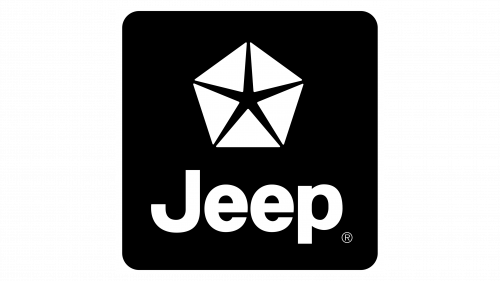
Jeep, an American car manufacturer, is known for its powerful style. Their cars are often associated with US military forces, probably because they started as a manufacturer of out-road light cars during WW2. These cars were marked by a star – the unchanging symbol of the United States, used to define the American vehicles from the foreign ones. Sometimes, they put it in a circular frame, split in several separated fragments. In the 80s, the company also used the Chrysler’s Pentastar as the logotype. Now, it’s hard to find the star on Jeep automobiles, as the company changed the symbol to a simple and laconic nameplate.


