Most Famous Logos With Circles
Circle is often an essential element of the company’s visual identity, along with its design and text captions. Sometimes, companies stylize some other shapes to remind a circle. Moreover, circle-based logotypes are simple and minimalistic, which allows them to be fixed by our eyes and brains much easier than multi-shaped logotypes. This top reveals some of the most famous logotypes with circles on them.
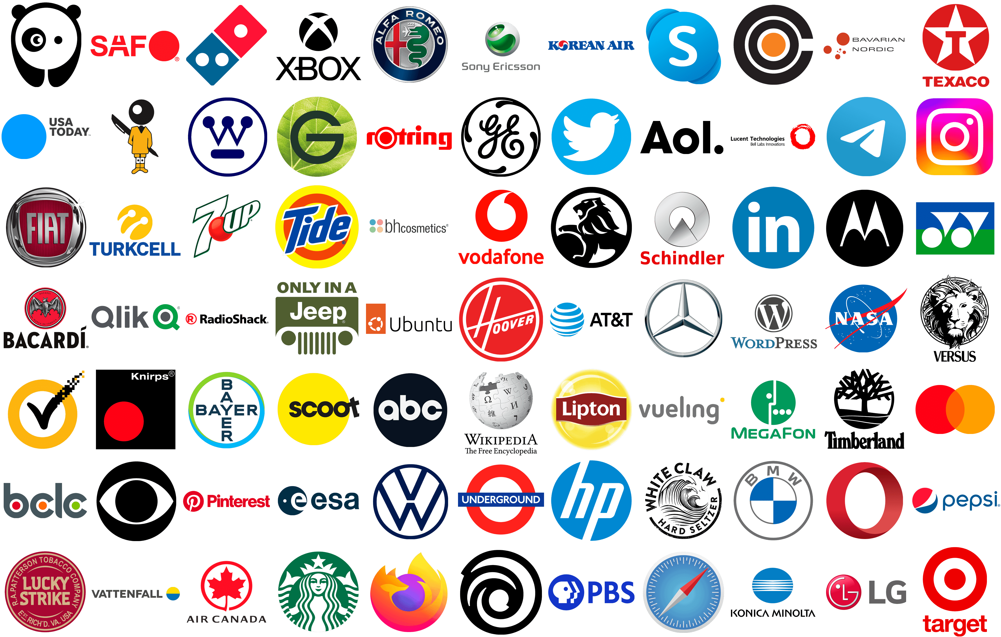
AT&T
![]()
AT&T is a nationwide wireless provider, working with 150 billion clients across the United States. The company is the most considerable internet provider in the US and claims the title of the world leader. Their logotype reflects this concept by showing a blue sphere. It consists of bright blue and white stripes that alternate between each other. To the right of it, there is the brand’s acronym in bold sans-serif letters.
USA Today
![]()
USA Today is the largest newspaper distributor and news telecasting business. Founded in 1982, it has become a prominent newspaper with a daily reader number of 2,6 million across the US, Canada, and Europe. Its logotype depicts a solid blue circle, which stands for balance, stability, and quality – the key attributes of the company’s approach to business. To the right, they wrote the brand name in all caps.
Minolta
![]()
Founded in the 1920s in Japan, Minolta was a prominent photographic equipment producer until its withdrawal from this industry in 2006. Their brand logotype shows a circle with four stripes in the middle. Each of them gets bolder at the center. The circle represents the world and symbolizes the brand’s international recognition, while the lines mean the light rays. Below the emblem, they wrote the name in all slim capitals.
Westinghouse Electric
![]()
Westinghouse is a giant American corporation that specializes in the electric industry. It scores a history since 1886 when George Westinghouse founded the company. Westinghouse is best known for its nuclear power direction – they handle NPPs in the United States and Europe. The concept of their logotype never changed throughout history – it showed a circular frame with the letter ‘w’ inside it. The latter version depicts this letter decorated with small circles at the top tips. The logo may be dark blue or black.
General Electric
![]()
General Electric is an American transnational electrical conglomerate founded in 1892 and based in Boston. Throughout its history, it operated in various industries and markets, including healthcare, digital, finances, aviation, power, and others. The brand mark shows a blue circle with a white inside contour. The outline has four drop-like extensions at the edges. It also has a highly ornamented handwritten letter ‘h’, colored white.
Safari
![]()
Safari is a web browser created by Apple in 2003. It’s available free on IOS-powered devices, Windows, and Android. The browser has worldwide fame due to its convenience, security, and speed. Its logotype is a blue circle that gets darker from the top to the bottom. There are multiple dashes at its edges and a two-pointed index at the center. The pointer is colored one-half red, and one-half white and gray.
Volkswagen
![]()
Volkswagen’s logotype is a monogram depicting the letters ‘v’ and ‘w’, both connected to the upper part of the ring. The concept of the brand’s logotype has never changed throughout over 90 years of the company’s history. Since its start, the logotype showed the two letters ‘v’ and ‘w’ incorporated into a ring. For the last 50 years, the logo’s color palette was brighter or darker blue except for the black version of 2019.
ESA
![]()
ESA is an acronym for European Space Agency – an international organization that unties 22 member states in space exploration. Since its launch in 1975, ESA has organized numerous programs for launching humans into space, creating satellites and service models, and astronautical research. Their corporate logotype shows a dark blue circle with a white dot and a white character ‘e’ inside it. To the right, the brand designers wrote the brand acronym in all lowercase letters.
Alfa Romeo
![]()
Alfa Romeo is an Italian vehicle manufacturer which specializes in luxury cars. Its logotype is a dark blue ring with bright spots at the top and bottom. The brand name shows up at the top in a bit flattened font with tiny serifs at the upper left part of each character (except for ‘o’). The frame is colored silver, as well as the letters and the inside of the logo. There, they drew a red cross and a crowned green snake eating a man.
PBS
![]()
Public Broadcasting Service or PBS is an American media telecaster and a non-commercial TV network. Since its foundation in 1969, PBS has been working as a publically sponsored non-profit organization programming to the station all over the US. Its logotype depicts a deep blue circle with a white human head image on it. A blue dot on it stands for an eye. The head’s front side is repeated in white as in waves. They also write their acronym in large sans-serif letters to the right.
![]()
Twitter is a famous social media developed by an eponymous American company. Its main concept is that users share their news in short messages called tweets. In doing so, they remind the birds to chat with each other in the trees. This concept is shown in the company’s logotype – a very bright blue circle with a white bird on it. It flies somewhere with its beak open.
Skype
![]()
Skype is online video communication software, developed in 2003 by Skype Technologies. Owned by Microsoft now, Skype provides also file transfer and instant massaging tools. Its logotype shows a blue circle with a capital ‘s’ in a sans-serif script with circled tips. In the upper right and lower left parts, there are two semicircles of different shades of blue.
![]()
LinkedIn is a social media platform where professionals and businesses share news and information about themselves. It shows itself as a platform where professional can find their own circle for communication. The media’s latter emblem is as simple as possible. It’s a bright blue round with two simple letters ‘i’ and ‘n’, both executed in a lowercase sans-serif script.
NASA
![]()
NASA is the acronym for the National Aeronautics and Space Administration of the US. It’s a large organization, which represents the interests of America in space exploration and aeronautical research. Their official insignia depicts a dark blue circle with many white dots and stars on it. The white acronym occupies the center. It’s executed in bold white capitals with prominent serifs. There is a white ring coming around the letters ‘a’ and ‘s’, which reminds a rocket’s trajectory. They also drew a red v-shaped wing which represents aeronautics, according to their official website.
Telegram
![]()
Telegram is an internationally considered social media, which settles its users to share photos, videos, and texts in chat groups and channels. It’s best known for its security, convenience, and various unusual features such as circle videos. The platform’s logotype depicts a minimalistic image of a paper airplane, placed on a bright blue circle and pointed somewhere forward.
HP
![]()
Hewlett-Packard, commonly known as HP, is one of the oldest American manufacturers of computers, laptops, printers, and accessories. Its logotype depicts a bright blue circle with the tilted letters ‘p’ and ‘h’, looking like they’re coming out of the area beyond the logotype. The letters have a semibold sans-serif typeface with reduced angles.
Target
![]()
Target is an American network of retail stores working under Target and SuperTarget brands. It’s the six-largest retail chain the United States with 345,000 employees as of 2018. Their logotype looks like a circular sign with a bright red frame, covering a smaller red circle. Below, there’s the name caption in semi-bold capitals without serifs.
SAF-Holland
![]()
SAF-Holland is a manufacturer of parts for trucks and trailers, headquartered in Bessenbach, Germany. Their products include suspension systems, axles, wheels, disc brakes, and others. The logotype of one of key members of the partnership – SAF – depicts a red circle placed to the right of the acronym written in a simple sans-serif typeface. The only feature of the wording is a custom capital letter ‘a’, split in two by a gap. It doesn’t have the upper tip, so the two diagonal bars just go up.
MasterCard
![]()
MasterCard is an American intercontinental financial system, founded in 1966. Launched as an interbank partnership, MasterCard has since become the second-largest payment-operating organization globally. Their logotype depicts two circles, a red one and an orange one. They merge at their edges and form a dark orange zone at the logo center.
Ubuntu
![]()
Ubuntu is a Linux distribution (modification of this OS, composed of free and open-source software). It goes in three versions: Desktop, Server, and Core for IoT devices and robots. Its logotype consists of three circles, each placed at the center of its circular bar. This logo is a schematic image of three people joining their hands to form a company of friends. It reflects the idea of ‘humanity’, on which Ubuntu is based. To the right of the emblem, they often put the nameplate in a refined sans-serif typeface.
Xerox
![]()
Xerox is the world leader in printing and document maintaining equipment creating. They’re best known as the pioneers in full-scale manufacturing of printers and copiers. The company’s logotype represents a pale red ball with a ‘x’-like pattern embedded into it. The sign is drafted of many gradient black and white lines, which intertwine one another. To the left of the ball, there is the brand name executed in all streamlined lowercase letters.
Lucky Strike
![]()
Lucky Strike is a globally recognized brand of sigarettes originating from the United States. The brand was launched in 1869. Since than, Lucky Strike produced the very first marque of chewing tobacco and one of the oldest cigarettes brand in the US. Most of its history, the company used only circular logotypes. The latest one depicts a deep red circle with the brand’s beige name at its center. There is also an inside contour and the ‘R. A. Patterson Tobacco Company Est. Rich’D. V. A. USA’ inscription at the perimeter.
LG
![]()
LG is a Korean multi-targeted conglomerate, located in Seoul. They’re engaged in technological, chemical, energetic, and telecommunications industries. All companies in the group operate under an overall logotype. It shows a dark red circle, decorated by a slim capital character ‘g’, going at the perimeter. It contains an uppercase letter ‘l’, and a white circle. To the right, there is a brand’s dark gray nameplate.
London Underground
![]()
London Underground is an organization to manage the development and sponsorship of the metropolitan in London and some counties of England. It has been using circular logotypes since 1905, changing the style and inscription time to time. The latter version depicts a blue vertical bar with the word ‘underground’ in all caps. The bar stands over a bold red ring.
Lucent Technologies
![]()
Lucent was an American multinational in the field of telecommunications devices. It was active from 1996 until its merger with Alcatel in 2006. Their logotype was known as ‘The Innovation Ring’. It showed a bold red paint spread abruptly in the form of a ring. To tis left, there is the brand nameplate in semi-bold black characters and the inscription ‘Bell Labs Innovations’ below it.
Vodafone
![]()
Vodafone is a British technological company, which specializes in mobile network. Since its foundation in 1984, the company has become a large mobile network supplier, working across the world. Vodafone logo depicts a red circle with a transparent drop inside it. Below the image, they usually write the nsme caption in a lowercase semibold typeface without serifs.
Rotring
![]()
Rotring is a German producer of tools for drawing and writing. Founded as 1926 as a manufacturer of fountain pens in Europe, it has since evolved into a prominent company in thid sphere. Its logotype depicts its red nameplate in a custom typeface. It has bold streamlined letterforms with small angles. The letter ‘o’ looks like a circle placed inside a ring.
Air Canada
![]()
Air Canada is the flagman airline of Canada and the nation’s most considerable one by the number of clients and the fleet. This is also a cargo and packages transporter across Canada and globally. Air Canada’s logotype depicts a maple leaf incorporated in a red ring. The name caption usually goes in a capitalized sans-serif typeface with semi-bold gray or black lines.
Knirps
![]()
Knirps is an Austrian supplier of umbrellas and rainwear. Their products are recognized internationally for their impressive quality, design and convenience. An important element of their umbrellas is a red dot, often placed on buttons. Yet this is a prominent part of their brand identity too. A large black circle usually stands below the company nameplate written in a sans-serif font. The background is always a black square.
Bacardi
![]()
Bacardi is one of the most significant family-controlled liquor-producing businesses. It started in 1869, when Facundo L. Bacardi purchased a distillery in Santiago de Cuba. While settling in the new building, Facundo and his wife found numerous bats, which became an inspiration for the iconic Bacardi bat logos for the years to come. The latter insignia shows a penciled black and white bat, placed on a red circle with a double yellow and black contour. The capitalized word ‘Bacardi’ is placed above, while the ‘marca de fabrica’ inscription stands below. The nameplate in all bold caps usually stands under the emblem.
7up
![]()
7up is a marque of soft drinks based on lime and lemon flavors. The brand is distributed jointly by Dr. Pepper Snapple Group and PepsiCo. Its logotype displays a big white number ‘7’, contoured dark green. Under it, the brand designers wrote the caption ‘since 1929’. A red circle with the tilted word ‘up’ stands to the right of the number, surrounded by numerous yellow, and green circles. Below it, there is also a wording ‘lemon, lime & bubbles’.
RadioShack
![]()
RadioShack is an American e-commerce and retail company, operating since 1921. At its best period of 90s, it managed almost 8,000 stores, distributing electronics in North America, Europe, and Australia. They use a logotype with the bold nameplate without serifs and a red ring with the capital ‘r’ inside it.
![]()
Pinterest is an online network platform that inspires its users to share photos and images. The social network can boast a total audience of 200+ million people from across the world. They were attracted by the platform’s incline to photos and a friendly, engaging design. Its logotype represents the platform’s style by showing a handwritten letter ‘p’ with its lower tip sharpened to remind a pin. The white symbol stands inside a bright red circle.
Hoover
![]()
Hoover is a US-based company selling home appliance products. Their brand name and logotype refer to iconic vacuum cleaners that dominated the market during the 20th century. Their insignia shows a light red circle with a white contour. The stylish brand name is incorporated into this outline. It has a custom letter ‘h’, executed of two tilted bars, crossing the horizontal one. This line covers the rest of the nameplate in an italic bold sans-serif typeface.
Fiat
![]()
Fiat is a legendary vehicle producer from Turin, Italy. During its 120+ years of history, Fiat remained the third-largest car producer in the world. Their products won numerous international awards for their high quality. The Fiat badge shows a red area with some vertical black lines. There is the brand name in metallic gray letters on it. This area has been incorporated into a silver frame.
Texaco
![]()
Texaco is a Chevron-controlled brand of gas with over 2000 points of presence in the United States, Latin America, West Africa, and some parts of Europe. Its logotype is based on a circle with a white star incorporated in it. The star contains the red capital character ‘t’. Under or to the right of the emblem, the brand designers usually put the brand name in all sans-serif capitals.
Opera
![]()
Opera is a web browser released in 1995 by an eponymous company. It distinguishes itself with an intelligent user interface and other useful tools. The website has a custom logotype showing the red letter ‘o’. Its right edge has a gradient darker and brighter red shade, so the mark looks 3D.
Ubisoft
![]()
Ubisoft is a French IT company that specializes in developing and distributing video games. The game franchises Far Cry and Assassin’s Creed have worldwide fame for their style, settings, and gameplay. The company’s 3D emblem depicts numerous curls, limited in a circular form and meeting at the center. The company’s uppercase nameplate stands under the emblem.
Xbox
![]()
Xbox is a video game brand created by Microsoft Corporation. It consists of five game consoles and many game studios and online services. It was first introduced in 2001 during the first Xbox game platform showcase. During most of the brand’s history, its logo showed a 3D ball with an ‘x’-like slot in it. To the right or under it – the nameplate in a capital sans-serif typeface with the letter ‘b’ having a short tail at the center.
CBS
![]()
CBS is an American broadcasting service and radio network headquartered in the United States. It has been highlighting worldwide events since 1926. Its logotype, used for over 70 years, depicts a black circle with a white oval in it. The oval contains a smaller black circle. The whole logotype reminds an open eye, watching straightly toward the viewer.
Jeep
![]()
Jeep is an American marque of crossovers, off-road trucks, and luxury cars, owned by Stellantis. A special feature of the vehicle’s design is a front side composed of wide glass, two circular lights, and a custom radiator grill. A brand’s logo shows these elements on a circle with a thin white contour.
ABC
![]()
ABC is an American telecasting and radio network company, owned by The Walt Disney Company. It manages self-branded news services, talk shows, as well as numerous entertainment franchises. Its logotype is a simple yet stylish black circle with the lowercase acronym on it.
Holden
![]()
Holden was an Australian company, which specialized in creation, import, and export of vehicles. It was founded in the middle of the 19th century, and had since created numerous connections between Australia and carmakers from Europe and America. Its brand logotype depicted an image of a lion raising his paw over a semi-circle. This picture was incorporated into a circular frame.
Motorola
![]()
Motorola is a former transnational producer of mobile devices, internet equipment, and radio systems. In 2011, the 94-year-old company was divided into two smaller Motorola-branded businesses into software development and mobile electronics sectors. Both companies use an emblem picturing a black circle with a white ‘m’ at the center. Its design reminds two triangles with rounded bottoms.
Timberland
![]()
Timberland is New Hampshire-based maker and seller of street footwear. Since its foundation in 1952, it has opened 260+ points of presence while its boots are highly recommended across the world. Its logotype shows the black name caption in a bold typeface with rounded serifs. To the right of the word, the designers put a stylized tree embedded into an unfinished ring.
Garnier
![]()
Garnier is a French bodycare and cosmetics brand controlled by L’Oréal. Its logotype depicts a semi-bold name caption in all dark green capitals. Behind the first three letters, they put a circle with a leaf. It could be interpreted as a gesture of unity between the mankind and nature.
Megafon
![]()
Megafon is a local Russian provider of cellular, internet, and cable network. It uses quite a catchy logotype with a small circle styled as a micro scheme with three white circles in its lower part, bordered from the fourth one by a white partition. The uppercase ‘Megafon’ inscription on the right features semibold letterforms with rounded edges, adding friendliness to the logo.
Qlik
![]()
Qlik is a US-based firm providing software for business data analysis, management, and integration. Its logo consists of three elements – a gray semi-bold lettering ‘qlik’ with the capital ‘q’. It goes with an emblem of a larger bright green capital ‘q’, containing a gray dot. The message is clear: using Qlik’s software, one can easily find the needed information and use it in operational processes.
Bayer
![]()
Bayer is a worldwide recognized German producer of chemical, biotechnological and pharmaceutical products. Started in 1863 by Friedrich Bayer and his partners, the company was once a leader in German and the world’s chemical industry. Its brand mark depicts the name, written twice horizontally and vertically inside a blue and green circle.
Starbucks
![]()
The iconic cafe shop chain’s logotype displays a white seamaid with a crown showing a star. Its long tails stretch at the edges of a dark green circle serving as a background. The long hair, styled as waves, goes down over the lady’s body, as she watches the viewer with a smile.
Lipton
![]()
Lipton is a significant brand of tea, providing a variety of tastes in their product lines since 1890. Lipton is widely recognized for its iconic logotype. It represents a yellow volumetric circle with light spots along the edges. Over it, there was a red plate with he widened center. It shows the white brand name with sharp serifs
Scoot
![]()
Scoot is a lowcost airline company originating in Singapore. Since its foundation in 2011, it has been using a logo with a yellow 3D ball with the brand name on it. All letters have a simple lowercase typeface without serifs. The last letter ‘t’ is tilted and joined with the previous ‘o’. It’s kicked out of the ball and relies on its neighbor. Lately, they refreshed the logotype and made it into a minimalistic black inscription over a solid yellow circle.
Vueling Airlines
![]()
Vueling is a considerable cargo and passenger airline from Spain. It covers most of the Spanish low-cost flights to all the major hub airports in Europe. Its yellow circle depicts the company’s name in a friendly sans-serif typeface with semibold lines. All gray letters here are lowercase and somewhat streamlined. Finally, a small white dot to the right of the nameplate decorates the logo.
Turkcell
![]()
Turkcell is a large mobile phone operator with over 39 million customers mainly in Turkey. Its fully yellow logotype depicts a 3D circular mark with a bright spot at the top. There are two slots in it – one smaller, and one bigger. The slots look like tilted antennas with widened foundations and the tops in circular shapes. The logo always goes without any inscription.
Symantec
![]()
Symantec, now known as Gen Digital, is an American IT company that stands behind iconic computer apps such as Avast, CCleaner, and Norton. Before its rebranding in 2019, it used a distinctive logotype with a yellow ring and checkmark in it. The black mark started as a solid image, but as it closed to the top, it faded away in pixels. This logotype went wordless.
Versus Versace
![]()
Versus is the name of a clothing brand launched by Versace in 1993. Its icon depicts a head of a lion, looking straightly at a viewer. Its mane occupies all space inside a ring. The whole logotype is black and white, whereas black is used to add shadow and contrast.
Wikipedia
![]()
Wikipedia is a way to find information about everything people need today. Its legendary logotype shows a ball without a top. It’s composed of numerous puzzles each containing some cultural symbol. One puzzle piece is missing – there is only its shadow.
Bored Panda
![]()
Bored Panda is an online news portal and media service that highlights art and society. Its logotype is based on a white circle serving as a head of a panda. There are two circular shapes, serving as the panda’s eyes. The left one looks like a black crescent, put inside a larger white circle, which itself stands inside a black one. A black outline forms the panda’s legs, ears, and the rest of its body.
White Claw
![]()
White Claw is an alcoholic drinks label that appeared in 2016. The badge pictures three waves, one bigger than the other. They’re raising in a rippling sea, shown in several horizontally oriented wavy lines. The icon is covered from the top by the brand’s name caption in all sans-serif capitals. Below it, there is the uppercase ‘hard seltzer’ inscription and a semicircle.
Pepsi
![]()
The logotype of the iconic soft drink consists of three areas, limited to a circular shape. This well-known combination of red, white, and blue colors evolved from Pepsi’s desire to show its consideration of American soldiers during World War II. As the years went on and Pepsi changed its logotype, logotype became referred to the international scale of the brand rather than WWII. The red-white & blue image put on the Pepsi bottles’ caps has eventually gotten the nickname ‘Pepsi Globe’.
Domino’s Pizza
![]()
Domino’s Pizza is the world’s leading pizza chain with locations all over the world. Its logotype is composed of several geometric shapes that form a minimalistic and polysemous logotype. It shows two blue and red squares with rounded corners. The blue one depicts two white circles, while the red one carries only one. These squares remind the domino bones which fell on each other.
British Columbia Lottery Corporation (BCLC)
![]()
BCLC is a Canadian crown-possessed company, managing casinos, lotteries, and gambling games across Canada. Their logotype depicts its lowercase acronym in a semibold font. All characters are somewhat rounded, and each of them except for ‘l’ contains a red, orange, and bright green circle.
AOL
![]()
AOL is an internet provider and an online portal, headquartered in the US. It has once been the nation’s leading company in this sector. The current logotype depicts its nameplate in a simple sans-serif typeface with the capital ‘a’. But previously it used a gradient blue and darker blue nameplate, placed to the left of a circle surrounded by three triangles with rounded bottoms.
Bavarian Nordic
![]()
Bavarian Nordic is a biotechnological firm engaged in the development, mass production, and distribution of anti-cancer medicines and vaccines for infectious deceases. Their logo is decorated by eight red circles of different sizes, spread chaotically, like molecules and bacteria. Below is the nameplate in a narrowed typeface with capital characters of a futuristic design.
BH Cosmetics
![]()
BH Decorative Cosmetics is a California-based producer of low-cost and cruelty-free makeup and self-care products, stressed by their style and colorfulness. Launched in 2009, the company targets primarily the young audience. Its logotype depicts its name in all lowercase sans-serif letters. The first ‘b’ and ‘h’ are larger than the others. To the left, they put four pale-colored circles – blue, red, green, and orange.
Le Creuset
![]()
Le Creuset is a French manufacturer of cast iron kitchenware. Their products have worldwide fame not just for their high quality, but also for their catchy design. Their corporate logotype is built upon two main elements – an emblem of the circles and the name, both put inside an oval frame. The mark depicts an orange circle, placed inside a black ring, which itself stands inside another incomplete ring, reminding ‘c’. To the left, there is the name caption in all bold capitals.
Yonex
![]()
Yonex is a Japan-based producer of gear and accessories for tennis, badminton, and golf. The company’s focus on sports products is pictured in its official logotype. At its left edge, two circles, placed under two triangles with rounded bottoms, remind white shuttlecocks. The rest of the logo is given on the nameplate in all uppercase letters. The logo’s background is a rectangle split into two green and blue parts.
![]()
Instagram is an American social media that settles its users to share videos and photos via posts, stories, and reels. Its logotype reflects the platform’s incline to photos by showing a camera, styled in square contours with rounded edges. The square contains a ring at the center and a smaller circle at the upper right corner. All this is placed on a bigger square in a gradient of red, blue, yellow, and pink.
Bic
![]()
Bic is a French international producer of various customer products, from their well-known pens to lighters. The brand’s logo shows a small manikin having a black ball with a white spot instead of a head. Behind this black-yellow & white character, they put a black pen. An inclined yellow parallelogram with rounded edges follows the icon from the right. It shows the nameplate with unproportional lines of bold letterforms.
BMW
![]()
The badge of the legendary car manufacturer displays a gray ring with three letters of the acronym at the top. Centrally inside it, there is a circle with a checkered blue and white pattern. It’s a nod of respect to the Flag of Bavaria, where the company originates.
Firefox
![]()
Firefox is a free Internet browser developed by Mozilla in 2004. It was the most considerable browser by user count in the 2000s, but today it’s the fourth-largest browser with 7.1% of global usage. Its logotype has always depicted a distinctive orange fox surrounding a blue globe. Throughout the brand’s history, its icon became simpler, and now it’s just several red, orange, yellow, and blue & violet lines curling in a circular shape.
Korean Air
![]()
Korean Air is the flag carrier of South Korea and its most significant air company with 164 airplanes. Korean Air’s logotype depicts the company’s importance to the state by showing the country’s national symbol. The letter ‘o’ looks like Gukjang with the addition of a white line at the center. Other characters are designed with an extra bold typeface with bold serifs.
Mercedes Benz
![]()
Mercedes Benz badge displays a three-pointed star with each bar reminding of a 3D triangle. The symbol is incorporated into a slim ring. The logo’s coloring may vary depending on the situation, but generally, it’s black or metallic silver. Their badge traces back to a 3-pointed mark on a postcard, used by the sons of the company’s founder, Gottlieb Daimler, to locate their house.
Schindler Group
![]()
Schindler Group is a Swiss producer of elevators, auto walks, and escalators. Its products are used in various public locations worldwide. The company utilizes an icon with a bold metallic gray ring having a triangular extension at the bottom. Usually, it has the red name caption, executed in a simple sans-serif typeface with the first ‘s’ capitalized.
Sony Ericsson
![]()
Sony Ericsson had once been a partnership between two multinational technological companies, Sony and Ericsson. It specialized in manufacturing smartphones, pads, smartwatches, and sports trackers. Its logotype showed a green glassy ball, put inside a gradient white and gray frame. They usually displayed their brand name in a sans-serif script with small rounded corners of the letters.
Tide
![]()
Tide is an American marque of laundry detergents, manufactured in powder or liquid forms. Its band mark shows a circular symbol that consists of an external yellow ring, an orange ring, and a yellow circle at the center. The brand name is placed over it. It has a bold design with sans-serif italic letters, which have a white contour.
Vattenfall
![]()
Vattenfall is a Swedish state-owned company in the sphere of power production. Its governmental ownership is stressed in the logotype by a circle in the colors of the Swedish flag. To the left, there is the dark gray name in all sans-erif capitals.
WordPress
![]()
WordPress is a free software that allows its users to organize their content in a blog format. It’s basically a website construction system with many templates and plugins. WordPress uses a logotype with a dark gray circle, contoured white. It shows the capital ‘w’ in a typical slim serif script, but its right side looks like a line with a bold top. An uppercase nameplate with sharp serifs follows the emblem. The letters “w” and “p” are slightly enlarged.


