Cars Brands that Start With P
The allure of automotive emblems transcends mere branding, embodying the essence and ethos of the manufacturers they represent. This article delves into the captivating world of car logos that begin with the letter “P,” a letter that, while not as prevalent as some others in the automotive industry, marks the presence of some truly distinctive and influential brands.
Our exploration begins with a dive into the rich histories behind these logos, unraveling how each symbol encapsulates the vision, heritage, and technological prowess of its respective brand. We uncover the evolution of these logos over time, witnessing how they have adapted to changing times while retaining their core identity. This journey through design and history not only highlights the artistic and marketing genius behind these emblems but also offers a deeper understanding of the automotive culture they symbolize.
Furthermore, we analyze the impact of these logos in shaping consumer perceptions and brand loyalty. From sleek and sophisticated designs to bold and emblematic symbols, each logo offers a window into the brand’s personality and market positioning. This article also delves into the often overlooked, yet intriguing, stories behind these logos. These narratives often reflect broader themes in the automotive industry, including innovation, competition, and the relentless pursuit of excellence.
Lastly, we consider the future trajectory of these logos in an industry that is rapidly evolving with advancements in technology and shifts in consumer preferences. As we step into an era of electric vehicles and autonomous driving, these logos may undergo transformations or retain their classic appeal, continuing to be symbols of prestige, quality, and innovation in the automotive world.
Packard
Packard’s emblem stands as a testament to its era of automotive excellence. This American luxury automobile brand, celebrated for pioneering engineering, opulent features, and superior craftsmanship, established foundational standards in the automotive world until its production concluded in the 1950s. The logo radiates aristocratic charm, crowned with a majestic swan in gold, symbolizing the zenith of accomplishment and nobility. At its heart lies a shield, adorned with a magenta and yellow diamond motif, evoking an air of lavishness and singularity, reminiscent of heraldic crests and a rich narrative. The emblem, encased in an ornate double-lined oval with elegant linework, portrays vintage splendor. Set against a bold black backdrop, the logo’s golden and magenta hues are strikingly prominent, embodying Packard’s storied heritage and unwavering commitment to excellence.
Pagani Automobili
In the realm of supercars, Pagani Automobili shines with its meticulous craftsmanship and engineering marvels, crafting limited-edition hypercars like the Zonda and Huayra, where artistry meets technology. Its emblem showcases the name “PAGANI” in prominent, uppercase letters with a contemporary, sans-serif font, exuding robustness and accuracy. Resembling a racetrack, the oval contour of the logo underscores the brand’s racing lineage, while the perforated detailing on the upper and lower arcs alludes to advanced technology and a tribute to automotive aesthetics. The emblem also features “Automobili Modena” in smaller, uppercase letters, grounding the brand’s identity in its Italian heritage and reputation for high-performance engineering.
Pagani Huayra
The Pagani Huayra, a crowning achievement of Pagani Automobili, epitomizes the zenith of Italian craftsmanship and engineering prowess. Known for its unique carbon-titanium build, meticulous detailing, and a powerful Mercedes-AMG V12 engine, it stands as a beacon of automotive art and performance. Its logo bears the name “Huayra” in a stylized, fluid script that conveys motion and swiftness. The typeface, sleek and with a metallic sheen, speaks of refined industrial aesthetics and luxury. The design of each letter, especially the extended “H” and “y”, creates a dynamic, asymmetrical balance, making the logo not only striking but a true representation of the artistic and dynamic spirit of Pagani Huayra.
Pagani
Pagani, the brainchild of Horacio Pagani, has etched a significant place in the automotive landscape with its devotion to artisan craftsmanship, innovative use of materials like carbon fiber, and unparalleled performance showcased in their exclusive hypercars. The Pagani logo is a testament to this ethos, featuring the brand name “PAGANI” in bold, capitalized letters using a straightforward sans-serif font. This text is set within an extended oval, reminiscent of a racetrack, reflecting the brand’s excellence in automotive engineering. The logo’s minimalist design underscores a contemporary and direct branding strategy, prioritizing clarity and impact. The thick, uniform strokes of the letters exude strength and authority, while the evenness of the text mirrors the precision and detail-oriented nature of Pagani’s design and engineering. The enclosing oval, a subtle nod to speed and fluidity, resonates with the brand’s legacy of high-performance vehicles.
Paige
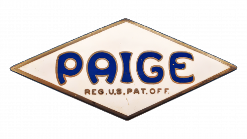
Paige, a significant player in the early 20th-century American automobile scene, produced a variety of vehicles including stylish sedans and roadsters, offering elegance at affordable prices until its merger into the Graham-Paige Motors Corporation. The Paige emblem features striking cobalt blue lettering in an elongated, flowing style, capturing the optimistic spirit and aesthetic of the era. Set against a cream background shaped like a diamond, the emblem communicates a sense of quality and elegance. The addition of “REG. U.S. PAT. OFF.” in a smaller font beneath the main text lends an air of official recognition, embodying a heritage of patented innovation and American creativity in the automotive industry.
Panhard
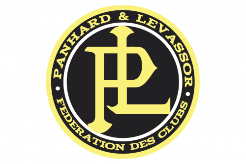
Panhard, a pioneer in the French automobile industry, was known for its innovative contributions like the Panhard rod and a strong engineering-centric approach to car design, until its eventual integration into Citroën in the 1960s. The Panhard emblem is distinct, featuring an interwoven monogram of “PL” in a pronounced serif font, set against a stark black circle, encircled by a gold ring. This typographic choice speaks to the brand’s rich history and tradition. The gold ring encircling the black background is inscribed with the full company name and “FEDERATION DES CLUBS,” highlighting its ties to automotive clubs and a community of car enthusiasts. The contrast between black and gold in the logo eloquently conveys Panhard’s sophistication and longstanding prestige in the automotive world.
Panoz
Panoz, an American marque renowned for its distinct road and racing vehicles like the Esperante and AIV Roadster, is celebrated for melding handcrafted elegance with high performance, marking a unique footprint in the automotive sector. Its emblem is a vivid display of abstract, swirling patterns in shades of blue and red, encircling a green clover set against a silver shield backdrop. This clover is emblematic of fortune, paying homage to the brand’s Irish-American roots, while the swirling designs convey movement and energy. “Panoz” is elegantly scripted across this shield in a fluid, cursive style, adding a personal, artisanal touch. This reflects a dynamic, performance-focused ethos deeply rooted in its heritage. The shield’s form underscores the resilience and safeguarding, resonating with Panoz’s dedication to safety and high performance in their sports cars.
Panther
Panther Car Company, a British automotive icon established in the 1970s, gained acclaim for crafting luxury vehicles with a retro flair, such as the Panther J72, which married classic aesthetics with modern mechanics. Its logo displays the word “PANTHER” sprawled over a stylized panther figure, marrying the imagery of the animal’s power and elegance. Below the text, a mesh pattern symbolizes robustness and intricacy, mirroring the brand’s dedication to sturdy engineering and meticulous design. The wings extending from the text symbolize Panther’s energetic ethos and the exhilarating experience they strive to offer through their vehicles.
Paramount Cars
Paramount Cars, a British manufacturer noted for its lightweight sports cars in the mid-20th century, like the Paramount 1½ Litre, skillfully combined traditional British sports car designs with innovative aluminum bodywork. The Paramount Cars logo features a pair of noble wings surrounding a central shield, signifying freedom and safeguarding. This shield prominently displays a bold “P,” and beneath it, the name “PARAMOUNT” is presented in a classic typeface, indicative of the brand’s pursuit of excellence in its niche. The juxtaposition of sleek, silver wings against the deep blue shield exudes luxury, reflecting the manufacturer’s ambition to fuse elegance with performance.
Paterson
Paterson, although a relatively obscure name in the grand tapestry of the automotive industry, epitomizes a segment that catered to regional or niche demands, highlighting the diverse and multifaceted history of car manufacturing and design. The Paterson emblem is a sophisticated representation of this heritage, featuring a flowing, ornate cursive script set against a deep, midnight blue backdrop, enclosed within a golden ring. The elegant script denotes a brand that valued personalization, class, and meticulous attention to detail. The gold-on-blue motif, reminiscent of a star-studded night sky, symbolizes the brand’s aspirations to reach high milestones in the automotive realm.
Peel
Peel Engineering Company, originating from the Isle of Man, is renowned for creating the Peel P50, the smallest production car in the world, and the Peel Trident, marking a distinctive period in post-war automotive history with a focus on microcars. The Peel logo is a vibrant testament to this legacy, displaying the company name in a lively, cursive script colored in a striking red, indicative of energy and enthusiasm. The font, both playful and assured, mirrors the company’s pioneering spirit in producing the smallest production car, capturing a unique moment in automotive innovation.
Peerless
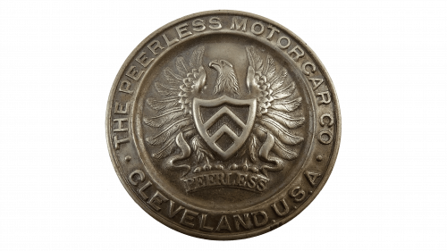
Peerless, a British automobile manufacturer known in the 1950s and 60s, especially for the Peerless GT sports car, distinguished itself through performance and notable appearances in events like the 24 Hours of Le Mans, reflecting Britain’s post-war automotive brilliance. Contrary to this, the Peerless emblem refers to the Peerless Motor Car Corporation, an esteemed American car maker from the early 20th century. This logo, rendered in a metallic finish, exudes a sense of lasting artisanship. At its core lies a shield, guarded by a majestic eagle, emblematic of strength and the freedom of the open road. The raised inscription “THE PEERLESS MOTORCAR CO. CLEVELAND U.S.A.” encircles this central motif, proudly asserting the company’s roots and location. The outer border adds a dignified framing, encapsulating the enduring legacy of this American automotive icon.
Pegaso
Pegaso, a celebrated Spanish manufacturer, is best known for its trucks and buses, and its foray into luxury sports cars, especially with the Z-102, marked Spain’s entry into high-performance automotive engineering. The Pegaso emblem proudly displays the mythical figure of Pegasus within a circular frame, encapsulating the essence of the Spanish brand known for its exclusive sports cars and commercial vehicles. The depiction of Pegasus, poised in mid-leap against a stark background, symbolizes agility and liberty, reflecting the brand’s ambition to excel in both performance and design. The emblem’s black and white palette conveys a sense of timeless sophistication, while the clean and unadorned lines emphasize the brand’s commitment to sleek, aerodynamic designs.
Perana Performance Group
Perana Performance Group, hailing from South Africa, has earned acclaim for its high-performance vehicles, particularly evident in the Z-One sports car, designed in collaboration with Zagato. The emblem of Perana Performance Group, characterized by its focus on high-performance automobiles, showcases two elegant metallic triangles set against a red hexagonal backdrop, echoing the grille of a high-performance sports car. The curved forms of the triangles impart a sense of luxury and velocity, while the hexagonal background symbolizes precision in engineering, mirroring the company’s dedication to excellence in performance and design.
Peterbilt
Peterbilt Motors Company, a subsidiary of PACCAR, stands as an iconic name in American truck manufacturing. Renowned for its heavy-duty and medium-duty trucks, Peterbilt is lauded for its fusion of advanced technology with classic styling, meeting the demanding needs of the freight and construction sectors. The Peterbilt logo features a fluid, assertive script in white, set within a striking red oval, embodying a harmonious blend of tradition and progress. The white border encircling the oval lends a refined, polished appearance, reflecting the brand’s meticulous attention to detail and commitment to quality.
Peugeot
Peugeot, a venerable name in the automotive industry, is among the oldest car manufacturers globally and plays a pivotal role in the European automotive scene. Renowned for a wide array of vehicles characterized by their durability, innovation, and design, Peugeot’s legacy stretches over two centuries. The Peugeot emblem, embodying this historic brand, features a regal lion’s head within a shield, a symbol resonating with strength, agility, and speed. The lion’s depiction, minimalist yet potent, with its mane swept back, suggests movement. The pointed base of the shield is a metaphor for forward momentum, reflecting Peugeot’s longstanding commitment to innovation and endurance in the automotive world.
PGO
PGO, a French automobile manufacturer, is known for its niche in creating small sports cars that blend retro aesthetics with modern technology. These cars cater to enthusiasts who value uniqueness and the joy of driving. The PGO logo is a sleek representation of this philosophy, encapsulating the brand’s initials in a modern, streamlined font within a shield shape. The emblem is adorned with horizontal lines that create an illusion of speed and dynamism. The emblem’s overall simplicity, combined with the sharp contours of the shield, speaks to the cutting-edge technology and sporty elegance that define PGO’s cars.
Piaggio
Piaggio, an Italian manufacturing powerhouse, has earned worldwide acclaim, particularly for its iconic Vespa scooters, which emerged as symbols of stylish and affordable mobility post-World War II. The company continues to be a leader in two-wheeled and lightweight transportation solutions. The Piaggio logo is a crisp, geometric emblem that prominently features a bold “P” to represent the brand’s initial, with the full name “PIAGGIO” displayed below in capital letters, emphasizing the brand’s stature and recognition in the industry. The emblem’s use of two shades of blue, split diagonally, signifies precision, dependability, and the brand’s rich Italian heritage.
Picchio
Picchio, an Italian racing car manufacturer, is celebrated for its expertise in crafting custom sports prototypes and racing cars, exemplifying Italy’s fervor for motorsport and precision engineering. The company has left an indelible mark in various racing circuits with its standout designs and high performance. The Picchio emblem encapsulates this spirit, featuring a stylized “P” intertwined with the colors of the Italian tricolor flag, a nod to the brand’s deep-rooted connection to Italian performance and national pride. The logo’s bold, italicized font and the dynamic orientation of the graphic elements mirror the speed and energy that are central to Picchio’s automotive philosophy.
Pieper
Pieper, a historical Belgian manufacturer, played a significant role in the nascent stages of the automotive industry, producing both cars and firearms. This dual focus reflects the innovative spirit of the late 19th and early 20th centuries, a time of rapid technological advancements. The Pieper emblem is a straightforward yet striking representation, with the company’s name in a sharp, contemporary font. This design choice is a reflection of the company’s pioneering spirit during an era marked by the emergence and growth of the automotive sector.
Pierce Arrow
Pierce Arrow, an American brand from the early 20th century, is remembered for its luxury vehicles, epitomizing prestige and cutting-edge design. Known for its elegant aesthetics and advanced engineering, Pierce Arrow was a beacon of luxury and innovation before ceasing operations in the 1930s. The Pierce Arrow logo is a classic representation of this legacy, featuring a circular badge with an arrow being shot by a kneeling archer. This image conveys a sense of direction and progress, aligning with the company’s forward-looking ethos. The intricate lettering around the perimeter proudly displays the company name, with “Buffalo, New York” inscribed at the bottom, a tribute to the company’s origins and its place in American automotive history.
Pilbeam
Pilbeam, a British entity in the realm of racing car manufacture, is lauded for its high-performance sports prototypes and single-seater race cars, demonstrating an unwavering dedication to engineering superiority and innovation in the competitive motorsports arena. The Pilbeam Racing Designs emblem encapsulates this ethos, featuring a stylized silhouette of a racing car set against a vivid green backdrop. The company’s name appears in a striking, block-like typeface, underlining the brand’s focus on strength and resilience. The grid pattern that accompanies the design is indicative of precision and technical expertise, hallmarks that are quintessential to the motorsport industry and Pilbeam’s legacy within it.
Pininfarina
Pininfarina, an esteemed Italian car design firm and coachbuilder, has earned global acclaim for its visually stunning and groundbreaking automobile designs, working in collaboration with major car manufacturers to produce some of the most iconic and luxurious vehicles in history. The Pininfarina logo is a testament to this distinguished heritage, featuring an elegant script ‘f’ set within a rectangular frame, crowned at the top. This design element signifies the firm’s regal standard in design excellence. Below the emblem, the full name of the company is inscribed in a sleek, elongated font, embodying the notions of elegance and velocity, which are central to the Pininfarina design ethos.
Piontek Engineering
Piontek Engineering, though not widely recognized in mainstream circles, has contributed significantly to automotive and mechanical engineering, exemplifying the innovation and technical skill that can be found in smaller, specialized engineering firms. The Piontek Engineering insignia is a testament to this, featuring a shield-shaped design that harkens back to symbols of heraldry and resilience. The emblem is rendered in a duo-tone color scheme of black and silver grey, striking a balance between modernity and timelessness. The name “PIONTEK” is boldly presented, with a pronounced “P” overlaying a stylized “E,” symbolizing technical accuracy and engineering expertise. “ENGINEERING” runs along the emblem’s vertical axis, clearly defining the firm’s area of specialization. The typography used is distinctly modern, conveying the company’s contemporary and progressive approach.
Playboy
Playboy, while primarily known for its magazine, also represents a unique chapter in automotive history with its Playboy automobile – a stylish post-war convertible that epitomized the era’s optimism. However, its production was brief, making it a notable yet rare mention in car history. The Playboy logo captures this essence, featuring a vivid red background surrounded by a grey border. The name “PLAYBOY,” prominent in white block letters, takes center stage, with “MOTOR CAR CO.” beneath it, indicating its automotive connection. “Buffalo, N.Y.,” mentioned at the bottom, grounds the logo in its geographical roots. The incorporation of a top hat and cane graphic intersects the brand name, symbolizing the sophistication and luxury that are often associated with classic automobiles.
Plymouth
Plymouth, once a division of Chrysler, carved its niche in American automotive history with affordably stylish vehicles like the Barracuda and Road Runner, before its discontinuation in 2001. The Plymouth emblem is a study in monochromatic sophistication, employing a stark black and white color scheme. The brand name “PLYMOUTH” is elegantly arched at the top, enclosed within a sleek circular border. At the center, a stylized sailing ship, reflecting the brand’s historical namesake, is depicted with minimalist artistry, sailing through waves that cleverly double as the vessel’s hull. A registered trademark symbol is prominently placed, affirming the logo’s proprietary status.
Polaris
Polaris, a prominent American manufacturer, is celebrated for its trailblazing snowmobiles, ATVs, and motorcycles, greatly influencing the off-road and recreational vehicle sectors with its focus on performance and dependability. The Polaris emblem is an ode to the celestial, featuring a vivid blue oval that evokes the expansiveness of the sky or the ocean’s depths. Central to the design is a complex, multi-pointed star, which could be interpreted as a compass rose or a snowflake, emblematic of exploration and meticulousness. Below this, the brand name “POLARIS” is boldly showcased, complemented by a matching star, underscoring the brand’s identity and ethos.
Polarsun Automobile
Polarsun Automobile, headquartered in China, diversifies its portfolio with vehicles including MPVs, SUVs, and trucks, mirroring China’s dynamic expansion in the automotive sector and its commitment to fulfilling varied consumer demands both locally and internationally. The Polarsun Automobile logo exudes a nautical elegance, dominated by a striking blue shade reminiscent of both the sea and sky. At its center is a sophisticated, interlocking design. “POLARSUN AUTOMOBILE” is neatly inscribed beneath in a contemporary yet understated font, allowing the emblem above to be the focal point.
Polestar
Polestar, originally an offshoot of Volvo focusing on performance, has transformed into an independent electric vehicle manufacturer, earning accolades for its eco-friendly, high-performance EVs like the Polestar 1 and 2, which merge Scandinavian design sophistication with advanced technology. The Polestar logo is a leap into geometric modernism, comprising four uneven triangles that converge to create a dynamic, star-like formation. This minimalist and sharp design, with its gradient of black hues, suggests a fusion of technology and innovation, emblematic of forward-thinking and versatility. Its simplicity lends itself to various interpretations, from a symbol of a high-tech enterprise to a hallmark of luxury.
Pontiac
Pontiac, a historic division of General Motors, left an indelible mark on American car culture with performance-centric vehicles like the GTO and Firebird, until its cessation in 2010. The Pontiac logo within this series is a sleek representation of another automotive brand. A downward-pointing black inverted triangle conveys a sense of progress and potency. At its center, a lone, luminous star represents excellence and guidance. Below, the brand name “PONTIAC” is displayed in a straightforward yet striking typeface, accompanied by a registered trademark symbol, asserting its distinctive identity.
Porsche
Porsche, a celebrated German automotive manufacturer, is renowned for its high-performance sports cars, SUVs, and sedans, epitomizing luxury, power, and cutting-edge engineering. The brand is a symbol of prestige in the automotive world, with iconic models like the 911. The Porsche emblem features the prestigious badge of a luxury sports car brand, shaped like a coat of arms and divided into four quadrants. The upper section presents the brand’s name in bold, sans-serif letters against a golden backdrop. Central to the emblem is a rearing horse, a symbol of strength and agility, positioned against a gold field. The middle band of the shield bears the name “STUTTGART,” a proud reference to the brand’s origins and storied history.
Portado
Portado, while not a widely recognized name in the global automotive sphere, holds a distinctive place in its specific market segment, offering specialized vehicles or services tailored to a niche audience. This diversity reflects the wide-ranging and eclectic nature of the automotive industry. The Portado logo features a stylized figurehead, reminiscent of ancient maritime symbols. This figure, representing a navigator, is set against the bow of a ship, capturing the essence of exploration and adventure. The bold, angular lines of the design convey movement and discovery, while the name “PORARO” is displayed below in a contemporary font, creating a juxtaposition between traditional imagery and modern design, symbolizing a bridge between past and present.
Praga
Praga, a storied Czech manufacturer with a varied legacy in producing cars, trucks, and airplanes, has recently reinvigorated its presence in the racing world. This revival marks a remarkable transition from its early 20th-century beginnings to contemporary motorsports. The Praga logo is elegantly scripted in a stylish, cursive font, colored in deep navy blue. The flowing script exudes casual elegance, underscored to highlight its significance. The underline adds a sense of grounding and stability, mirroring the brand’s solid reputation and enduring legacy. This emblem represents a harmonious blend of traditional values and modern flair, reflecting a brand that honors its past while embracing the future.
PRB
PRB, an Australian kit car manufacturer, is celebrated for its high-performance, lightweight vehicles, inspired by the Lotus Seven. It has cultivated a dedicated following among driving enthusiasts for its emphasis on pure driving experience and mechanical simplicity. The PRB logo features a circular crest encapsulating a vibrant scene. At the top, the letters “PRB” denote the brand’s initials. Central to the emblem is a dynamic yellow sports car, depicted in profile within the circle, symbolizing speed and agility. Encircled by a silver-grey border, the word “AUSTRALIA” is prominently displayed at the bottom, anchoring the brand to its national roots.
Premier Motor
Premier Motor, a significant player in the Indian automotive industry, has transitioned from manufacturing licensed Fiat vehicles to offering a broad spectrum of cars and utility vehicles, mirroring the dynamic nature of India’s automotive landscape. The Premier Motor logo represents this evolution through its design, focusing on typography rather than imagery. The word “Premier” is artfully rendered in a flowing, cursive font, evoking a sense of elegance and high-end branding. The sweeping curves and elongated tails of the letters suggest a blend of tradition and refinement, resonating with a luxury brand known for its heritage and commitment to quality craftsmanship.
Premier
Premier, as a distinct automotive manufacturer, showcases its versatility and resilience in a competitive market through a history of producing various vehicles. The logo for “Premier” is a refined representation, featuring an elegant elliptical design. Within this ellipse is a stylized “P” that unfurls like a ribbon, embodying fluidity and grace. The use of a deep blue color in the logo conveys a sense of professionalism and dependability. Beneath this emblem, the brand’s name is spelled out in bold capital letters, asserting the brand’s strong presence and authority in the industry.
Prince Motors Company
Prince Motors Company, a revered name in the Japanese automotive industry, is known for its luxury vehicles and groundbreaking technology, including the iconic Skyline model, before its merger with Nissan in 1966. The Prince Motors Company logo is a striking, stylized depiction of a shield, utilizing red and white colors, with an abstract “P” prominently featured, resembling a downward-pointing arrowhead. This dynamic design element signifies forward momentum and a commitment to innovation. The use of red in the logo is eye-catching, representing energy and passion, while the shield form symbolizes protection and strength, aligning with the brand’s ethos.
Prodrive
Prodrive, a British motorsport and advanced engineering group, has established a formidable reputation in rally and endurance racing, contributing to the success of various teams in the World Rally Championships and Le Mans. Additionally, Prodrive is involved in sophisticated automotive engineering projects beyond racing. The “Prodrive” logo is a testament to this legacy, featuring a simple, modern sans-serif typeface. The brand name is rendered in a classic black, communicating a sense of seriousness and sophistication. Below the text, a blue horizontal line adds a dynamic flair, possibly reflective of Prodrive’s dedication to precision and excellence in both the racing and engineering arenas.
Proto Motors
Proto Motors, a South Korean sports car manufacturer, has made its mark with limited production high-performance vehicles and concept cars, reflecting the country’s growing prowess in automotive design and engineering on a global scale. The Proto Motors logo creatively embodies this spirit. “PROTO MOTORS” is spelled out in a casual, sans-serif font, but with an innovative twist: the “O” in both “PROTO” and “MOTORS” is replaced by an abstract design that suggests a road stretching into the horizon or perhaps a stylized automotive component. This design choice is a nod to the brand’s inventive approach to car design and manufacturing.
Proton
Proton, initially Malaysia’s national car project, has evolved into a significant Southeast Asian automaker. It is known for its range of affordable and reliable vehicles and has played a vital role in Malaysia’s industrial development. The Proton logo features a fierce, stylized tiger’s head within an oval, a symbol of power and agility. The use of silver gradients imparts a metallic, contemporary appearance, reflecting technological progress. Beneath this, the word “PROTON” in capital letters portrays a solid, dependable brand image.
Puch
Puch, an Austrian company with a rich history in manufacturing motorcycles, bicycles, mopeds, and automobiles, is celebrated for its transportation innovation and cherished for its vintage models by enthusiasts worldwide. The Puch logo is a model of simplicity and effectiveness, featuring a black and green quartered shield with a prominent border. Within this shield, the name “PUCH” is inscribed in white against the black background, creating a striking contrast. The green segments add a touch of vitality and might also reference the brand’s Austrian roots, echoing the green found in the national flag.
Puma
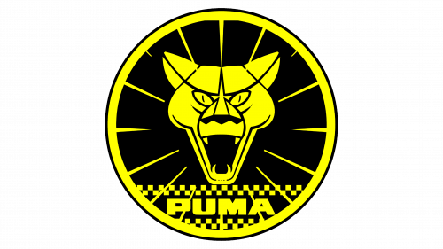
Puma, a major German multinational corporation, is renowned for its high-quality athletic footwear, sportswear, and accessories. It stands as one of the world’s leading sport lifestyle companies and has a rich history of supporting outstanding athletes and sports teams. The Puma logo is a bold depiction of a puma’s face, rendered in an eye-catching yellow and black color scheme. The depiction of the puma is fierce and authoritative, symbolizing strength, speed, and agility. Enclosed within a circle, radiating lines emanate from the puma’s head, creating a dynamic and intense visual effect. Below this figure, the brand name “PUMA” is incorporated into a design reminiscent of a racing track, reinforcing the connection with speed and automotive excellence.
Pyeonghwa Motors
Pyeonghwa Motors, the sole automaker in North Korea with connections to South Korea, focuses on a limited range of cars and commercial vehicles. This unique position reflects the distinct economic and political environment of North Korea. The Pyeonghwa Motors logo is a bold, shield-shaped emblem, featuring a strong color palette of royal blue and black. Central to the design are two stylized white doves with outstretched wings, symbolizing peace. This imagery is both a literal and figurative interpretation of the brand’s name, which connotes harmony and tranquility, aligning with the company’s distinctive presence in the automotive sector.
Python
Python, in a different context, is a highly regarded, interpreted programming language known for its straightforward syntax and ease of readability. It is extensively utilized across various domains, including web development, data analysis, artificial intelligence, and scientific computing, making it a valuable tool for programmers at all levels of expertise. The Python logo utilizes a minimalist and contrasting design. It features a sleek, upward-pointing angular shield, symbolizing progress and advancement. Accompanying this is the brand’s name in a unique, futuristic typeface, echoing the modernity and precision of the shield, and reflecting the language’s cutting-edge applications and appeal in the realm of programming and technology.
