Plymouth Logo
Plymouth is a vehicle brand of Chrysler Corporation and its successor DaimlerChrysler. Plymouth’s original purpose was to serve the lower end of the booming market when people could not afford much. The division greatly helped in ensuring Chrysler Corporation’s survival when many other car brands failed. The most recognized models in the Plymouth lineup are the muscle cars, legendary supercars with high performance.
Meaning and History
The first Plymouth auto was produced in 1928 and turned out to be a profitable part of the Chrysler concern. Thanks to high quality and other advantages over competitors, Plymouth took third place after Chevrolet and Ford by 1940. In the 1960s, the boom for muscle cars began. In 2001, DaimlerChrysler abandoned the Plymouth brand, since all Plymouth products duplicated other models of Chrysler Corporation and sales were down. The name was proposed by the manager Joseph W. Frazer. He hoped it would remind people of a Massachusetts landmark – Plymouth Rock, on which the first pilgrim stepped off the ship.
What is Plymouth?
Plymouth is a renowned American car brand. It was founded by prominent carmaker Walter Chrysler in the 1920s. Initially, the concern released a whole range of inexpensive Chrysler cars, but then it got known for its muscle cars.
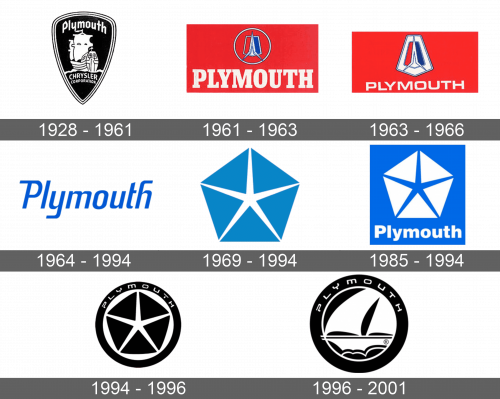
1928 – 1961
A triangular shield of black color with several black and white thin lines served as the base for the logo. The Mayflower ship decorated the emblem. At the top, it stated the new brand name – Plymouth. At the bottom, it specified the name of the parent company.
1961 – 1963
The new brand image looked very different and bold. A red and blue pentagon featured a white rocket. This emblem was framed by a thin white circle and placed on a red rectangle with the brand name underneath. The name was done in bold serif letters of white color. It was meant to reflect the confident place the brand had on the market and its great potential.
1963 – 1966
The modifications put more accent on the pentagon emblem. There was no more circle and the pentagon was significantly larger than before. A white pentagon with smaller red and blue pentagon featured a white rocket, which fit inside the pentagon shape.
1964 – 1994
This version was extremely minimalistic and stated “Plymouth”. The font was blue, sans-serif, and italicized. The letters had smooth, curved lines.
1969 – 1994
A blue pentagon shape with a star inside were now representing Plymouth. The star was white and had thin spikes that reached respective angles of the shape. This emblem became an iconic image of Plymouth.
1985 – 1994
The previous emblem was placed on a blue square. It was a different shade of blue, much brighter. The colors of the pentagon and the star were inverted. At the bottom of the square, there was a brand name written in white, bold letters.
1994 – 1996
The pentagon and star emblem were now set on a round base. The logo had a black border that had the brand name written across the top of it. The latter was white and featured a unique, sans-serif font. It looked very stylish and professional.
1996 – 2001
The recognizable pentagon was replaced by a drawing of a Mayflower ship. It was coming back of the original brand image.
Font and Color
There are several colors used by the brand for its logos. The original and the latest logos feature a black-and-white palette. There was a short period when the company used red as a key color choice. The blue and white color palette stayed with the company for thirty years, standing for the reliability of these cars. For most logos, the brand used custom, sans-serif fonts.

