Peugeot Logo
Peugeot, a prominent automobile manufacturer with a rich history dating back to 1810, is now part of Stellantis – a global automotive group formed in 2021 through the merger of PSA Group and Fiat Chrysler Automobiles. With a diverse range of vehicles, from cars to vans, Peugeot maintains a strong presence in Europe, Latin America, Africa, and Asia. The brand is committed to innovation, actively exploring electric and hybrid technologies to reduce emissions and meet the evolving demands of the automotive market. Stellantis, the parent company, is a multinational entity with a varied portfolio of well-established automotive brands.
Meaning and history
Initially, the company started as a manufacturer of coffee mills and bicycles. It wasn’t until 1889 that Peugeot ventured into the automotive industry with the introduction of its first car, a steam-powered tricycle.
Over the years, Peugeot expanded its lineup, becoming renowned for its innovative designs and engineering. The early 20th century marked significant growth, with Peugeot producing various vehicles, from cars and vans to trucks and motorcycles.
Post-World War II, Peugeot made a significant impact with models like the 203 and 404, which were praised for their reliability and performance. The 1960s and 70s saw further expansion, with the introduction of popular models such as the 504.
The 1980s marked a pivotal point in Peugeot’s history, with the acquisition of Citroën in 1976, forming PSA Group. This was followed by the acquisition of Chrysler Europe in 1978, which expanded the company’s reach and portfolio.
However, the late 20th and early 21st centuries posed challenges for Peugeot, with financial struggles and a shifting automotive market. In response, Peugeot introduced new models, focusing on innovation, fuel efficiency, and design to regain market share.
In 2016, PSA Group acquired Opel and Vauxhall from General Motors, further expanding its reach in Europe.
The significant turning point came in 2021 when PSA Group merged with Fiat Chrysler Automobiles (FCA) to form Stellantis, the fourth-largest automaker in the world. This merger brought together a diverse range of brands, including Peugeot, Citroën, Fiat, Jeep, and Chrysler, among others.
Today, Peugeot continues to be a key player in the automotive industry, focusing on electric and hybrid technologies, with a strong presence in Europe and growing markets in Latin America, Africa, and Asia. The company remains committed to innovation, sustainability, and meeting the evolving demands of the global automotive market.
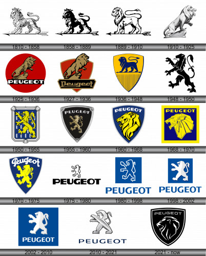
1810 – 1858
In the year 1810, the Peugeot lineage opted to incorporate the emblem of a lion as the hallmark of their brand. The ferocity and sharp canines of the lion symbolized the robustness of the brand’s steel offerings, serving as an emblematic representation of the brand’s enduring nature and quality. This powerful feline figure was strategically chosen to embody the essence of Peugeot’s products, highlighting their strength and longevity. The lion, with its majestic presence and commanding aura, seamlessly aligns with the brand’s ethos, underpining the steadfastness and resilience of the company’s diverse range of products. The adoption of this iconic lion emblem was a testament to Peugeot’s commitment to excellence, and it has since become synonymous with the brand’s identity, reflecting its heritage and the unyielding spirit that has been passed down through generations. The lion is not just a symbol; it is a proclamation of Peugeot’s dedication to upholding the highest standards of quality and durability in every product that bears its name.
1858 – 1889
In an attempt to render the lion figure more pronounced and intimidating, the designer intricately incorporated shades and shadows, enhancing the three-dimensional effect of the image. Despite these alterations, the color scheme remained steadfastly monochrome, a testament to the brand’s elegance and simplicity. It’s pivotal to highlight that during this transformative era, the Peugeot lineage took the significant step of formally registering the lion emblem as their official trademark. This was in the year 1858, a momentous occasion that solidified the lion’s symbolic representation of the swiftness and might characterizing the brand’s bicycles and motorcycles. This crucial decision not only marked a significant milestone in the company’s history but also underscored the emblem’s integral role in symbolizing the essence of the brand and its products, solidifying the lion’s status as a timeless and iconic representation of Peugeot’s legacy in the realm of mobility.
1889 – 1910
In this epoch-making time frame, the brand celebrated the debut of its inaugural automobile and concurrently undertook a creative reimagining of its emblematic lion logo. The original fierce countenance and muscularity of the lion underwent a transformation, giving way to a more lifelike and nuanced rendition. This redesign witnessed the lion’s features being refined to exude realism, while its tail was artistically elongated to add a touch of elegance. Complementing these changes, the arrowhead was rendered in a deep, rich black, adding a striking contrast that further accentuated the emblem’s visual appeal. These meticulous adjustments were not mere cosmetic enhancements; they were a strategic move aimed at aligning the emblem with the evolving identity and aspirations of the brand as it ventured into the realm of automobile manufacturing, marking a significant milestone in the company’s storied history.
1910 – 1925
The depiction of the majestic lion was ingeniously crafted as a three-dimensional sculpture, with its grandiosity enhanced through the expert application of shadows and highlights that added depth and dimension to its form. The formidable beast is portrayed turning its gaze towards the right, its fierce snarl revealing a set of formidable fangs. The left front paw is unsheathed, brandishing razor-sharp claws, while the right paw firmly presses down upon an arrow, anchoring it against a stone. This dynamic portrayal captures the essence of the lion’s strength and ferocity, symbolizing the brand’s commitment to power, precision, and excellence. The meticulous attention to detail in the rendering of the lion not only showcases the brand’s dedication to quality but also reflects the company’s heritage and its evolution over the years, seamlessly blending tradition with innovation.
1925 – 1936
In this particular time frame, the enterprise opted to utilize its preceding emblem version, steering clear of the three-dimensional rendition. The logo was reenvisioned as a two-dimensional graphic to facilitate straightforward printing applications. A stark black rectangle envelopes a section of the rocky terrain and obscures one of the hind limbs, with the brand’s moniker prominently displayed. The name “Peugeot” is meticulously inscribed in a bold, blocky uppercase font, its formidable width and potency harmoniously mirroring the lion’s majesty. Notably, the indented “U” and “G” characters are evocative of a predator’s gaping maw, further fortifying the symbolic association between the brand’s identity and the mighty lion that stands as its emblematic representative.
1927 – 1936
In this phase of its evolution, the brand embraced a logo that maintained the basic contours of its predecessor. However, this incarnation adopted a less intricate approach, choosing to represent the lion in a more abstract, generalized manner, eschewing minute artistic intricacies. The regality of the king of the jungle is undiminished, his massiveness and formidable presence fully intact. Poised majestically atop a craggy outcrop, the lion’s left paw is elegantly lifted, while his right paw securely pins down an arrow. The erstwhile red disk has undergone a metamorphosis into a shield framed with a gleaming golden border. Simultaneously, the automotive company’s name has found a new home within a black trapezoidal shape, its edges adorned with an intricate, figured cutout, providing a contemporary twist to the traditional emblem.
1936 – 1948
This era marked a pivotal moment in the history of Peugeot emblems, introducing vibrant hues to its design palette. A lion, bearing resemblance to its antecedent incarnations, is showcased facing the left direction, perched atop a slender arrow. The tail of the beast draws inspiration from the 1889 logo, while its remaining features are a harmonious blend of the brand’s initial representations. A notable distinction in this version is the introduction of a traditional shield, complete with a framing border and adorned with dark stripes at its base. The backdrop of the emblem is bathed in a rich yellow hue, with the lion, along with the surrounding details, rendered in a deep shade of navy blue, creating a visually striking contrast that embodies the essence of the brand’s legacy and its continual evolution.
1948 – 1950
The illustrators skillfully positioned the lion in a striking pose, elevating it onto its hind limbs while its front limb reaches forward, unfurling its claws in a display of might. Its jaw is agape, with a lengthy tongue protruding from its mouth, adding to its fierce demeanor. Serving as the backdrop is a symbol reminiscent of heraldic tradition, potentially a vertical banner, which is set against a rich black canvas and is interspersed with grey embellishments resembling combs. This composition, with its blend of vigor and tradition, is a testament to the brand’s dynamic spirit and its respect for its storied heritage, encapsulating the essence of Peugeot’s identity.
1950 – 1955
Post-revamping, the Peugeot emblem has undergone a transformation into a more vibrant and engaging visual. Its vivacity and inner dynamics are a result of the meticulous thin outlines used in crafting the figure. Moreover, the black lines provide a stark, effective contrast that serves to enhance the lion’s yellow hue. While the illustrators reenvisioned the depiction, they preserved the posture of the beast; a formidable predator that strides on its hind legs towards the left, its forepaws extended forward and tongue lolling out. In addition to this, the animal has been metamorphosed into a heraldic emblem, set against the backdrop of an armorial shield framed by a double-wide border, adding a touch of regality to the overall design. This evolution of the logo is reflective of the brand’s commitment to innovation while staying true to its roots.
1955 – 1960
Simultaneously, a distinct iteration was employed, characterized by a triangular shield adorned with embellished corners. Contrasting the previously observed mightiness, in this rendition, the lion is portrayed with an air of elegance, its limbs slender and terminating in outstretched claws. Consistent with previous depictions, the tail is artfully elevated and curled, now taking on the semblance of a blossoming flower complete with a bud and leaves, mirroring the heraldic fleur-de-lis. Hovering above the feline figure, the word “Peugeot” is inscribed, with the letter “E” uniquely truncated, lending a contemporary flair to the traditional emblem. This variation of the logo encapsulates a blend of grace and power, effectively mirroring the brand’s dedication to innovation while paying homage to its storied heritage.
1960 – 1968
The artists turned their focus to the lion’s head, honing in on this aspect as a symbol of its potent strength, resilience, and vigor. They opted to capture the creature in a side profile, providing a vantage point that affords a more vivid depiction of its emotive state. The gaping maw filled with formidable fangs, the furrowed brow, the prominent ear, and the magnificent mane that adorns its substantial neck, all coalesce to project an aura of calm confidence, raw power, and charismatic allure. The tendrils of its mane are intentionally angled to achieve a harmonious juxtaposition with the shield, which is bordered by a grey stripe. The brand’s name is proudly displayed at the pinnacle, rendered in a timeless design that pays homage to its rich heritage while exuding a contemporary elegance.
1968 – 1970
In 1968, Peugeot took a bold leap in reimagining its logo, transitioning to a design language defined by rigorous strokes, crisp lines, and acute angles. The previous triangular backdrop gave way to a more contemporary square frame, within which the lion was re-envisioned to resemble an Egyptian deity, complete with rectangular ears and trapezoidal strands of its mane. The ferocity of the beast was accentuated as it was depicted mid-roar, baring its formidable fangs in a display of raw power and might. This dramatic shift in aesthetic not only modernized the logo but also infused it with a sense of majesty and strength befitting the brand’s storied heritage and ambitions for the future.
1970 – 1975
The Peugeot logo from this era radiates a vibe of friendliness, security, and allure. The lion, bathed in a sunny yellow hue, has shed its fearsome visage, adopting a more approachable aesthetic characterized by curvaceous shapes, sleek lines, and a lack of intricate details or jagged edges. The result is an emblem that exudes warmth and gentleness. Similarly, the brand’s moniker underwent a transformation, adopting a rounded, lowercase typeface reminiscent of cursive handwriting. In this ensemble, the only elements that retain a touch of fierceness are the pointed corners of the shield, serving as a subtle nod to the brand’s storied heritage and its commitment to merging tradition with innovation.
1975 – 1980
A significant overhaul was once again bestowed upon the logo’s concept, flipping the script on the visual hierarchy of its elements. Now, perched at the top is a diminutive lion, poised gracefully on its hind limbs, while dominating the lower half is the colossal brand name “Peugeot,” a stark contrast in size. Despite these alterations, the logo retained its monochromatic color scheme, preserving a sense of continuity with its past iterations. This reimagined emblem encapsulates the brand’s innovative spirit, demonstrating its willingness to challenge conventions and evolve while still paying homage to its storied lineage through its choice of a timeless palette.
1980 – 1998
Retaining the silhouette from its predecessor, the lion is now encapsulated within a pristine white border, set against a deep blue backdrop that serves to accentuate its regality. Situated beneath this square tableau, the automaker’s name is meticulously rendered in a compact, block-style font. This strategic sizing and placement ensures that the viewer’s gaze is initially captivated by the majestic feline before seamlessly transitioning to the textual element. This thoughtful composition not only elevates the lion to a position of prominence but also creates a harmonious visual hierarchy that effectively communicates the brand’s essence while engaging the observer’s attention.
1998 – 2002
The creative minds behind the logo revisited the concept manifested in its antecedent, albeit with a noteworthy tweak. This iteration sees the lion rendered in grander proportions, achieving a delightful equilibrium with the textual component situated beneath it. As a result, both the majestic beast and the brand name coexist in harmonious splendor, neither overshadowing the other. Furthermore, a blue square has been artfully introduced, serving as a visually appealing backdrop that adds a touch of vibrancy to the emblem and further accentuates the logo’s overall aesthetic appeal, seamlessly blending the old with the new to create a timeless symbol that proudly represents the brand’s legacy.
2002 – 2010
The designers ingeniously merged the heraldic lion with the brand’s moniker, harmoniously encasing them within the confines of a square. The aesthetic is further enhanced by a subtle interplay of light and shadow, with the right flank of the regal lion bathed in a delicate gradient of shade. This nuanced addition lends depth and dimension to the emblem, encapsulating the brand’s rich history and sophisticated identity. Through this meticulous design, the emblem not only serves as a testament to the brand’s legacy but also stands as a contemporary symbol that resonates with modern sensibilities, embodying the perfect amalgamation of tradition and innovation.
2010 – 2021
The contemporary emblem showcases a sophisticated rendition of the lion, meticulously crafted to resemble a metallic sculpture. While the majestic beast retains its iconic stance, it has evolved to embody subtle anthropomorphic characteristics, adding a unique layer of complexity to the design. The color palette has been revitalized, opting for a soft and inviting amalgamation of white, grey, and blue hues that imbue the logo with a modern and refined aesthetic. This carefully considered combination of elements results in a logo that is not only emblematic of the brand’s rich heritage but also in tune with the contemporary design sensibilities, ensuring its relevance and appeal to modern audiences.
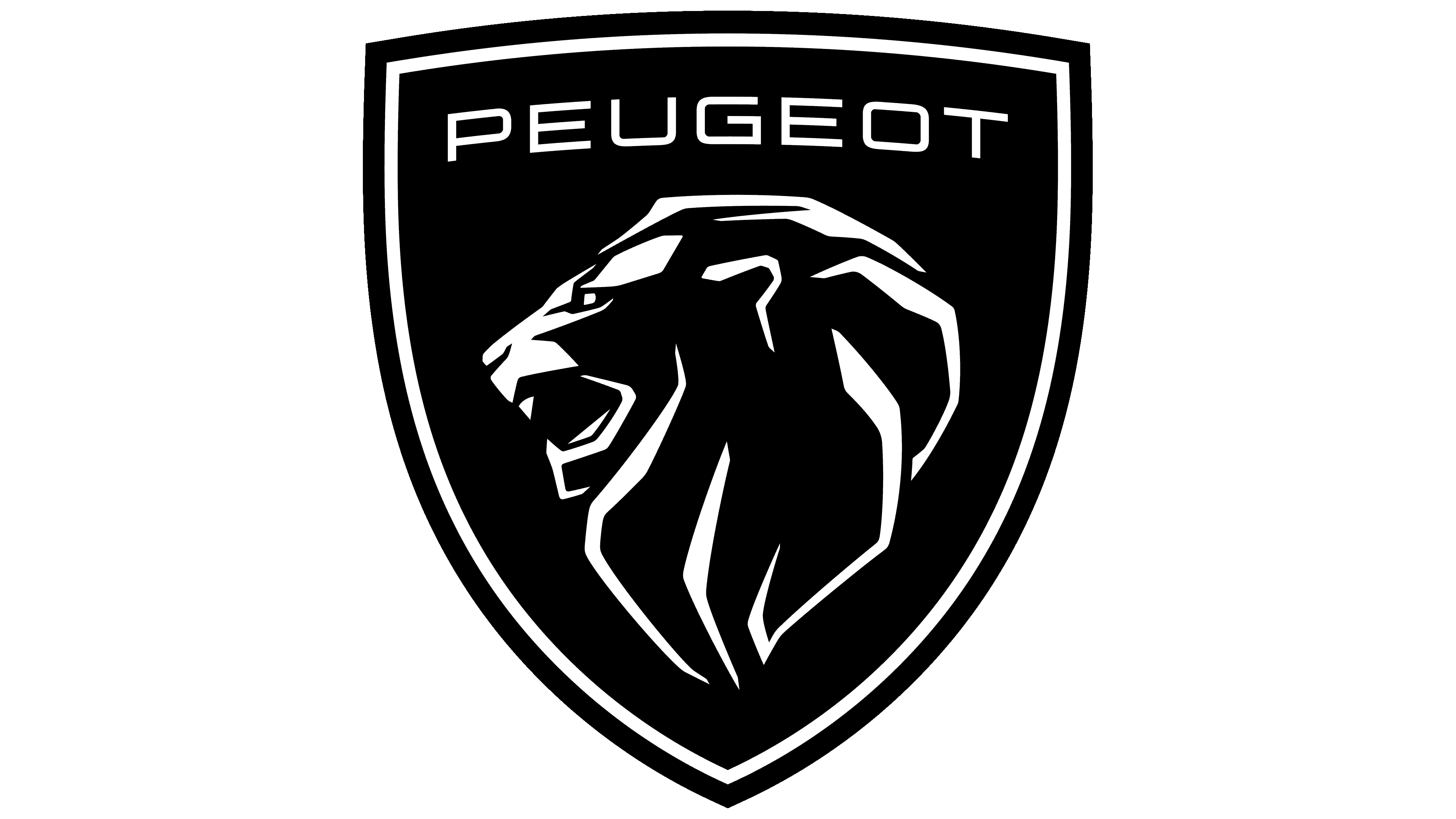
2021 – Today
In the year 2018, there was a pivotal shift in the brand’s visual identity as designers initiated the process of integrating elements from the 1960 Peugeot e-Legend symbol, poised to become the successor of the existing logo. The iconic imagery of the emblem remained largely unchanged, with the most noticeable alteration being the font utilized for the “Peugeot” inscription that gracefully arches above the lion’s cranium.
From its inception, the automotive company’s brand identity has been intrinsically linked to the representation of a lion that exudes power, confidence, and strength. This majestic creature has been a constant presence, evolving in form yet remaining steadfast in essence, a testament to the brand’s reverence for its roots and its commitment to upholding the superiority of its product offerings. This evolution symbolizes a harmonious blend of tradition and innovation, encapsulating the essence of the legendary brand and its rich heritage.
