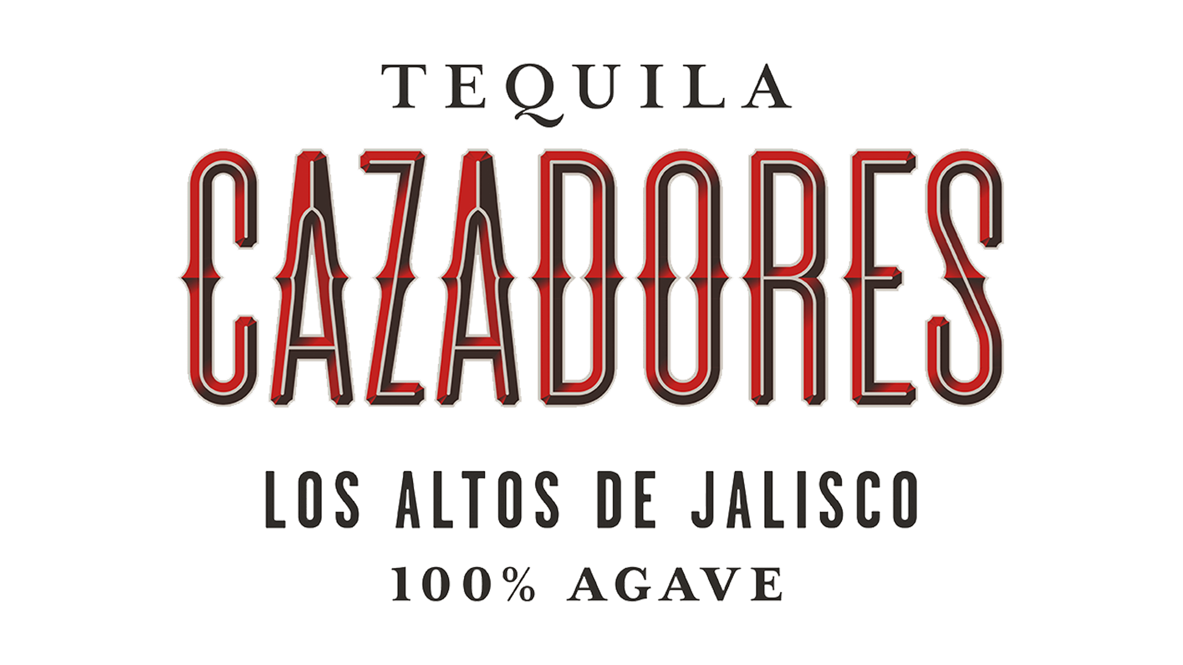
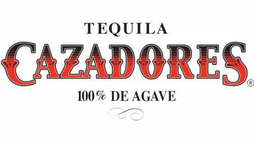
Cazadores Logo
Cazadores is a popular tequila brand from Mexico. Mostly, they just sell it in North America, but you can find them in Europe, as well. There is nothing too special about it; by all accounts it’s just a brand of well-made tequilas. They use most of the ingredients for the classic blue agave tequila from the Mexican highlands.
Meaning and History
The brand was born in 1922 in Arandas in the state of Jalisco, Central Mexico. It’s actually the best place for tequila-making, seeing how Jalisco is a birth-place of this drink. The word ‘cazadores’ means ‘hunters’ in Spanish, and it’s really nothing more than a poetic description of the drink.
1922 – 2014
The initial logo featured the brand name written in all capital letters. The style is what’s interesting here. The letters resemble wrought iron rather than the usual machine-written word. The style is very artistic, and it’s also reflected in the coloring. It’s a gradient of black and red (coming from top to bottom).
The other visual elements included the word ‘Tequila’ written in black serif letters above the main element, as well as the words ‘100% de agave’ below, in the similar style.
2014 – today
The carried the concept on almost intact. The letters became tall and thin instead of the bulky wrought iron aesthetic they had before. The color palette stayed, but it was no longer a gradient, but rather some parts of them were colored red, and some were black. Some elements, like the middle notches, stayed.
They also added the words ‘Los Altos de Jalisco’ below. It pretty much translates to ‘the highlands of Jalisco’. The other two written parts are mostly the same, although the font slightly changed.
Emblem and Symbol
The most recognizable part of Cazadores branding is actually their secondary emblem. It’s a photographic depiction of a deer. The story tells us that the founder of Cazadores Company was inspired into making tequila by a deer he saw out of the window. They often depict one above neck, as a result.


