Chelsea Logo
Chelsea Football Club is renowned for its long history. The team has many trophies, including European cups. Chelsea has traditionally shown flamboyant football, which has allowed him to conquer an army of fans far beyond the borders of his native England.
Meaning and history
Chelsea is one of the several major football clubs in London. This English club is considered one of the top-ranking clubs, as well as amongst the most famous clubs in the world. It was founded in 1905, boasting a rich and storied history with many triumphs and failures.
Chelsea has only entered spotlight in the 50s, when they first started claiming big trophies. After that, they’ve consistently won a major cup every few years, with the most prolific streak in the 2000s and 2010s. Chelsea is currently the 10th best club in the Premier League ranking.
What is Chelsea?
Chelsea is one of the top professional football clubs in England. Active since 1905, they are amongst several chief clubs in London, next to Hotspurs and Arsenal. Despite that, Chelsea have a vast international following, becoming an UEFA Champion two times in 2012 and 2021.
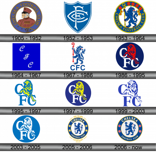
1905 – 1952
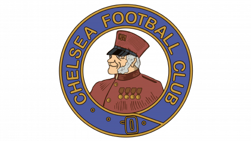
The first logo of the club appeared in 1905 along with its foundation. The base was a circle, in it along the border in yellow letters on a blue background the inscription CHELSEA FOOTBALL CLUB flaunted. In the center of the circle, on a white background, was a bearded man in a red jacket. Because of this, one of the team’s nicknames appeared – “retirees”.
1952 – 1953
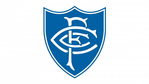
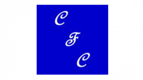
In 1952, a temporary logo was used, the club wanted to get rid of the offensive nickname. In a shield with blue edges and a white background, the blue letters FCC intersected.
1953 – 1964
It was based on the original logo, but the circle is now formed from two stretch marks. CHELSEA FOOTBALL CLUB has moved to the bottom. In the upper part, red balls and red roses were alternately located. In the center is a blue lion with a yellow staff.
1964 – 1967
During these years, the official logo remained the same, but only the letters FCC were embroidered on the T-shirts.
1967 – 1986
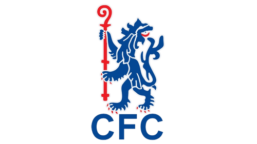
In 1967, only a blue lion was left from the previous logo, in whose hands was now a red staff. Under the lion are the letters CFC.
1986 – 1995
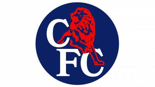
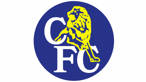
In 1986 a new coat of arms of the club was developed. The base is a dark blue circle, on it are white letters CFC, with the last two in the lower part, and the first in the upper, a red lion crawls out of it.
1995 – 1997
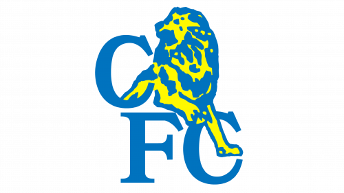
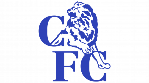
The circle was removed from the emblem, the letters became blue (a lighter shade), the lion was drawn in blue-yellow.
1997 – 1999
Management decided to go back to the 1986 version with a few edits. The lion is now painted in gold, the circle has become lighter.
1999 – 2003
The circle is removed from the emblem again, only letters and a lion remain, everything is depicted using two colors, blue and white.
2003 – 2005
In 2003, they began to use an even lighter shade of blue, again a circle became the basis, and inside the already familiar letters and a lion in white.
2005 – 2006
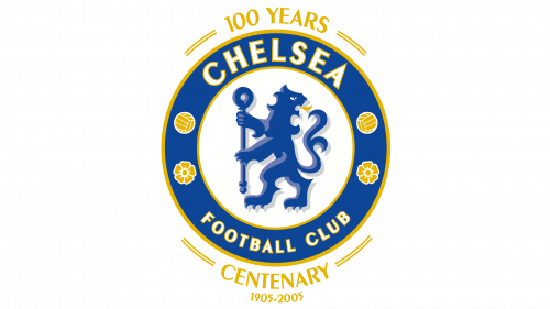
The 2005 emblem is again based on a circle, at the top it says CHELSEA, at the bottom – FOOTBALL CLUB. The inscription is made in white letters on a blue background. There is also a white circle inside, inside which is a blue lion with a staff. Balls and roses in gold are also inscribed in the blue circle. Around the emblem, there are inscriptions dedicated to the 100th anniversary of the team.
2006 – Today
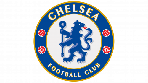
The logo has undergone a couple of changes. Removed inscriptions dedicated to the centenary. Balls and roses are now shown in red.
Color and font
The main color of the team is blue, which is reflected in the logo. Since 2006, a dark shade has been used. The name of the club is written in a recognizable font.
