China Car Brands
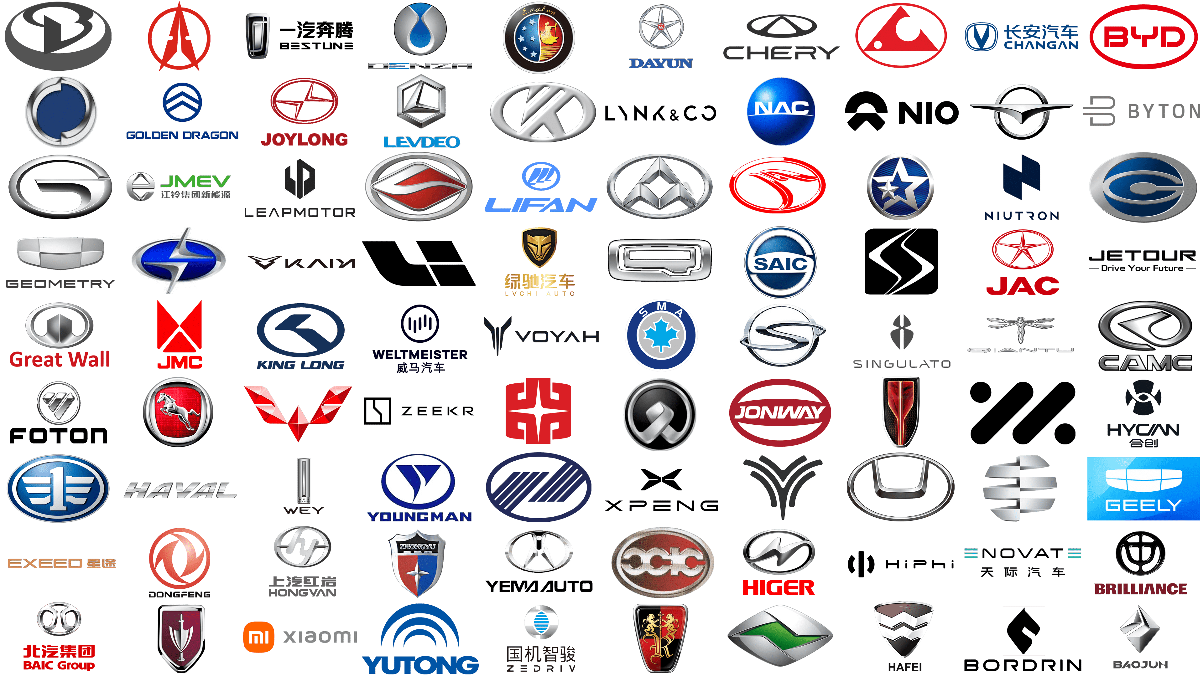
In the realm of automobile insignia, a logo transcends mere identity. It embodies a brand’s lineage, ethos, and vision. China’s auto industry has blossomed, presenting a spectrum of brands. Each brand’s emblem stands as a silent envoy, conveying stories of heritage and foretelling technological advances. These symbols represent more than corporate identity, they echo the fusion of ancient craftsmanship and modern innovation.
This article opens the gateway to the emblems defining China Car Brands. Here, logos embody more than company crests, they are narratives in metal and paint. They mark the evolution from design blueprints to fully-fledged road titans. Each logo weaves a brand’s narrative, from its humble beginnings to its rise on the world stage.
We embark on a journey, tracing the lineage of these symbols. We dissect their aesthetics, uncovering embedded messages. These badges stand as proud declarations of China’s automotive aspirations and achievements. Join us as we explore these emblems, revealing the drive and spirit at the heart of each brand.
Aiways
In 2017, a new innovator emerged in Shanghai, dedicated to shaping the future of transportation with eco-friendly options. This electric vehicle manufacturer, Aiways, has caught the attention of the industry with its U5 SUV, a vehicle that encapsulates the company’s commitment to sustainability, cutting-edge technology, and sleek design. They strive to revolutionize the electric vehicle market through advanced autonomous driving capabilities and environmentally conscious production methods. The logo is a bold, geometric design consisting of a sequence of black rectangles arranged asymmetrically. The top and bottom rows feature two rectangles each, horizontally aligned and evenly spaced. Bold, sans-serif capital letters spell out “Aiways” below the emblem, showcasing a contemporary and industrial look.
Aoxin
Stepping into the clean energy vehicle arena, Aoxin New Energy Automobile Co. Ltd. has made a name for itself within China’s bustling electric vehicle scene. By focusing on developing electric sedans and buses, Aoxin aligns its efforts with the global push for reduced carbon emissions, emphasizing efficiency and high performance in their vehicles. Victory and achievement are symbolized by the metallic laurel wreath encircling Aoxin’s logo, which also features a red and blue shield with a white star at its center, radiating a sense of pride, strength, and excellence, while the color scheme suggests passion and trust.
Arcfox
Under the BAIC Group’s wing, Arcfox shines as a luxury and innovation beacon in the electric vehicle (EV) market. With standout models like the Arcfox α-T and Arcfox GT, the brand combines high performance, autonomy, and exceptional design, securing a leading position in the EV market’s evolution. Arcfox’s logo embodies the future with its sleek, silver fox head design. The sharp, angular lines form a ‘V’, symbolizing motion and forward-thinking. Its minimalist approach uses negative space creatively, suggesting the eyes and ears of a fox in a design that’s both simple and expressive.
Avatr
A groundbreaking collaboration has given rise to Avatr Technology, where Changan Automobile, Huawei, and CATL have combined their strengths. By integrating Huawei’s HiCar for unparalleled connectivity and utilizing CATL’s advanced battery technology, Avatr is at the forefront of producing electric vehicles that are sustainable, intelligent, and futuristic. The Avatr logo features a minimalistic design, with a slender rectangle and a triangular void at its heart. An inverted ‘V’ inside divides the space, forming a stylized ‘A’. “AVATR” is clearly written below in a simple, uppercase font, highlighting the brand’s commitment to clarity and modern design.
BAIC Group
Emerging as a cornerstone of China’s automotive landscape, Beijing Automotive Industry Holding Co., Ltd. (BAIC Group) operates as a formidable state-owned enterprise. It boasts a varied lineup, including passenger cars, commercial vehicles, and new energy vehicles, underscoring its pivotal contribution to steering the automotive industry towards a more sustainable and innovative future. The BAIC Group’s insignia presents a symmetrical, silver emblem that evokes the image of intertwined infinity symbols within a circle, positioned above the brand name and Chinese characters in red. This design seamlessly blends a sense of innovation and continuity with a deep cultural resonance.
Baojun
The collaborative venture among General Motors, SAIC Motor, and Wuling Motors has propelled Baojun into a key player in China’s competitive affordable vehicle segment. By offering a broad spectrum of vehicles that resonate with the modern Chinese consumer’s preference for quality, value, and design, Baojun has successfully carved out a robust market position. Its logo features a dynamic, silver diamond shape with a distinctive folded corner, placed above the brand name “BAOJUN” in uppercase letters. The logo’s design emphasizes modernity, sharpness, and a commitment to precision and advanced technology.
Baolong
Hailing from Shanghai, Baolong Automotive Corporation stands out for its specialized production of automotive parts and accessories, such as tire pressure monitoring and exhaust systems. This focus not only highlights the company’s expertise in boosting vehicle performance and safety but also underscores its dedication to quality and innovation. Baolong’s brand identity is encapsulated in a bold, monochromatic logo, incorporating a stylized ‘B’ that ingeniously mirrors the numeral ‘3’. This design is set within a circular frame, suggesting unity and continuity, with its smooth lines and curves embodying elegance and fluidity.
BeiBen Truck
With roots in Inner Mongolia, BeiBen Truck Co., Ltd. has earned acclaim for manufacturing heavy-duty trucks built to endure the rigorous demands of the construction, transportation, and logistics sectors. This commitment to crafting vehicles that epitomize durability, performance, and quality showcases the company’s expertise in navigating the complexities of commercial vehicle production. The logo of BeiBen Truck is marked by a vivid red arrowhead encased in a circular outline, pointing upwards to symbolize progress and momentum. Accompanied by two symmetrical white forms that suggest a ‘B’, the red hue conveys vibrancy and passion. This emblem, circumscribed by a circle, projects a sense of authority and integrity.
Bestune
FAW Group introduced a significant evolution in its brand identity by transitioning from Besturn to Bestune, marking a bold step towards innovation in automotive design and technology. This rebranding reflects the company’s ambition to offer vehicles that combine modern aesthetics with advanced features, catering to the changing tastes of consumers and underscoring FAW’s dedication to quality and progress in the automotive world. The Bestune logo, with a stylized metal emblem in a rectangular frame, embodies depth and dimension through the play of lines and curves. The brand’s name, “BESTUNE”, appears in bold, block letters next to Chinese characters, establishing a robust brand presence.
Bordrin
Entering the electric vehicle sector with a distinct proposition, Bordrin focuses on producing family-friendly EVs that emphasize safety, comfort, and eco-friendliness. The company’s mission to advance sustainable mobility is evident in its vehicles, which are equipped with superior battery technology and smart connectivity features. The emblem’s sleek, curved lines abstractly outline the shape of the head and neck, with the top curve suggesting the horse’s mane or the back of its head, while the pointed tip at the bottom could represent the snout. This symbolic depiction of strength and grace aligns with common branding strategies where equine imagery is used to evoke speed, power, and elegance. The stark black and white contrast of the emblem enhances its silhouette, making the resemblance to a horse’s head more pronounced.
Brilliance
As a key player in China’s automotive industry through its collaborations with BMW and Toyota, Brilliance Auto Group manufactures a wide range of vehicles, from luxury sedans to commercial vans, reflecting its pursuit of excellence and innovation. The company meets the evolving needs of both domestic and international customers. The Brilliance logo showcases a black circular emblem with a unique design of three window-like panels arranged symmetrically, creating a unified central figure. This symbolizes precision and clarity. The brand name “BRILLIANCE”, in bold, capitalized maroon letters below the emblem, reinforces the theme of outstanding quality and brightness.
BYD
Known for embodying the aspirational message “Build Your Dreams”, BYD Company Limited leads the way in electric vehicles and rechargeable batteries, showcasing a diverse range of electric cars, buses, and trucks. As a forerunner in sustainable energy solutions, BYD aims to revolutionize global reliance on fossil fuels. The BYD logo, set against a red circle, features the initials “BYD” in prominent, white typography. This design’s simplicity, characterized by clear lines and a striking color contrast, exudes strength and reliability. The red border enhances the logo’s boldness, conveying a message of energy and fervor.
Byton
Byton is revolutionizing the automotive sector with its focus on integrating advanced digital technologies into its electric vehicles. These smart cars, known for their expansive touchscreen interfaces and state-of-the-art connectivity features, stand at the intersection of automotive excellence and digital innovation, shaping the future of mobility. The logo of Byton features an elegantly simple design where the letter ‘B’ is mirrored and rotated, crafting an abstract, interconnected emblem. The “BYTON” name is presented in a light gray, sans-serif font, spreading across the space to convey a sense of modernity and technological sophistication that mirrors the brand’s futuristic and minimalist design philosophy.
Changan
With a storied history spanning over a century, Changan Automobile Co., Ltd. stands as a pillar in China’s automotive industry. This venerable manufacturer offers an extensive array of vehicles, including passenger cars and commercial trucks, and leads in the development of electric and autonomous vehicles, showcasing its unwavering dedication to innovation and a sustainable future. The Changan logo is marked by a prominent blue ‘V’ within an oval, symbolizing trust and stability. The brand’s name appears in a deep blue, rendered in both Chinese characters and the Roman alphabet, communicating reliability and depth through a clear, precise font.
ChangFeng
As part of the Guangzhou Automobile Group (GAC), ChangFeng Motor has carved a niche in producing rugged SUVs and light trucks, inspired by China’s diverse landscapes. These vehicles are built to tackle the demands of both urban and natural settings, embodying the brand’s commitment to versatility and performance. The logo of ChangFeng displays a red triangle with a circular cut-out and a smaller white circle inside, evoking a stylized depiction of the sun and moon within a landscape. Encircled by a red ring, the emblem embodies the harmony and cyclicality of natural elements, conveying a message of continuity and balance with nature.
Chery
Since its inception in 1997, Chery Automobile Co., Ltd. has risen to prominence as one of China’s leading export-focused car manufacturers. Offering a diverse lineup that includes economy cars, SUVs, and electric models, Chery places a strong emphasis on innovation and quality, aiming to meet the varied demands of customers globally. The Chery logo features a black oval intersected by a stylized ‘A’, creating a mountainous silhouette within, symbolizing resilience and aspiration. Below this, the “CHERY” name is set in a clean, sans-serif font, reflecting the brand’s commitment to a modern and straightforward identity.
Dayun
Dayun Group has made significant strides in the production of heavy-duty trucks, motorcycles, and electric vehicles, marking its presence as a key player in China’s automotive and transportation industries. The commitment to quality, innovation, and sustainability is evident as Dayun continues to enhance its technologies to cater to the global market’s varied needs. The Dayun logo, featuring a metallic five-pointed star within a circle, embodies ambition and direction. A red circular seal with Chinese characters at the star’s heart accentuates the brand’s cultural heritage. The name “DAYUN”, spelled out in capitalized blue letters below the emblem, signals stability and reliability.
Denza
The collaboration between BYD Company and Daimler AG gave rise to Denza, a beacon in the Chinese electric vehicle market, with a focus on producing environmentally friendly vehicles that also lead in design and engineering. This joint venture underscores a shared commitment to fostering sustainable mobility solutions. The Denza logo, with its oval emblem and a fluid blue shape reminiscent of an hourglass or infinity symbol, represents sustainability and the ongoing journey towards a greener future. Its silver-to-blue gradient adds a contemporary and sleek touch, while the stylized gray “DENZA” font complements the logo’s futuristic vibe.
Dongfeng
As one of China’s most comprehensive automotive groups, Dongfeng Motor Corporation has been instrumental in the automotive industry’s growth, offering an array of vehicles from passenger cars to new energy vehicles. This diversity reflects Dongfeng’s dedication to innovation, quality, and environmental stewardship. The logo features a red oval with interlocking shapes that suggest motion and cohesion. The gradient within these shapes imparts a three-dimensional look, enhancing the logo’s dynamism. The brand name “DONGFENG”, in bold and capitalized letters, underscores the brand’s influential and solid reputation.
Englon
Under the Geely Automobile Holdings umbrella, Englon was created to fuse classic British design’s elegance with modern Chinese automotive craftsmanship. The brand’s lineup, known for its sophistication, comfort, and reliability, echoes Geely’s goal of making premium cars more accessible. Englon’s logo is a nod to classical elegance, showcasing a golden figure that invokes Greek or Roman mythology imagery, accompanied by a chariot wheel and staff, set against a backdrop of a blue half-globe with white stars and red-gold rays, all framed in a silver circle. The “Englon” name, presented in an exquisite script above the emblem, lends an air of refinement and distinction.
Enovate
Enovate Motors is on the forefront of the electric vehicle revolution in China, dedicated to advancing EV technology and design. The company focuses on delivering vehicles that feature the latest innovations, exceptional performance, and sustainable solutions, aiming to spearhead the transition towards a more efficient, eco-friendly future in mobility. The Enovate logo embodies a sleek, minimalist aesthetic with three horizontal lines positioned to the left of the word “ENOVATE”, possibly signifying the letter ‘E’ or denoting progress and forward movement. Accompanied by Chinese characters beneath the English name, the logo connects the brand to its cultural roots with a clean, sans-serif font, projecting an image of innovation and clarity.
Everus
As part of Guangqi Honda’s portfolio, Everus marks the venture’s entry into the electric vehicle arena, introducing models that prioritize affordability, reliability, and eco-friendliness. This initiative highlights Honda’s dedication to enlarging its environmental footprint in China and globally. The Everus logo is crafted with metallic horizontal, curved bands forming an abstract ‘E’, embodying a sense of dynamism and precision. Its three-dimensional design, enhanced by gradients and shadows, adds depth, symbolizing the brand’s commitment to modernity and automotive innovation.
Exeed
Under the Chery Automobile umbrella, Exeed emerges as a luxury SUV brand that integrates opulence, performance, and cutting-edge technology. With a mission to transform the premium vehicle segment, Exeed offers models featuring state-of-the-art amenities, unmatched comfort, and a distinctive design, catering to consumers seeking elegance and quality. The Exeed logo employs a minimalist and typographic approach, with the name “EXEED” showcased in a specially stylized font where the letters are interconnected by horizontal lines, highlighting unity and the interconnectedness of technology and luxury. The logo’s soft copper hue conveys a sense of premium quality and sophistication, complemented by Chinese characters that underscore the brand’s global reach and heritage.
FAW
Established in 1953, First Automotive Works (FAW) Group has grown from its beginnings as a commercial truck manufacturer to become a cornerstone of China’s automotive industry. Today, FAW produces a comprehensive lineup of vehicles, including luxury cars, buses, and trucks, celebrating a tradition of innovation, quality, and leadership in the automotive world. The FAW logo is distinguished by a bold blue circle enclosing a silver emblem, which features horizontal bars arranged to depict a stylized ‘1’, embodying leadership and precedence. The emblem’s symmetrical design and metallic gradients lend it a contemporary, prestigious look, befitting the brand’s illustrious history and its ambition to shape the future of mobility.
Foton
Since its inception in 1996, Foton Motor Group has swiftly ascended as a prominent international player in the commercial vehicle sector, crafting an extensive array of trucks, buses, and agricultural machinery. By harnessing advanced technology and innovation, Foton meets the varied demands of global markets, underscoring a commitment to quality, durability, and environmental stewardship. The Foton logo is distinguished by a circular badge with a silver metallic sheen, containing an abstract emblem of stylized, angled shapes that hint at an ‘F’, projecting modernity and technological progress. “FOTON” is displayed in bold, capitalized letters below the badge, reinforcing the brand’s robust and reliable image.
Fukang
Fukang marks an important chapter in the history of international automotive ventures in China, originating as a popular car model by Dongfeng Citroën. This collaboration symbolized the fusion of European design and technology with Chinese manufacturing prowess, contributing to the automotive industry’s modernization and growth within China. The logo features an emblem that consists of a circular motif with a metallic silver outline and a deep blue center. The silver portion is designed with two opposite, inward-pointing arrows that do not meet, creating a gap and an open circle that frames the blue background. This design could be seen as representing movement, connection, or technological advancement.
GAC Group
GAC Group, short for Guangzhou Automobile Group Co., Ltd., stands as a titan in the automotive industry, both in China and globally. Through its comprehensive vehicle lineup, including cutting-edge electric vehicles and hybrids offered via its brands and joint ventures, GAC Group demonstrates a deep-rooted commitment to sustainability and technological innovation. The emblem is a silver monogram inside a circle. The monogram consists of a stylized letter “G”. The design of the “G” is modern and minimalistic, with a three-dimensional effect provided by shading and highlights, giving it a metallic sheen. The outer circle is also rendered in silver, creating a frame for the monogram.
Geely
From its humble beginnings as a refrigerator manufacturer in 1986, Geely has transformed into a powerhouse in China’s automotive landscape and a significant player on the global stage, acquiring international brands and leading the charge in new energy vehicle development. This evolution underscores Geely’s vision of fostering a sustainable future with smart, innovative mobility solutions. Geely logo with blue emblem with intersecting arcs inside. The gradient blue hue imparts depth and trustworthiness, while the brand name “GEELY” in bold, capitalized letters below the emblem, conveys a contemporary and assertive brand persona.
Geometry
Geely’s entry into the electric vehicle arena comes with the introduction of Geometry, a brand dedicated to reshaping the EV market through its emphasis on clean energy, smart technology, and affordability. Geometry’s mission to democratize eco-friendly transportation aligns with a broader global shift towards sustainable mobility. The brand’s logo, featuring a grayscale emblem, conjures images of a futuristic shield, with its metallic finish and segmented design lending a sleek, contemporary edge. Below this emblem, the word “GEOMETRY” is rendered in a straightforward, modern sans-serif typeface, mirroring the logo’s clean and technologically advanced aesthetic.
Golden Dragon
Part of Xiamen King Long United Automotive Industry Co., Ltd., Golden Dragon excels in producing buses and coaches that are synonymous with quality, safety, and comfort. The brand’s global presence underscores China’s expanding role in the international automotive and transportation sectors. The Golden Dragon logo employs a bold, circular blue badge that houses a white zigzag pattern, evoking the peaks of mountains. “GOLDEN DRAGON”, displayed below the badge in strong, uppercase letters, communicates the brand’s emphasis on excellence and durability.
Gonow
Known for its lineup of affordable SUVs, pickup trucks, and minivans, Gonow caters to the practical demands of consumers in emerging markets, focusing on accessibility, reliability, and value. The brand’s commitment to offering cost-effective transportation solutions is reflected in its identity. The Gonow logo encapsulates this ethos with a dynamic blue and silver oval that encompasses an abstract, silver swoosh resembling the letter ‘G’. The logo’s blue center adds depth, while its metallic edges suggest sophistication. Its fluid, modern contours imply motion and innovation, pivotal to Gonow’s brand philosophy.
Great Wall
Established in 1984, Great Wall Motors has emerged as a leader in the SUV and pickup sector in China, boasting influential sub-brands like Haval and WEY. This success underscores the company’s focus on innovation, quality, and international growth, with aspirations to set global benchmarks in automotive excellence. The Great Wall logo is marked by a silver, shield-like emblem within a circular frame, centering on a bold, angular motif that abstractly forms’. Below this emblem, the brand name “Great Wall” is highlighted in a striking red sans-serif font, offering a vivid contrast that complements the logo’s strength and ambition.
Hafei
Hafei Motor once stood as a pivotal automotive manufacturer in China, recognized for its small cars, light trucks, and minibuses tailored to the nuanced demands of both urban and rural consumers. The brand’s commitment to innovation, affordability, and practicality was evident in its vehicle designs. Its emblem, a modern triangular shield that transitions from burgundy to white, features two stylized, interlocking chevrons in white that suggest movement and precision.
Haima Car
Originating from a collaboration between Chinese companies and Mazda, Haima Automobile has evolved to carve out its own niche in the passenger car and minivan sectors, marrying sleek design with efficient performance. This reflects its dedication to vehicles that complement dynamic lifestyles and adhere to sustainable practices. The logo, centered around a stylized bird in flight within a silver ring, exudes simplicity and elegance. The bird’s wings breach the ring’s confines, embodying freedom and advancement, while its black and silver palette denotes sophistication and a premium quality.
Hanteng Autos
Since its inception in 2013, Hanteng Autos has rapidly ascended within the Chinese automotive landscape, with a sharp focus on SUVs and electric vehicles. By embracing advanced technology and innovative design, Hanteng aims to meet the rising demand for environmentally friendly and refined mobility options, marking its ambition on the global stage. The brand’s logo, an oval encircling a three-dimensional red backdrop, showcases a silver horse in motion, its dynamic stance conveying speed and elegance. The textured red background within the oval enriches the design, lending depth and character, while the frame speaks to quality and heritage.
Haval
As an arm of Great Wall Motors, Haval has carved a niche for itself in the SUV domain, underlined by an unwavering emphasis on safety, quality, and innovation. With a portfolio designed to satisfy a broad spectrum of consumer needs and adapt to varying driving environments, Haval has cemented its status as a premier SUV brand in China, with an increasing global presence. Its logo features the “HAVAL” brand name in uppercase, rendered in a sleek, metallic fashion that embodies strength and contemporary flair. The lettering’s sharp angles and three-dimensional impact underscore the brand’s dedication to precision and durability.
Hawtai
Since its establishment in 2000, Hawtai Motor Group has made notable advances in the automotive sector, offering a lineup that includes passenger cars, SUVs, and clean energy vehicles. By leveraging robust research and development alongside advanced production methods, Hawtai delivers vehicles that are not only environmentally friendly and technologically advanced but also align with international sustainability objectives. The company’s logo features a stylized ‘H’ set within a silver oval ring, boasting a three-dimensional effect to add depth and a luxurious feel. The design’s modern, minimalist aesthetic underscores Hawtai’s sleek and forward-thinking brand image.
Higer
Higer Bus Company Limited, founded in 1998, has emerged as a leading bus manufacturer in China, crafting a broad array of buses and coaches that prioritize safety, comfort, and efficiency. These vehicles serve various markets globally, underscoring China’s dedication to enhancing public transportation infrastructure and accessibility. The Higer logo features a sleek silver “H” encased in a silver oval, symbolizing fluidity and progress.
HiPhi
As a pioneering division of Human Horizons, HiPhi leads the way in crafting luxury electric vehicles that incorporate cutting-edge AI technology, connectivity, and innovative design. Aimed at transforming the human-vehicle interaction, HiPhi, through models like the HiPhi X, showcases futuristic aesthetics, intelligent features, and sustainable mobility solutions, heralding a new age of transportation. The logo is comprised of two distinct elements. On the left is a symbol consisting of two curved brackets flanking a central vertical line. On the right side is the text “HiPhi”, presented in a unique typeface that echoes the styling of the symbol. The letters are capitalized, with the “H” and “i” mirrored in both the first and second half of the word, promoting a balanced and rhythmic visual effect.
Hongqi
Established in 1958, Hongqi stands as the most venerable luxury car brand in China, boasting a storied history of serving state officials and showcasing Chinese craftsmanship and luxury. Merging traditional elegance with contemporary innovation in automotive engineering, Hongqi symbolizes both prestige and technological progress within China’s automotive industry. The logo features a striking red vertical element, suggestive of ascent, set against a black shield with a silver border. An intricate grid pattern in the background adds depth, while the bold red emblem foregrounds luxury and distinction.
Hozon Auto
Established in 2014, Hozon Auto is swiftly gaining traction in China’s electric vehicle sector with its dedication to the development of new energy vehicles, including pure electric and hybrid models. The brand is focused on delivering affordable, reliable, and innovative transportation solutions that support the reduction of carbon emissions and promote sustainable mobility. The logo embodies a stylized, abstract depiction of a sprouting seed, symbolizing growth, sustainability, and freedom. Its minimalist black and white color scheme emphasizes the brand’s commitment to a modern, clean, and environmentally conscious approach.
Hualing Xingma
Hualing Xingma Automobile (Group) Co., Ltd. is recognized for its heavy-duty machinery and commercial vehicles, carving a niche in the global market with its high-performance construction vehicles, trucks, and special-purpose vehicles designed for the rigorous demands of the construction and transportation industries. The logo features a stylized silver arrow within a circle, representing direction and progress, with “CAMC” displayed below in a bold, industrial typeface that underscores the company’s reputation for strength and reliability in the automotive domain.
Hycan
Born from a partnership between GAC Group and NIO, Hycan stands at the forefront of the electric vehicle industry, focusing on producing smart, performance-oriented EVs that meld advanced technology, user-centric interfaces, and sustainable design principles. The brand aims to redefine electric mobility with vehicles designed for the environmentally conscious drivers of the future. The logo presents an abstract guardian figure, with a central circle and symmetrical ‘arms’ extending outward, denoting protection and embrace. “HYCAN”, written in a capitalized modern font along with Chinese characters, reflects the brand’s cultural roots and forward-looking identity.
IM Motors
IM Motors represents a strategic alliance between SAIC Motor, Zhangjiang Hi-Tech, and Alibaba Group, endeavoring to transform the electric vehicle landscape with smart, interconnected vehicles that harness Alibaba’s AI and cloud computing expertise. This collaboration is a testament to the merging of digital technology and automotive design, aiming to offer innovative, sustainable, and intelligent mobility solutions. The logo, featuring two overlapping oblong shapes with two round dots, all in black, conveys depth, symmetry, and simplicity, signaling elegance and a modern design ethos focused on harmony and purity.
JAC
Since its founding in 1964, Jianghuai Automobile Co., Ltd. (JAC) has transitioned from specializing in commercial trucks to becoming a multifaceted automaker that offers a broad spectrum of vehicles, including passenger cars, commercial vehicles, and electric vehicles. This evolution underscores JAC’s flexibility and dedication to catering to the varied demands of consumers through continual innovation and a commitment to quality. The company’s logo, featuring a red star within a circular, symbolizes guidance and the pursuit of exploration. The varying thickness of the circle and star lines injects a sense of dynamic movement into the design. “JAC” is prominently displayed beneath the logo in red, reinforcing the brand’s confidence and strength.
Jetour
Introduced by Chery in 2018, Jetour has swiftly captured the market’s attention with its lineup of affordable yet stylish SUVs and MPVs, targeting younger consumers and families seeking vehicles that blend comfort, style, and practicality. This commitment to delivering value-for-money mobility solutions without compromising on quality or design is clearly reflected in the brand’s ethos. The Jetour logo consists of the brand name “JETOUR” in a bold, sans-serif font, underscored by the tagline “Drive Your Future”. The design’s simplicity and futuristic orientation echo the brand’s dedication to innovative automotive design and vision.
Jiangnan
Jiangnan Automobile, a subsidiary of Zotye Automobile, is renowned for producing the Jiangnan TT, one of the most cost-effective cars available, highlighting its focus on delivering economical transportation options. Concentrating on compact cars, Jiangnan caters to first-time car buyers and consumers in emerging markets by prioritizing affordability, simplicity, and accessibility. The brand’s emblem, showcasing a lightning bolt-like figure that slices through a deep blue oval, creating asymmetrical sections, radiates energy and a forward-looking perspective. The sleek metallic trim framing the blue oval accentuates a commitment to innovation and the electrified future of transportation.
Jinbei
As part of the Brilliance Auto Group, Jinbei has established a robust reputation for manufacturing dependable vans and minibuses, primarily serving the commercial transportation sector. This focus on quality and durability has positioned Jinbei as a favored brand among businesses in need of reliable vehicle solutions, both domestically and internationally. The Jinbei logo features a maroon shield with a metallic border, centered around a stylized lance or sword, symbolizing a blend of tradition and strength. The design’s clean, modern lines suggest a harmonious melding of historical values with a contemporary design ethos.
JMC (Jiangling Motors Corporation)
Since its establishment in 1968, JMC has ascended as a significant figure within China’s automotive landscape, focusing on light trucks, pickups, and SUVs. The company’s strategic alliances with global automotive leaders underscore its dedication to innovation, quality, and environmental stewardship, striving to produce vehicles that cater to a wide array of consumer preferences. The JMC logo, made up of interlocking triangles, is a striking red color. This geometric configuration symbolizes stability and equilibrium, with the red hue conveying energy and passion. “JMC” is boldly presented beneath the emblem in the same red tone, projecting strength and clarity.
JMEV (Jiangxi Electric Vehicle)
As an offshoot of Jiangling Motors Corporation, JMEV has rapidly emerged as a dynamic entity in the electric vehicle sector in China, emphasizing the design and production of electric cars and SUVs that meld stylish aesthetics with eco-friendly performance. This dedication mirrors the brand’s ambition for a greener, more sustainable future in personal mobility. The JMEV logo showcases a sleek, metallic grey abstract emblem paired with the acronym “JMEV” in a lively green, symbolizing eco-innovation and forward-thinking. The emblem’s contemporary design, alongside the green color, emblematic of environmental sustainability, reflects the brand’s commitment to the advancement of electric vehicles.
Jonway
Established in Zhejiang, China, Jonway Automobile has carved its niche by providing an assortment of affordable transportation options, including scooters, motorcycles, and automobiles, with a special emphasis on utility vehicles and electric scooters. This approach demonstrates the brand’s versatility and commitment to fulfilling the changing needs of both domestic and global markets. The Jonway logo features the brand name “JONWAY” prominently within an ellipse, with white lettering set against a dynamic red backdrop, bisected by a white, horizontal swoosh that infuses the design with a sense of motion and speed, encapsulating the brand’s energetic essence.
Joylong
Renowned for manufacturing high-quality passenger vans and minibuses, Joylong Automobile prioritizes safety, comfort, and reliability in its vehicles, which are extensively utilized for passenger and goods transportation across Asia and beyond. This focus showcases the brand’s pivotal role in enhancing mobility and facilitating commerce. The Joylong logo is depicted as a simple red circle encasing a cross, reminiscent of a navigational aid or compass, with the cross partitioning the circle into quadrants, symbolizing the brand’s global reach. “JOYLONG”, inscribed in a bold, red font below, highlights the brand’s dedication to delivering joy and enduring value.
Kaiyi
As a newcomer to the automotive industry, Kaiyi Automobile is set on making a significant impact with its lineup of passenger vehicles that blend appealing design with functional practicality, all at an accessible price point. The brand aims to fulfill the desires of the growing middle-class consumer base seeking vehicles that are both affordable and stylish. Its logo, a geometric abstraction with sharp angles and intersecting lines, evokes the silhouette of a bird in flight, symbolizing freedom and aspiration. Accompanied by the brand name “KAIYI” in bold, capitalized letters, which feature angular cuts to echo the emblem’s modernity, the logo conveys a sense of dynamism and progressive spirit.
King Long
A pioneer in China’s bus manufacturing sector since 1988, King Long produces a broad spectrum of buses and coaches catering to public transport, tourism, and education sectors. With a commitment to employing advanced technology and stringent quality controls, the brand ensures its vehicles meet the highest standards of safety, comfort, and efficiency. The logo, highlighting a stylized “K” within an oval, employs dark blue and white to signify professionalism and trustworthiness. The emblem’s circular form symbolizes King Long’s global reach and commitment to fulfilling customer needs, while “KING LONG” is displayed below in a font that evokes a sense of regal heritage and reliability.
Kingstar
Specializing in a wide array of light commercial vehicles, Kingstar offers versatile and dependable transportation solutions that address the requirements of both businesses and individual consumers. Focusing on durability, efficiency, and affordability, Kingstar supports the mobility and operational needs of small to medium-sized enterprises worldwide. The logo presents a sleek metallic “K” within a circle, stretching to the circle’s edges to represent expansion and ambition. With its minimalist design, bold lines, and solid silver color, the emblem projects a premium, lasting brand image, indicative of Kingstar’s commitment to quality and value.
Landwind
Operating under Jiangling Motor Holding, Landwind challenges traditional market pricing with its array of affordable SUVs, underscoring the company’s dedication to providing practical and accessible mobility options. Aimed at enhancing its footprint both domestically and internationally, Landwind focuses on delivering great value. The logo features a bold red diamond encapsulated within a three-tiered circular motif, perhaps evocative of a wind turbine, symbolizing a forward-thinking and dynamic approach. The striking red and silver color scheme conveys energy and contemporary flair, while the emblem itself represents Landwind’s drive for innovation and strength in the automotive landscape.
Leapmotor
Established in 2015, Leapmotor is a leading force in China’s electric vehicle (EV) industry, showcasing an array of electric cars that epitomize state-of-the-art technology, stylish design, and a strong commitment to sustainability. The company aims to spearhead the shift towards cleaner and smarter urban mobility solutions. The Leapmotor logo features a bold, black monogram, which cleverly forms a stylized “L” mirrored to represent forward movement or leaping ahead. Positioned above the brand name “LEAPMOTOR” in uppercase letters, the logo’s modern, clean aesthetic aptly communicates the brand’s focus on innovation and dynamic performance.
Levdeo
Committed to expanding the electric vehicle landscape, Levdeo produces a comprehensive range of electric vehicles, from passenger cars to commercial vehicles, with the goal of mitigating urban pollution and easing traffic congestion through eco-friendly and efficient transportation solutions. The Levdeo logo showcases a three-dimensional metallic hexagon with an abstract “L” at its core, symbolizing stability and technological precision. The company’s name, “LEVDEO”, is presented in a contemporary blue font, reflecting the brand’s modern, forward-looking approach to vehicle manufacturing.
Li Auto
Founded in 2015, Li Auto stands at the forefront of China’s burgeoning new energy vehicle market, specializing in premium electric vehicles that offer extended range capabilities. The brand merges luxury with innovation and environmental sustainability, catering to the increasing demand for sustainable and high-performance mobility solutions worldwide. The Li Auto logo features a stylized, black “L”, creating an abstract figure that embodies symmetry and innovation. This simple yet striking design underscores the brand’s dedication to pioneering automotive technology’s future with a sleek and contemporary flair.
Lifan
Lifan Industry (Group) Co., Ltd., with its diversified offerings in motorcycles, automobiles, and power equipment, has significantly contributed to China’s automotive sector by providing affordable vehicles globally. The brand prides itself on innovation and its ability to deliver dependable transportation options to a wide audience. The Lifan logo displays a blue stylized “L” within a circle, symbolizing unity and wholeness. The “L” is depicted with dynamic strokes, denoting speed and efficiency, while the brand name “LIFAN”, positioned below in a similar blue shade, conveys a sense of trustworthiness and reliability.
LvChi Auto
Launching its venture into the automotive world with a focus on electric vehicles, LvChi Auto sets out to revolutionize luxury mobility by integrating advanced electric powertrains with autonomous driving technologies. This initiative embodies the brand’s ambition to blend elegance with environmental sustainability, creating premium electric vehicles tailored for the future of urban transport. The LvChi Auto logo features a sleek, golden shield adorned with a stylized, angular visage, evoking a mythological or regal emblem. This majestic figure, set against the shield’s black backdrop, is complemented by the brand name “LVCHI AUTO” in elegant golden lettering below, symbolizing luxury and exclusivity.
Lynk & Co
Created through a collaboration between Geely and Volvo Cars, Lynk & Co reimagines automotive retail and ownership by marrying Scandinavian design ethos with Chinese manufacturing prowess. The brand offers connected, technologically sophisticated vehicles to a global audience, redefining accessible luxury and pioneering ownership models. The logo utilizes bold, contemporary typography to spell out “LYNK & CO” in black, featuring a custom typeface where the ampersand also serves as an infinity symbol, reflecting the brand’s focus on endless connectivity and modern elegance.
Maxus
As part of SAIC Motor, Maxus has gained international acclaim for its extensive lineup of light commercial vehicles and vans, known for their durability, adaptability, and efficiency. These attributes underscore the brand’s commitment to engineering excellence and customer satisfaction. The Maxus logo, encased within a circular frame, showcases a silver arrow ascending within a triangle, symbolizing progress and superiority. This arrow subtly forms an abstract “M” for Maxus. The logo’s clean lines and metallic sheen convey a sense of dynamism and innovation, mirroring the brand’s progressive spirit.
Nanjing Automobile Corporation
As one of China’s pioneering automobile manufacturers, with roots stretching back to 1947, Nanjing Automobile Corporation, now part of SAIC Motor, remains influential by marrying traditional craftsmanship with contemporary technological innovation. The brand’s logo is emblazoned on a glossy blue sphere, featuring the acronym “NAC” in white, uppercase letters, bisected by a silver horizontal stripe. This design suggests global aspirations and a commitment to modernity, with the sphere’s glossy finish and sleek styling reflecting a vision that is both futuristic and expansive.
NIO
Founded in 2014, NIO has quickly positioned itself at the forefront of the electric vehicle industry, known for its high-performance, premium electric cars and pioneering battery swapping technology. This positions NIO as a visionary company aiming to revolutionize mobility with vehicles that offer unmatched performance, innovation, and a distinct user experience. The NIO logo features a minimalist design in black and white, with a central emblem that resembles an inverted U, symbolizing connectivity and advancement, placed above the brand name “NIO” in a bold, sans-serif font. The emblem’s curved shape hints at movement and strength, while the use of stark black emphasizes sophistication and the modern ethos of the brand.
Niutron
Entering the electric vehicle market, Niutron is establishing its presence by committing to the development of versatile electric and hybrid vehicles that seamlessly integrate design, performance, and technology. Aimed at modern consumers looking for sustainable yet powerful and stylish mobility solutions, Niutron presents a promising new option. Its logo showcases a dark blue monogram that artfully merges a stylized “N”. Der Name „NIUTRON“ ist in einer klaren, unversehrten Schriftart geschrieben. The embedded arrow signifies progress and forward-thinking, while the deep blue color represents reliability and depth, mirroring the brand’s aspirations.
Qiantu
Qiantu Motor takes an innovative approach to the automotive industry, focusing on high-performance electric sports cars like the Qiantu K50, which marries sleek aesthetics with eco-friendly technology. This commitment underlines the brand’s dedication to sustainability alongside thrilling performance. The Qiantu logo features a metallic dragonfly with its wings extended, symbolizing agility and the elegance of design. Below this emblem, “QIANTU” is spelled out in capital letters, using a modern font that reflects the brand’s commitment to aesthetics and technological advancement, positioning Qiantu as a synonym for beauty and innovation in electric vehicle design.
Qoros
Formed as a joint venture between Chery Automobile of China and Kenon Holdings of Israel, Qoros Auto stands out in the global automotive market by emphasizing safety, quality, and innovation. Its cars, which adhere to European engineering standards and aesthetics, offer a contemporary driving experience. The Qoros logo features a modern, silver rectangle with a unique, stylized cut-out that creates a three-dimensional visual effect. This design is both sleek and futuristic, conveying the brand’s focus on advanced engineering and sophisticated design, indicative of Qoros’ ambition to set new standards in automotive excellence.
Ranz
Emerging as a collaborative electric vehicle initiative between Toyota and FAW Group, Ranz symbolizes a strategic shift towards sustainable transport solutions in the Chinese market. The brand focuses on crafting electric vehicles that blend Toyota’s reliability with eco-friendly technology, contributing to the worldwide transition to more sustainable automotive practices. The Ranz emblem, featuring a diamond-shaped figure with a metallic sheen and a central green wave, embodies the fusion of innovation with a commitment to environmentally friendly technology. This design reflects the brand’s dedication to electric vehicles and sustainable mobility solutions, highlighting its pioneering role in the evolution of green transportation.
Roewe
Since its establishment in 2006 by the Shanghai Automotive Industry Corporation (SAIC), Roewe has become a symbol of luxury and technological advancement in the Chinese automotive sector. The brand offers a range of sophisticated vehicles that merge contemporary design with state-of-the-art technology and sustainability. The Roewe emblem showcases a golden lion with two tails, poised with a sword against a divided background of red and black within a shield, suggesting heritage and strength. The emblem’s use of gold denotes luxury and quality, while the red and black background symbolizes passion and sophistication, aligning with the brand’s commitment to innovation and luxury.
SAIC (Shanghai Automotive Industry Corporation)
As a giant in China’s automotive industry, SAIC Motor has a significant impact on the global automotive landscape, featuring partnerships with major international brands like Volkswagen and General Motors, as well as managing its own brands such as MG and Roewe. SAIC’s logo, with bold white letters “SAIC” set against a blue oval outlined in silver, represents a blend of traditional and contemporary design elements. The blue color symbolizes trust and reliability, a nod to the company’s role in the automotive industry, while the metallic outline suggests technological progress and innovation, underlining SAIC’s commitment to excellence and the development of electric vehicles for a global market.
SAIC Iveco Hongyan
Demonstrating the power of international collaboration, SAIC Iveco Hongyan Commercial Vehicle Co., Ltd., unites Italian engineering with Chinese manufacturing to offer a lineup of heavy-duty trucks known for their durability, efficiency, and advanced technology. This partnership addresses the rigorous demands of the logistics and construction sectors globally. The logo, a metallic emblem with the stylized letters “HY” within a circular frame, symbolizes the synergy between SAIC, Iveco, and Hongyan. The metallic silver tone conveys a modern, technological flair, while the circular border signifies unity and the comprehensive nature of this joint venture, highlighting the collaborative spirit and innovative drive of the brand.
Sehol
Emerging from the strategic alliance between JAC passenger cars and Volkswagen Group, Sehol signifies a transformative phase in China’s automotive industry, with a focus on crafting intelligent, eco-friendly vehicles that merge German engineering excellence with insights into the Chinese market. The commitment to innovation and sustainable mobility is embodied in the Sehol logo, which features a minimalist design consisting of two white curved lines resembling a dynamic ribbon, symbolizing movement and vision. The logo’s black and white palette underscores the brand’s commitment to sophistication and modernity.
Shanghai Maple Guorun
A subsidiary of Geely Automobile Holdings, Shanghai Maple Guorun has established its presence in the Chinese automotive market by providing affordable, reliable vehicles aimed at families and budget-conscious consumers, prioritizing practicality and efficiency. The brand’s logo showcases a circular motif with a stylized maple leaf at its heart, surrounded by the initials “SMA” set against a backdrop of blue and silver. This design, with its pointed leaf edges and circular enclosure, suggests sharpness and cohesion, reflecting the brand’s focus on delivering comprehensive and accessible mobility solutions.
Shuanghuan
Shuanghuan Automobile Company has made its mark by offering SUVs and trucks as economical alternatives to more recognized brands, focusing on the essential needs of consumers in emerging markets with an emphasis on durability and affordability. The Shuanghuan logo, with its metallic sheen, displays an ‘S’ shaped figure nestled within an outer ring, creating an elegant, three-dimensional twist that adds depth to the design. The use of silver tones projects a vision of the future and a commitment to premium quality, mirroring the brand’s aspirations towards refinement and excellence.
Singulato
As an innovator in China’s rapidly evolving EV market, Singulato Motors stands out for its dedication to developing smart, electric vehicles tailored for the tech-savvy urban commuter. By harnessing advanced technology and AI, Singulato aims to transform the driving experience and mitigate urban pollution. The brand’s logo features a stylized, symmetrical emblem that simultaneously evokes a shield and a budding plant, positioned above the “SINGULATO” name in a simple, grey, sans-serif font. This emblem, suggesting growth, protection, and balance, coupled with the grey color, conveys a sense of equilibrium and professionalism, aligning with the brand’s innovative and forward-looking ethos.
Soueast
Southeast (Fujian) Motor Co., Ltd., commonly referred to as Soueast, has carved a niche for itself as a leading Chinese automobile manufacturer. Through its collaborations with Mitsubishi Motors and Taiwan’s Yulon Group, Soueast has developed a varied array of vehicles, including sedans and SUVs, that showcase the precision of Japanese engineering and the efficiency of Chinese manufacturing. The logo is a dynamic red oval with an abstract form inside that resembles a swooping, stylized bird. The lines are fluid and convey motion, with the inner form interlacing with the oval, giving the impression of speed and agility. The use of red color adds to the logo’s energetic and passionate feel. This type of design is often used to denote freedom, progress, and a forward-thinking approach, which may suggest it’s the logo of a company in a dynamic industry like automotive or sports.
Venucia
Born from the joint venture between Dongfeng and Nissan, Venucia specifically serves the Chinese market with a selection of vehicles that marry affordability with style. These vehicles are crafted to align with the distinct tastes and necessities of Chinese consumers, showcasing a dedication to delivering reliable, value-oriented transportation solutions without sacrificing design or performance. The emblem features a circular badge with a prominent star theme. Inside the badge, a large silver star dominates, with a smaller, more detailed silver star to the side, creating a layered star effect. The background of the badge is a rich blue with a honeycomb pattern, which adds texture and depth to the design. The silver elements of the stars and the badge’s border have a metallic finish, suggesting a sense of quality and refinement.
Voyah
Voyah, Dongfeng Motor Group’s luxury electric vehicle marque, sets its sights on transforming the landscape of green mobility. With an exquisite lineup of premium electric and plug-in hybrid vehicles, Voyah combines cutting-edge technology and design to offer unmatched performance, comfort, and sustainability. The brand positions itself at the forefront of China’s electrification initiative. Its logo, a bold black emblem that either depicts a stylized “V”, rests above the “VOYAH” name in a sturdy, sans-serif font. This design symbolizes freedom and advancement, with the dark hue underscoring the brand’s elegance and power.
Weltmeister
Weltmeister (WM Motor) emerges as a pioneering force within China’s electric vehicle sector, emphasizing the creation of smart, connected EVs that prioritize affordability, dependability, and advanced technology. Weltmeister’s mission is to broaden the accessibility of electric mobility and contribute to the worldwide shift towards cleaner transportation. The logo features a circular badge with five vertical black bars, situated above the “WELTMEISTER” name in capital letters, with Chinese characters beneath. These bars, reminiscent of a sound equalizer or battery level, denote energy and innovation, while the encompassing blue circle symbolizes unity and the brand’s global aspirations.
WEY
Launched by Great Wall Motors, WEY has established itself as China’s pioneering luxury SUV brand, offering a lineup that showcases sophisticated design, cutting-edge safety features, and innovative technology to provide a premium driving experience. This ambition highlights Great Wall Motor’s intent to contend in the international luxury automotive arena. The WEY logo features a sleek, metallic pillar, situated above the brand name “WEY” in a bold, sans-serif font. The logo’s vertical structure conveys innovation and prestige, while its silver gradient enhances its modern and technological appeal.
Wuling
A joint venture between General Motors, SAIC Motor, and Wuling Motors has resulted in the production of affordable, practical vehicles designed for both urban and rural consumers across China and beyond. Vehicles like the Wuling Sunshine minivan and the Hongguang Mini EV underscore the brand’s contribution to increasing mobility and fostering economic growth. The Wuling logo features a stylized, angular “W” with a crystalline design in a red gradient, symbolizing innovation and vitality. The sharp angles and vivid red color evoke a dynamic and passionate character, with a glossy finish that adds a contemporary, quality feel.
Xiaomi
Renowned for its innovation in consumer electronics, Xiaomi is expanding into the automotive industry with plans to apply its expertise in smart technology to the production of electric vehicles. These vehicles will embody the fusion of AI, IoT, and sustainable mobility solutions, signifying a substantial broadening of Xiaomi’s ecosystem into green transportation. The Xiaomi automotive logo showcases the letters “mi” in white within an orange rectangle, adjacent to the brand name “xiaomi” in grey, lowercase letters. The use of orange represents enthusiasm and creativity, while the design’s simplicity signals Xiaomi’s approachability and innovation ethos.
XinKai
XinKai Auto Manufacturing Co., Ltd. provides a selection of commercial and passenger vehicles, including trucks and SUVs, with an emphasis on durability, functionality, and affordability. Catering to consumers requiring dependable transportation solutions across varying terrains and conditions, XinKai underscores its commitment to quality and customer satisfaction. The logo is framed within a silver and red oval, featuring a symmetrical design of interconnected “C” shapes that evoke mechanical parts or links. The red background conveys strength and passion, while the silver outlines suggest technological sophistication. The emblem’s overall form signifies connectivity and dependability, reflecting XinKai’s focus on reliability and service.
XPeng
Since its inception in 2014, XPeng Motors has been a driving force in China’s electric vehicle movement, crafting intelligent EVs that blend advanced autonomous driving capabilities and artificial intelligence. This effort to transform urban mobility is embodied in models like the P7 sedan and G3 SUV, which highlight the brand’s commitment to innovation, sustainability, and the advancement of smart transportation solutions. The XPeng logo features a stylized, black ‘X’, reminiscent of two crossed, angular boomerangs, positioned above the brand name “XPENG” in a straightforward, contemporary font. The ‘X’ represents the convergence of innovation, while the text’s clean lines underscore the brand’s focus on modernity and simplicity.
Yema
Operating from Chengdu, Yema Auto has made its mark in the Chinese automotive sector by offering a diverse lineup, including electric cars, SUVs, and MPVs, prioritizing affordability and practicality. This approach is aimed at continuously addressing the changing demands of Chinese consumers by adapting to the ever-evolving automotive landscape. The Yema logo showcases a metallic emblem encased by a silver ring, featuring a stylized ‘Y’ that also suggests a road stretching into the horizon, above the brand name “YEMA AUTO” in uppercase, sans-serif letters. The emblem’s silver sheen signifies technological elegance, while its design represents direction and the journey ahead.
Youngman
With a diverse portfolio in the automotive industry, Youngman is renowned for producing buses and luxury coaches and has engaged in collaborations with international brands to introduce high-end passenger cars to the Chinese market. This strategy reflects its ambition to merge quality, luxury, and performance in transportation solutions catering to both public and private needs. The Youngman emblem, a blue, circular badge enclosing an abstract, upward-pointing chevron, uses bold blue to denote reliability and professionalism. The chevron symbolizes growth and advancement, complemented by the “YOUNGMAN” brand name in uppercase, sans-serif letters below.
Yuejin
A key player under the Nanjing Automobile Group umbrella, Yuejin specializes in manufacturing light to medium-duty trucks, providing a reliable fleet that supports the critical logistics and transportation infrastructure in urban and rural areas across China. This commitment is aligned with Yuejin’s dedication to quality, innovation, and contributing to the country’s economic progress. The Yuejin logo, framed within a circular blue outline, features blue stylized stripes indicative of speed and efficiency. The blue and white color scheme communicates professionalism and precision, while the design’s dynamic stripes symbolize continuous movement and forward momentum.
Yutong
Yutong Group has established itself as a global leader in bus and coach manufacturing, setting standards in the transportation industry with a strong emphasis on safety, environmental sustainability, and innovation. The company’s diverse range of vehicles, including electric buses, plays a pivotal role in modernizing public transport systems and reducing urban pollution worldwide. The Yutong logo, composed of a series of blue arcs, invokes images of signal strength bars. The deep blue color symbolizes depth and reliability, while the upward-reaching arcs denote growth and positive momentum. This design effectively communicates connectivity and modernity, resonating with Yutong’s vision for the future of transportation.
Zedriv
As a rising star in China’s electric vehicle market, Zedriv focuses on producing compact and eco-friendly electric cars tailored for urban commuters. The brand emphasizes design, efficiency, and smart technology to provide sustainable and convenient transportation options, in line with the global trend towards greener mobility. The Zedriv logo features a metallic silver badge enclosing a blue, horizontally striped oval atop a segmented silver circle that suggests a globe. Below this emblem, the brand name “ZEDRIV”, accompanied by Chinese characters, highlights the blend of modern technology with global aspirations. The logo’s design embodies innovation and a forward-looking approach in the automotive industry.
Zeekr
As part of Geely Holding Group, Zeekr targets the luxury electric vehicle market with state-of-the-art technology, exceptional performance, and innovative user experiences. The Zeekr 001 model exemplifies the brand’s commitment to sleek design, advanced electric powertrains, and smart connectivity, appealing to customers who prioritize luxury, sustainability, and performance. The Zeekr logo showcases a simple, black square frame disrupted by abstract geometric shapes to create a “Z” next to the brand name “ZEEKR” in a clean, modern font. This design symbolizes a departure from conventional norms, with its crisp lines reflecting precision and a contemporary ethos.
Zhongtong
Known for its production of high-quality buses and coaches, Zhongtong Bus significantly impacts the public transportation sector by prioritizing safety, comfort, and eco-friendliness. Through advanced technology and research, Zhongtong produces vehicles for educational, tourism, and urban transit applications, underscoring its dedication to improving public mobility solutions. The Zhongtong logo is a bold red icon with a white star located in the center of the shape, also resembling a cross. The prominent use of red communicates passion and vitality, while the star and cross imagery suggests excellence and the merging of ideas, reflecting Zhongtong’s commitment to quality and forward-thinking in transportation.
Zhongyu
In the Chinese automotive market, Zhongyu Auto has made its mark by providing vehicles that seamlessly marry practicality with affordability. Tailored for consumers in search of dependable transportation solutions that do not skimp on quality or performance, Zhongyu embodies a dedication to satisfying the varied needs of its domestic audience. The brand’s logo is a shield-shaped emblem depicting a red and blue field divided by a bright silver star, embodying the concepts of protection and strength. Above this emblem, the “ZHONGYU” brand name is elegantly scripted in black against a silver banner, with the shield symbolizing defense and resilience, and the sword reflecting precision and cutting-edge technology. The use of contrasting colors further underscores the brand’s commitment to diversity and balance.
Zinoro
Originating from the collaboration between BMW and Brilliance, Zinoro targets the Chinese market with a specific focus on electric vehicles, introducing models like the Zinoro 1E that blend BMW’s engineering prowess with Brilliance’s insight into local preferences. This endeavor highlights a unified commitment to fostering innovation and sustainable mobility solutions within one of the globe’s most significant EV markets. The logo is a sleek, monochromatic emblem encased within a circular border. At the center, a three-dimensional silver band folds over itself, creating an abstract shape that evokes a sense of interconnectivity and modernity. The band’s reflective surface contrasts with the deep black background, giving the design a bold and striking appearance. This interplay of light and shadow suggests precision and cutting-edge design. The circular frame adds a sense of completeness and continuity.
Zotye
As a significant contender in the Chinese automotive sector, Zotye Auto offers an extensive portfolio, including SUVs, electric cars, and sedans, celebrated for their affordability and ability to meet consumer demands. This agility in adapting to the rapidly changing automotive landscape underscores Zotye’s dedication to quality and customer satisfaction. The brand’s logo, with a silver, stylized “Z” within a square frame, radiates a futuristic and upscale allure. The bold, forward-leaning “Z” suggests a commitment to progress and innovation, aligning with Zotye’s vision for the future.
ZXAuto
Specializing in SUVs and pickup trucks, Zhengzhou Nissan Automobile Co., Ltd. (ZXAuto) is renowned for its vehicles’ rugged durability and off-road prowess, catering to consumers who prioritize reliability and performance in demanding conditions. This focus mirrors the brand’s dedication to producing vehicles that fulfill the adventurous and professional needs of its clientele. The logo is a stylized, metallic emblem enclosed within a circular outline. A three-dimensional, silver chevron is the focal point, segmented into faceted planes that reflect light, giving it a jewel-like appearance. This chevron is centrally placed, floating within the ring, which creates a sense of suspension and movement. The surrounding circle features contrasting shades and reflections, enhancing the depth and the premium feel of the emblem.
