Chupa Chups Logo
With Spanish roots, the Chupa Chups lollipop had its own history of ups and downs, but today its worldwide recognition makes it one of the most famous candy brands. The first lollipops were launched with seven flavors. The candy became so popular that, having received all the rights to the company, Enric Bernat eliminated the remaining 200 varieties of sweets and focused all brand activities on producing and marketing Chupa Chups.
Meaning and History
The Spanish company, which later became known for the Chupa Chups lollipop, was founded in 1946 and was called Granja Asturias S.A. The famous lollipop idea was developed back in 1958 by Enric Bernat Fontladosa, the founder of Chupa Chups. It was not easy to name an unusual candy with a handle. First, Bernat came up with the name “Gol” (goal) since the candy resembled a ball and the mouth a gate. In 1961, Bernat officially renamed the candy Chupa Chups. The Perfetti Van Melle bought the brand in 2006.
What is Chupa Chups?
This is a well-known brand that invented the idea of lollipops. The lollipops under this brand are being enjoyed by kids and adults in over 150 countries.
1958 – 1961
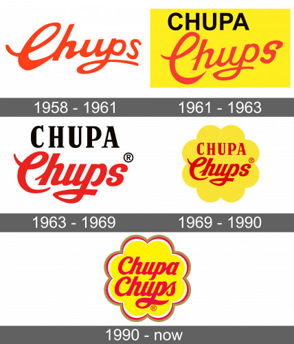
The first logo was simply the word “Chups”, which means to suck. It was done in a bright red color that immediately caught attention. The letters were also quite fancy thanks to beautiful cursive writing. The first letter was capitalized and all the letters were interconnected. The word itself was written in an arch, which gave it a dynamic feel.
1961 – 1963
With an official change in name, the logo now featured “Chupa Chups” on a bright yellow background. The first word was done in simple, all uppercase, black letters. The word was shorter than the second one and both aligned on the left. The accent was still on the word “Chups”, but the wordmark included the full name. The second word was kept almost unchanged. The “C” was disconnected from the rest of the letters, which looked thinner. The word was at a diagonal instead of an arch.
1963 – 1969
The updated version had both words written in a straight line. The word “Chupa” centered with the other word and looked more stylish thanks to an addition of serifs and different thicknesses used for the letters. The letters in the “Chups” looked much thicker, which made it even more attractive for the children.
1969 – 1990
When the company was going global, Bernat turned to Salvador Dali, a well-known surrealist, for an idea of a new emblem. According to one version, it took him almost no time to design the logo. According to another, Salvador Dali spent hours drawing what became the hallmark of the brand. In the end, he placed a red wordmark on a yellow background in the shape of a daisy flower. The wordmark was kept the same, only now both words were red.
1990 – Today
A multicolored border was added to the flower, which now was a brighter yellow color. The first word was written for the first time in the same style as the word “Chups”. Such changes made the logo look more cheerful and appealing.
