Cleveland Browns Logo
A professional American football team started out as one of the All-America Football Conference clubs. It was known as Cleveland Browns. McBride, who owned the Browns, did the right thing and hired Paul Brown. He coached teams at the college level very successfully and became the club’s first coach, manager, and VP. He managed to gather players who had no equals in the AAFC.
Meaning and History
The club played for the first time in 1944. After AAFC collapsed in 1950, the NFL acquired a new team. The Browns reached the finals several years in a row. They won it three times in the early 1950s. The fourth championship was achieved in 1964. In the late 1990s, the owner transferred the players to Baltimore and gave them a new name as the city of Cleveland retained the right to a franchise called Browns. In 1999, a new team finally played again. Some believe the first coach has something to do with the team’s name, but it is Joe Louis, a black boxer known as the Brown Bomber, that was honored by the founders.
What is Cleveland Browns?
The United States has many great football clubs and Cleveland Browns can surely be added to that list. Browns have reached the playoffs 22 times in the first forty years. The new team has not been as successful since being founded several years after the original team left.
1946 – 1959
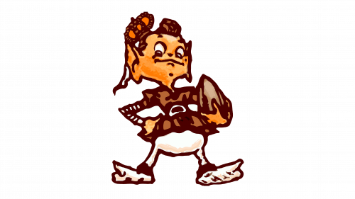
A cartoon drawing of an elf football player. It is holding a football with a left hand while the other hand is on his hip. It has a brown top and white bottom. A brown is also used to outline the drawing and for all the details. The face and hands have a skin color. With a brown and orange crown on its head, the character looks very pleased and even proud. The logo was done by Dick Dugan.
1959 – 1970
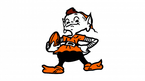
The cartoon elf was flipped, so it was facing left. The football was now in the right hand, and the crown was gone. Another major update was the colors. The shirt, shoes, ball, as well as cap, were bright orange. The hands and face are no longer skin color, but white. Black is used for outlines as well as the trousers. The only brown element is the hair. Overall, it looked cleaner and more professional.
1970 – 1986
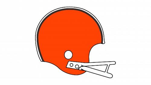
The team got a completely different logo. It is a helmet, which is typical for football clubs. Nonetheless, it looks bright and memorable thanks to its bright orange color. The top has a thick black outline followed by a thinner line with white space separating the two. The facemask, which is done in a very minimalistic style, is white with a thin black outline. All the lines are smooth and there are no sharp angles.
1986 – 1992
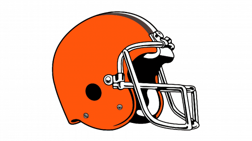
The new logo was a more complicated and detailed drawing of the helmet done in the same color palette. In fact, it looks very realistic. The helmet is also depicted at a different angle, so the front of the helmet is slightly visible. This further enhanced the 3D feel of the logo. The inside was done in black, while the facemask stayed white with black outlines. There’s also a white and grey line going from the front of the mask towards the back.
1992 – 1995, 1999 – 2006
The logo was updated once more. Although it has not changed much, a more modern and complicated facemask replaced the old version. The grey line at the top of the helmet turned black. The angle at which the helmet was depicted has also changed, although not drastically. The orange color was a different shade. The same logo was used by the new team formed at the end of the 1990s.
2006 – 2015
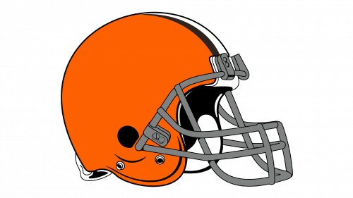
A small update was done in 2006. The black and white facemask was done in a grey color with a thin black outline. Another change was the orange color, which now looked more like what the team had back in the 1980s. Although the shape and other details have not been redrawn, the logo looked very different.
2015 – 2024
A bolder and redder shade of orange was used for the helmet, which has not changed its shape in any way. The facemask was a different color again. This time, it was black with a thin white outline, which gave it a 3D look. The lines looked thinner, but it was more of an illusion than an actual change. These small changes modernized and improved the logo.
2024 – Today
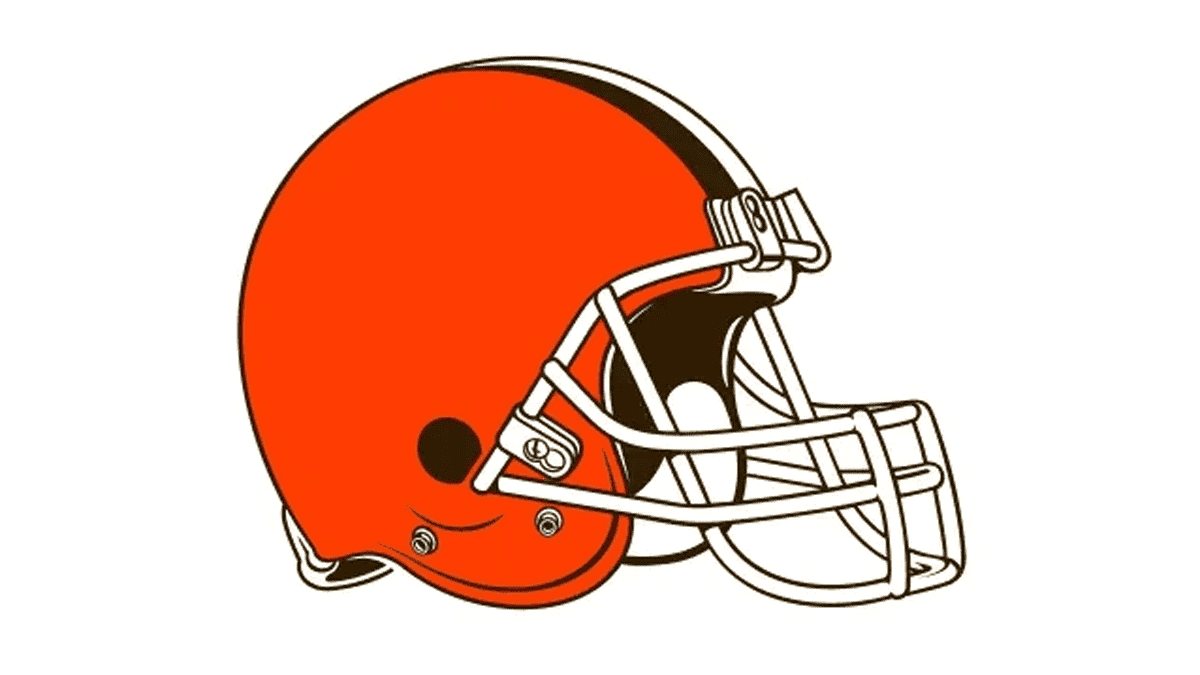
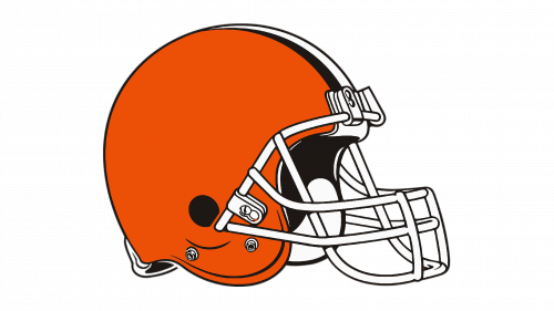
The Cleveland Browns logo, adopted by the club in 2024 is a mix of the versions from 1992 and 2015. From 2015 we have the intense orange shade and the width of the white and black stripes, while the element taken from the older version is the white grille, with which the bright helmet looks more elegant and fresh. However, not much has changed in the visual perception of the club and its players.
What does Browns mean in Cleveland Browns?
The “Browns” part of the name of a famous football team from Cleveland is a tribute to the first coach of the club, and its co-founder, Paul Brown. The surname of a sportsman is not very obvious and gives a lot of space for developing it into mascots, shades, and identities.
What is a brown mascot for Cleveland?
The mascot of the Cleveland Browns football club is a funny cartoonish elf called Brownie. This friendly creature wears an orange and black outfit, supporting the color scheme of the club, and evokes a sense of playfulness, looking super funny and cool.
Where did the Cleveland Browns’ name come from?
The name of the football club is formed by the city it was founded in, Cleveland, Ohio, and the surname of the club’s first coach and co-founder, Paul Brown. The name of the club was proposed by the fans during a contest, which took place in the first months of the club’s history.
