Houston Oilers Logo
The Houston Oilers were a professional American football team established by oil tycoon Bud Adams. Created in Houston, Texas, they were a founding member of the American Football League (AFL) before merging into the NFL in 1970. The team was known for its distinctive derrick oil rig logo, symbolizing the city’s deep connection to the oil industry. The Oilers won two AFL championships before relocating to Tennessee in 1997, becoming the Tennessee Titans. Their legacy includes pioneering the use of the “run and shoot” offense.
Meaning and history
Founded in 1960 by Bud Adams, the Houston Oilers were a key AFL team, later joining the NFL. Initially, Adam’s ownership brought success, including two AFL championships. The team’s identity was closely tied to Houston’s oil industry, reflected in their name and logo. Throughout the years, the Oilers experienced ups and downs, marked by memorable players and playoff appearances. In the 1980s and 1990s, the team’s performance fluctuated, leading to fan dissatisfaction and financial challenges. Adams, seeking a new stadium, faced local opposition. In 1997, unable to secure the desired facilities in Houston, Adams moved the team to Tennessee, rebranding them as the Titans. This relocation ended the Oilers’ era in Houston, leaving a legacy of football passion and community spirit. The team’s history is a tale of ambitious beginnings, thrilling highs, and a controversial move, encapsulating the volatile nature of professional sports franchises.
What is Houston Oilers?
The Houston Oilers were a trailblazing American football franchise, birthed in 1960 by entrepreneur Bud Adams in the heart of Texas. Renowned for their pioneering spirit on and off the field, they carved a path in the American Football League before joining the NFL, leaving a legacy of innovation and transition when they became the Tennessee Titans in 1997.
1960 – 1961
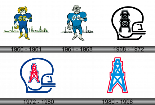
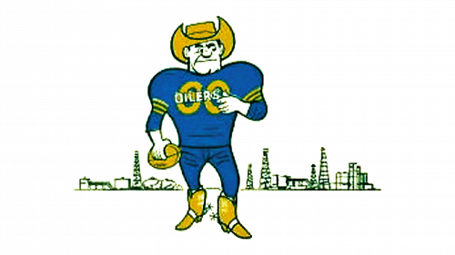
The logo portrays a robust football player, clad in a blue jersey with the “Oilers” emblem, symbolizing strength and competitiveness. He dons a golden cowboy hat and boots, reflecting Texas’s rich cultural heritage and the oil industry’s ruggedness. Cradling a football, he stands ready for action, encapsulating the team’s fighting spirit. Behind him, a stylized skyline dotted with oil derricks pays homage to the city’s industrial landscape, anchoring the team’s identity in Houston’s oil-driven economy. This image is a vibrant fusion of sports, local pride, and economic prowess.
1961 – 1968
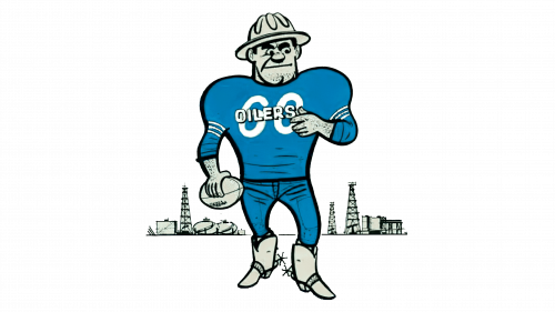
This iteration of the Houston Oilers logo introduces a more defined mascot, a muscular football player with a determined gaze. He’s donning a blue uniform that seems to reflect agility and a hard-hat, signifying resilience. His stance is assertive, holding a football to his side, ready to spring into action. The background skyline with oil derricks, though more subdued than before, remains a steadfast symbol of the team’s industrial roots. The logo’s evolution subtly nods to a blend of sportsmanship and the gritty oil heritage of Houston.
1968 – 1972
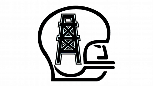
This logo simplifies to a stark, monochromatic design, capturing the essence of the Houston Oilers in a silhouette. The outline of a traditional oil derrick is central, signifying the industry that gave the team its name. Incorporated into the design is the side profile of a classic football helmet, marrying the worlds of oil and football. This minimalist approach strips away previous details, offering a bold, graphic symbol that speaks to the team’s identity with crisp, clean lines. It’s a modernist turn from earlier, more detailed logos.
1972 – 1980
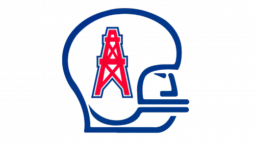
The evolution of the logo adds a striking red color to the oil derrick, enhancing its visibility and impact. The helmet outline remains in a contrasting blue, maintaining the team’s original colors and reinforcing its athletic identity. This color update brings a fresh vibrancy to the logo, symbolizing energy and passion, while retaining the minimalist design that connects the team’s oil heritage with their competitive spirit. This redesign is both a nod to tradition and a step towards a more dynamic visual representation.
1980 – 1996
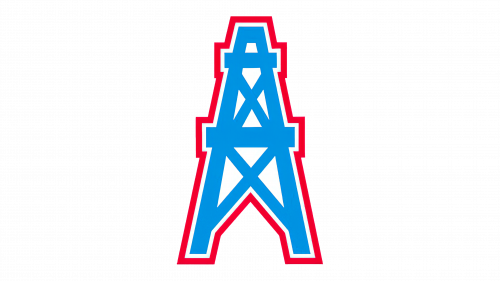
The logo transitions to an unadorned, bold blue oil derrick outlined in red, shedding the helmet silhouette. This minimalist design emphasizes the industry that defines the team’s namesake and spirit. The clean, sharp lines convey a modern and powerful image, focusing solely on the iconic symbol of oil exploration and production. It’s a visual distillation of the franchise’s core, signifying strength and a deep connection to the energy sector, with a straightforward yet impactful aesthetic.
