New Orleans Saints Logo
The New Orleans Saints, established in 1966, are a professional American football team based in New Orleans, Louisiana. Part of the NFC South in the NFL, they rose to fame with their unique style, branding, and match performance.
Meaning and history
Their early years, like many expansion teams, were challenging, with the first winning season coming in 1987 and the first successful playoff not until 2000. Despite this, they garnered a dedicated fan base, drawn to the vibrant culture and spirit of New Orleans.
Hurricane Katrina in 2005 has changed the Saints and the city of New Orleans. The hurricane damaged the Superdome and dishoused the team for a season. They got back to the stadium in 2006 and quickly made their new victory against the Atlanta Falcons.
The peak of the Saints’ success came in the 2009 season, under the supervision of Sean Payton (head coach) and Drew Brees (quarterback). They secured their first NFC Championship and went on for the victory in the Super Bowl XLIV against the Colts. This victory was a moment of triumph for a city that faced serious challenges. The Saints continue to play an important role in New Orleans’ cultural identity.
What is New Orleans Saints?
The New Orleans Saints are a famous American soccer club from the city of the same name in the state of Louisiana, United States. Playing in the NFL’s Southern Conference, they have achieved numerous records, decisive victories, prestigious trophies and a community of loyal fans.
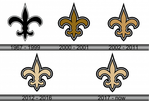
1967 – 1999
This original emblem is a simple but bold fleur-de-lis, a stylized lily that is often associated with the French monarchy and is a symbol deeply rooted in the history of Louisiana, once ruled by France. Its clean black lines on a white background have remained iconic for over three decades. The simplicity of the design provides easy recognizability and versatility across a variety of media.
2000 – 2001
In this version, the lily has taken on a more refined and modern look. The edges are slightly curved, giving it a less austere look. The gold outline adds depth and a prestigeous feel, a step up from the black and white color scheme.
2002 – 2011
This logo retains the gold outline but adds a black shadow effect and a white and gold border, creating a three-dimensional and dynmic look with a shadow. Perhaps this design is meant to showcase the lively nature of the team and its progression into the new millennium.
2012 – 2016
This logo shows a return to a flatter design, with the removal of the 3D shadow. With this iteration, the brand designers make an attempt to follow trend towards flat graphics. The gold edging gets more pronounced, and the black French Lilac core is now more polished and modern.
2017 – Today
The current logo further improves the design, with the gold border taking on a metallic sheen that speaks of luxury and quality. The black core has become deeper and more prominent, which can be interpreted as an indication of the team’s strength and resilience.
Color
The design balances modernity and tradition, reflecting the team’s heritage even today with black, beige and white colors.
Font
The Saints logo does not contain any text elements, relying solely on the emblem.

