Green Bay Packers Logo
GBP is one of the many football teams inside the NFL roster. These guys come from Wisconsin, namely – Green Bay city. They are actually amongst the most successful teams in the American North, and the best team Wisconsin has to offer overall. It’s been like this for a long time.
Meaning and History
The team first started in 1919 by a few high-school graduates. The name itself is derived from their sponsor back in the day – the local meat packing facility. The choice for the color of their uniforms was pretty obvious, considering that their hometown had the word ‘Green’ in its name.
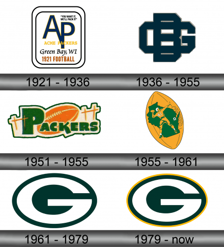
1921 – 1936
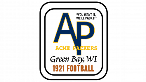
The first emblem was something of an advertising brochure than a fully-fledged emblem. They took a rectangle and wrote a lot of things on it. Namely:
- A big acronym that said ‘AP’ – stands for ‘Acme Packers’, their initial name – in dark blue
- A smaller meaning of the acronym right below, in yellow
- ‘Green Bay, WI’ in dark blue
- ‘1921 Football’ in orange
- The sponsor’s motto in the top right corner
1936 – 1955
In 1936, team switched to an acronym for the main element of its design. It was a dark blue combination of letters one over another in the usual college font. You can clearly discern a wide ‘G’, as well as a tall ‘B’ (for Green Bay), but the ‘P’ is completely engulfed by the second letter.
1951 – 1955
For several years, they also used this one simultaneously with the 1936 design, although it was obviously not as popular. It was just an orange football with some stars on both sides of it and the word ‘Packers’ written in green in front of the main image. The text was also not very pleasant to look at – bulky and thick as it was.
1956 – 1961
In 1956, both designs were scrapped in favor of this one. It was a sandy football with a green silhouette that belonged to the state of Wisconsin itself. They also put a bit white dot where Green Bay itself would be, as well as a football player ready to throw in the same color as the background, with some additions of green and white.
1961 – 1979
In 1961 they adopted the logo the brand uses even now – a green oval with a big uppercase ‘G’ painted white right inside it. It’s not very well proportioned, but at least it’s not disproportional to the circle itself – the letter is the same distance from the edges of the shape everywhere.
1979 – today
In 1979 they added a slightly yellow outline to the outside of the green oval to signify their secondary color. That was about it for the next decades.
Emblem and Symbol
When Packers need to use the name of their team alongside the symbol, they usually write it in the same dark green color. All the letters are uppercase and have an iconic ‘college’ design with a black vertical split in the middle of many of them. There are also other design variations, but this one is primary.
