Oakland Raiders Logo
The Raiders are a professional American football team founded in Oakland, California on January 30, 1960. Even though the name would suggest otherwise, they are currently based in Henderson, Nevada. The club is a part of both the National League (NFL for short) and the American Football Conference.
Meaning and History
A beloved anecdote states that the team was initially called ‘Oakland Seniors’, which was a very good way of making people laugh at you. So, they almost immediately decided to change it to ‘Raiders’ – for absolutely no other reason than became it sounds awesome and aggressive.
1960 – 1962
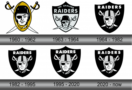
The first logo was designed shortly after the name was adopted. It depicted the helmeted head of the football player, with one eye covered with a patch. On the background there was put a yellow ball and the two swords with the handles, made in black-and-gold, crossed behind the ball.
1963 – 1964
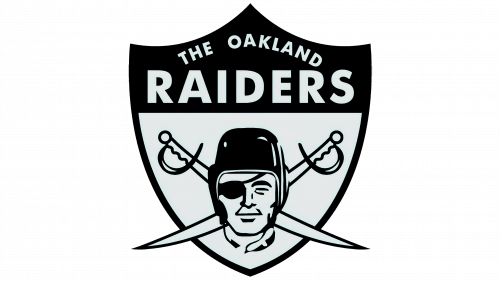
The second variation had the shield as a background with a black upper part, where designers placed the name of the team. The emblem itself got a few changes too. It had lost the yellow ball, but the peaky swords, colored in white with black outline, remained crossed behind the football player.
This emblem stayed with the team for only a year, but was used for the future versions.
1964 – 1982
In 1964 the coloring sustained a slight change. The shield got completely black. The helmet of the player changed its own color from black to gray with a black stripe on it.
The swords went to the fully white color without any contours. They were a bit shorter than in the previous versions, also they became less peaky. Above the emblem, there was the white capitalized inscription with the name of the club – ‘Raiders’.
1982 – 1995
Nothing at all changed, except the intervals between the letters got smaller.
1995 – 2020
The size of the logo got bigger, and that’s it.
2020 – today
The size of the logo returned to previous proportions, and that’s all.
Emblem and Symbol
It’s really not clear what the player is supposed to symbolize, considering that he literally misses one eye and closed the other one for tactical advantage. It’s possible that the designers made slight homage to the previous name – the ‘Seniors’ – in this comical way, but it’s impossible to determine.
