Carolina Panthers Logo
One of the well-known teams in the US that plays football comes from Carolina. It was founded by a person who has been playing for NFL previously, which does not happen a lot. The mascot is a cat character known as Sir Purr that looks like panther and wears jersey number 00. As reported by Forbes, the buyer paid over $2 billion to become the owner of the Panthers. The league’s owner’s have approved of this transaction without a second thought and David Tepper has a controlling voice in the team since 2018.
Meaning and History
Brought about in the late 1980s, The Panthers later joined other teams as the national league was expanding once more since 1976. When the club won 7 of 16 games right after joining the league, there was no regrets that it was accepted to represent it. It exceeded all expectations the subsequent year by winning 12 games.
What is Carolina Panthers?
This is a team from North Carolina that is well known beyond the country. Millions watch it play football. An interesting fact about this team is that they have a stadium that is legally also called as the team itself or rather as Panthers Stadium, LLC.
1995 – 2011
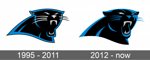
The team’s logo is easily associated with their name as it is a side view of the panther’s head. The eyes are light gray and the mouth is open with visible gray fangs. The black beast with blue accents stands for the courage and strength of the team. Alternate logos featured the word “Carolina” above the animal and “Panthers” below written in blue capital letters using a custom font with black shadow.
2012 – Today
The new panther became more realistic-looking. It also uses more blue colors instead of light gray. The mouth and ears got more blue accents, while the eyes and fangs look simpler and with fewer details. Overall, the head was slightly enlarged in comparison to the rest of the body visible on the logo. A Gothic font family series was used to write a wordmark. It was capitalized team’s name written in two lines with the second line made slightly indented.
