Costco Logo
Among retail chains where membership provides many advantages to the buyer, Costco supermarkets take the first place. The company operates under the membership system. Costco Wholesale Corporation is an American supermarket chain that is focused on selling goods from a limited number of manufacturers at an affordable price. This allows them to increase sales of certain brands and thereby receive additional discounts from them.
Meaning and History
It all started back in 1976 when the first Price Club appeared in the aircraft shed San Diego, California. It was a completely new concept – a retail warehouse where people could shop only with membership card. Later in 1993, it merged with Costco, and the combined company was named PriceCostco. Next year, though, Saul and Robert Price left PriceCostco and started a new business. It was not until 1997 that the company received the name Costco Wholesale. Since 2015, it is almost the largest retailer in the whole world (after Walmart).
What is Costco?
Costco is a major retail chain in the US. The popularity of the Costco network is primarily due to the favorable prices in its stores, but the quality is also a huge factor. Since 2016, Costco has been the world’s number one retailer for premium quality beef, organic foods, fried chicken, and wine.
1976 – 1993
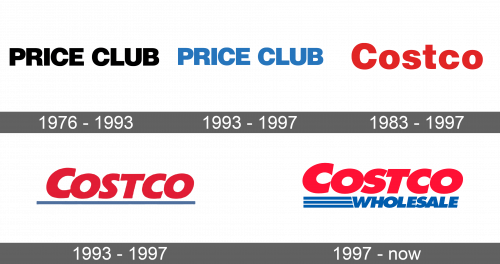
The original logo of Costco is hard to associate with it. It stated “Price Club” in simple uppercase, bold letters. It was done in black color on a white background. There were no other elements, which gave the logo a timeless look.
1993 – 1997
After the merger, the Price Club kept working under its original name for some time. The logo was only slightly redesigned. The color was changed to light blue, while the letters looked thinner and more delicate.
1983 – 1993
A logo that stated “Costco” was first presented in 1983. A dark red was used to write “Costco” with the first letter being capitalized. The letters were well spaced and looked quite thick. The color gave a vibrant and eye-catching look.
1993 – 1997
Ten years after the previous logo was introduced, it underwent an update. The letters looked more like they were hand-drawn and were written in cursive. There was also less spacing between each letter, so they were almost touching. Although the red was kept for the name, a relatively thick line that underlined the word added a new color to the logo. It started slightly before the first letter and definitely made a statement.
1997 – Today
The new logo looked very recognizable as the color scheme was kept unchanged. The name of the company acquired a more defined edge, which was further enhanced by a thin dark red outline. The shape of the letters closely resembled the previous version and they only got slightly thicker. The most noticeable change was an addition of “Wholesale” under the first line. It was done in blue with all letters being uppercase. The font was just as simple and significantly smaller. The word “Wholesale” was embellished by three parallel lines on the left, which were evenly spaced to be the same height as the word.
