Target Logo
Target is one of the largest retailer chains in America. This one’s specific shtick is that it’s a discounter. You can always reliably find what you need in one of their stores, and at a reasonable price. Funnily enough, the previous owners ‘Dayton Co’ didn’t want to be associated with their new project, but now they are defunct, and Target is not.
Meaning and History
Target is simply supposed to inspire that you can find there whatever you aim to find. In practical sense, the founders simply wanted it to be called as something completely disassociate with the head corporation – Dayton. When it was founded in 1962, Dayton simply treated it as a fun experiment.
What is Target?
Target is a chain of American supermarkets, founded in 1902. It’s one of the main such companies in the US, although it’s not very widespread abroad. They typically sell a wide range of groceries, including everything from food to clothing to electronics, home products, personal care and more.
1962 – 1968
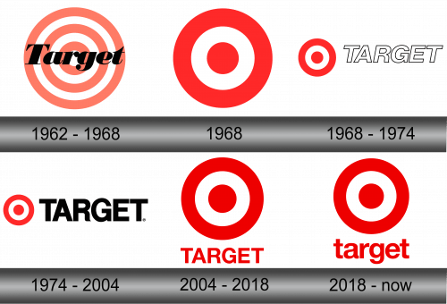
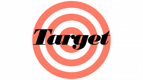
The first logo was a usual archery target symbol with three pale red layers and three white layers (ending with the white dot in the middle). Right on top of that, they place a brand’s name – Target – in a basic typographic font, a little tilted to the right. It wasn’t a pleasant sight, and they rearranged it soon.
1968 – 1968
This style stayed with the company for many years. It’s the same target symbol, but with just three rings (red-white-red), much thicker than before and brighter. It was use as a basis for future logos, (as well as independently) but the general idea remained the same throughout the years.
1968 – 1974
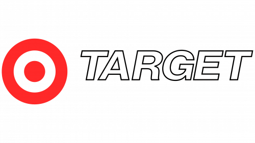
In 1968, the company simplified their symbol to a red-white-red cockade. This design was used through the decades, paired with various text designs. For the 6 years in question, it was paired with a white text with thin black outline. This time it lost its notches and was pretty straightforward and uniformly shaped.
It was still tilted to the right, however.
1974 – 2004
The 1974 version looked very similarly, and wasn’t too far off conceptually. The red got rather paler, while the text element straightened out and finally stopped tilting. Color-wise, there were two main choices for the text part. It was either just completely black or completely red (if set against the white background).
2004 – 2018
In 2004, the text moved from sitting just to the right of the cockade to being placed beneath it. It lost some of its size and was now indefinitely painted red. True, it could be black of white, but only when they needed to decorate the store exteriors with the 3D letters.
In addition, the color red was also slightly darkened. As for the shape of the text, it barely changed.
2018 – today
The only change logo suffered this time was switching from the uppercase to lowercase, in terms of the text part. Some stores still use the uppercase version, but for most other scenarios, the style changed.
Emblem and Symbol
The ‘target’ symbol (alternating rings with of various sizes) is a long-accepted concept in archery and some other sports. The company opted to use a comical version of this symbol used in some cartoons, for instance, where characters are marked for shooting with the similar symbol.
