Advance Auto Parts Logo
Advance Auto Parts is a retailer that specializes in automotive parts and accessories. Arthur Taubman founded the company to serve the needs of the automotive community. It originated in Roanoke, Virginia. The business was established to provide parts, accessories, and service to vehicle owners.
Meaning and history
Advance Auto Parts was founded in 1932 in Roanoke, Virginia. It began as a small store by Arthur Taubman. The company expanded rapidly, focusing on auto and truck parts. By 1998, it had over 1,000 stores. In 2005, it acquired Autopart International, growing its footprint. A significant merger happened in 2014 with General Parts International. This move made it the largest automotive aftermarket parts provider in North America. They also launched online platforms to improve customer service and reach. By 2021, Advance Auto Parts operated over 5,000 stores. The company’s focus on digital transformation and community involvement continues to drive its success.
What is Advance Auto Parts?
Advance Auto Parts is a leading automotive parts provider in the United States. It offers replacement parts, accessories, batteries, and maintenance items for cars and trucks. The company operates stores across the U.S. and serves both do-it-yourself customers and professional installers.
1953 – 1955
The logo depicts bold, capitalized text, proclaiming “ADVANCE STORE” in a stark monochrome palette. The letter “A” towers over the rest, asserting a leading presence. An oval encapsulates the word “STORE,” establishing a grounded, complete look. The design is minimalist yet impactful, relying on strong font weight to command attention. The simplicity of the color scheme underscores the brand’s straightforward approach to commerce.
1954 – 1973
This iteration of the logo introduces “ADVANCE STORES” with an “S” appended, suggesting a network of locations. The letter “A” retains its prominence but now shares space more democratically with other characters. The typography stands bold and unembellished against the oval background, which remains a defining feature. The logo’s monochromatic color scheme persists, conveying a classic and timeless brand image. The design evokes a sense of expansion and accessibility while maintaining its original strong visual identity.
January-May 1973
The logo has transitioned from “ADVANCE STORES” to “ADVANCE AUTO”, signaling a refined brand focus. The typeface remains bold and assertive, with the letter “A” still dominating the visual hierarchy. “AUTO” is new, replacing “STORES” and indicating a specialized automotive direction. The encapsulating oval endures, a constant in the brand’s evolving identity. The logo’s black-and-white contrast remains a visual anchor, unifying the design with its predecessors while heralding a new era for the brand.
1973 – 1979
The logo sheds the monochrome for a refreshing blue hue, introducing color to the brand’s identity. “ADVANCE/AUTO” is presented in white, offering a crisp contrast against the blue. The typography is modernized, with a slash separating the words, hinting at both dynamism and a bridge between the past and future. The oval has been stretched into a rounded rectangle, giving the logo a more contemporary and streamlined appearance. This design signifies a shift towards a more modern and accessible brand.
May – December 1979

This logo presents a whimsical take on branding, with a car shape forming the backdrop for the company name. “ADVANCE/AUTO”, split by a slash, is encased within an elongated oval, suggesting a vehicle’s side panel or window. The lettering is bold and clean, standing out in a crisp white against the soothing blue background, ensuring high visibility and a friendly appeal. The simplistic graphic style of the car is playful yet unmistakable, reflecting a business that’s approachable and dedicated to all things automotive. This design captures the essence of the brand with a blend of fun and functionality.
1980
In this logo, the palette reverts to stark black and white. A silhouette of a car precedes “Advance-Auto”, signaling a direct automotive association. The hyphen between “Advance” and “Auto” represents a connection and perhaps a transition or bridge within the brand. The text adopts a more stylized typeface, with serifs adding a touch of sophistication. This design captures the essence of the brand’s automotive focus, using simplicity and direct imagery to communicate its specialty.
1980 – 1981
The logo removes the hyphen, creating “Advance Auto” as a unified phrase. The car icon remains, maintaining the automotive theme. Serifs are dropped for a cleaner, sans-serif font, enhancing readability and modernity. The rectangular background stretches across, suggesting a wide-reaching, inclusive brand. This streamlined design reflects a contemporary shift while retaining the essence of the company’s automotive roots.
1981 – 1982
The logo has undergone a significant redesign, now featuring a triangle to convey stability and growth. Within this shape, the car silhouette sits at the base, spotlighted as the foundation of the company. “Advance Auto” is boldly placed along the bottom edge of the triangle, signifying a strong base. The font is sans-serif, simple, and direct, ensuring legibility and a modern feel. This design marks a geometric departure from previous iterations, emphasizing a forward-moving direction symbolized by the triangle’s peak.
1983 – 1984
This logo repositions “Advance Auto” to the forefront, with a bold, sans-serif typeface commanding immediate attention. The triangle, previously the logo’s main element, now shares the stage as a dynamic backdrop. The car silhouette persists subtly within the triangle, underscoring the brand’s automotive focus. The overall design embraces a more assertive and forward-facing stance, with black and white colors maintaining a classic contrast. This evolution reflects a confident brand ready to be recognized at first glance.
1984 – 1991
The logo introduces a rich red color, adding vitality and a strong visual impact. “Advance Auto Parts” now fully spells out the brand’s market, with “Parts” completing the company’s scope. The triangle is redesigned with a cut, which, along with the car silhouette, remains integral to the motif, reinforcing the automotive theme. The typography is bold and more pronounced, creating a memorable and distinctive brand presence. This refreshed logo suggests a renewed focus on the comprehensive range of products the company offers.
1992 – 1997
The logo now sports a bold, slanted dynamic with diagonal lines suggesting speed and motion. “Advance Auto Parts” appears in a sharp, modern sans-serif font, enhancing the brand’s progressive nature. The design has shifted to pure black and white, emphasizing a strong contrast and clarity. The rectangle on the right might symbolize a road or path, aligning with the theme of automotive travel and progression. Overall, the logo conveys a more futuristic and high-energy identity.
1997 – 2002
The logo has shed the previous diagonal dynamism for a clean, horizontal orientation, emphasizing stability and clarity. “Advance Auto Parts” is boldly presented in a sans-serif font, with a red block on the right side adding a pop of color and visual interest. The red block is striking, capturing attention and likely symbolizing a commitment to action and excellence. This design balances simplicity with a modern, corporate feel.
2002 – Today
The logo bursts with a vibrant red background and yellow lettering for a bold contrast. The addition of a checkered flag motif at the end conveys speed and automotive racing. The colors are reminiscent of a pit stop, aligning with the fast-paced environment of auto repairs and racing. This striking color choice and racing symbol create an energetic and competitive image for the brand, suggesting quick service and a dynamic industry presence.
2024 – Today
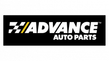
Transitioning from the vibrant red and yellow, the logo now opts for a sleek black background with white and gray text, accented by a yellow slash. This design leans towards a more modern, high-tech feel, with the slash suggesting speed and precision. The compact layout with bold, capitalized letters indicates a strong and consolidated brand presence. Swapping the checkered flag for a simpler graphic element, the logo communicates efficiency and forward motion. Overall, the logo adopts a more contemporary and polished appearance.
