Cracker Jack Logo
Cracker Jack is a snack made of caramel-coated popcorn and peanuts with a molasses flavor. Its lasting influence on American society can be traced back to a nostalgic Americana. The snack continues to tempt both young and old during sports games and other events, remaining to be a fan favorite for decades. Cracker Jack’s mascots Sailor Jack and his dog Bingo first debuted in 1916. Sailor Jack represents Frederick’s grandson, Robert Rueckheim.
Meaning and History
![]()
The history of Cracker Jack begins in 1871, when Frederick William Rueckheim, a German immigrant, started vending popcorn on a street corner in Chicago. He later invented a brand-new popcorn recipe for the Chicago World’s Fair in 1893. The term “Cracker Jack” was first formally registered in 1896. The snack was previously known as candied popcorn and peanuts. In the past, anything of superior quality and pleasing could be referred to as a “cracker jack.” Thus, it is no wonder the company chose such a name. Earlier it was named after the founder. Frito-Lay has been the owner of the Cracker Jack brand since 1997.
What is Cracker Jack?
Cracker Jack is a time-tested popcorn snack that was created by a German immigrant. Popcorn, peanuts, and molasses made up the treat. It has been owned by Frito-Lay since the end of the last century.
1896 – 1937
![]()
The company went for a bold and eye-catching red color for its logo. It is used to write the name and also add lines above and below to frame it. The name is printed using a beautiful, old-style font that combines curved stroke ends and spur serifs. An inevitable part of the Cracker Jack packages is a drawing of a sailor boy dressed in all blue. He is accompanied by a loyal dog and a package of Cracker Jack. Although modern at the time, this logo has a vintage style that appeals to the consumer.
1937 – 1987
![]()
After a little over forty years, the company made some adjustments to its logo. The updated font closely resembles the one introduced in the previous century. The color, though, is closer to the maroon shade of red. It looks powerful and sophisticated without being overly daring. The company kept the image of a sailor boy with a dog and a Cracker Jack box.
1987 – 2013
![]()
The designer set the name on a diagonal once again. However, it broke the name across two lines, like in the prior design. The designers made the red lighter. They added a light blue shadow with white spacing between the letters and the shadow. The logo tuned out lighter, softer, and more welcoming. Nevertheless, the image did not lose its strong and confident feel. The sailor image has been redrawn and was done in color.
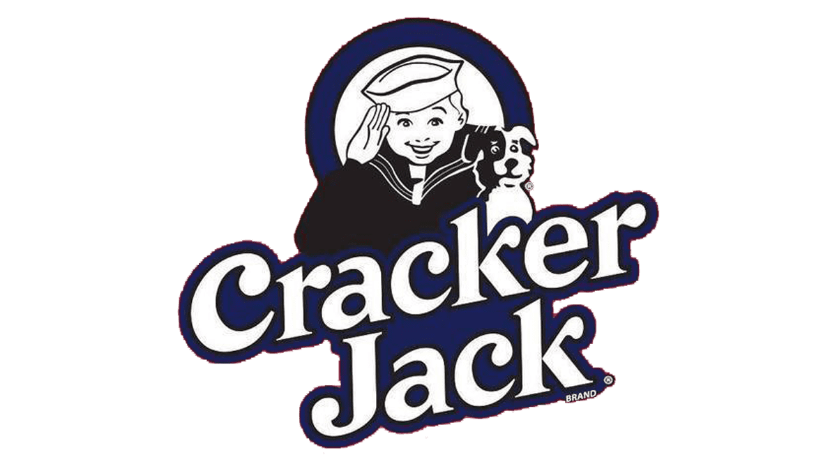
2013 – Today
![]()
The updated logo looks bolder. Thicker strokes, removal of white space between letters and shadow, as well as darker red shade gave it a completely different feel. It is also worth noting that the second line was indented slightly more. At the same time, the brand name has undergone very minimal changes. As for the sailor, it was done in a darker color palette. It is a half-body portrait with a ring frame behind it creating a base.
Font and Color
In 2013, the company used a rounded, sans-serif font similar to Asikue Medium Oblique, Creamtrade, Rashfield, or TS Veracruztrade font. The font has been kept the same even though each logo version looks unique and different.
For many years, the company used different shades of red as its main color. The red reflects the passion for the product and consumers’ love for the brand. The color is also known to increase appetite and is often used in the food industry. Since 1987, the brand also introduced a blue shadow, adding a touch of trustworthiness and relaxation.