Frito-Lay Logo
Frito Lay stands as a titan in the snack world. Herman Lay and Elmer Doolin birthed this giant. Its roots trace back to the United States. They created it to satiate America’s growing appetite for snacks. This endeavor blended two snack powerhouses, laying the foundation for a snack empire.
Meaning and history
The union of The Frito Company and H.W. Lay & Company in 1961 marked the creation of Frito-Lay. Both companies had been separately successful since the 1930s. Doolin bought a corn chip recipe, birthing Fritos. Lay began by distributing potato chips. Their merger combined expertise and passion for snacking. The combined forces led to innovative snack foods embraced across the globe. The Frito-Lay name became synonymous with quality and variety. It reshaped snacking culture with products that became household staples. Frito-Lay operates under PepsiCo, continuing to innovate and satisfy snack cravings worldwide.
What is Frito-Lay?
Frito Lay, an unrivaled leader in the snack industry, crafts an extensive range of snacks that delights taste buds worldwide. Synonymous with innovation and quality, it stands as a pillar of snack culture, bringing moments of joy to everyday lives.
1961 – 1980
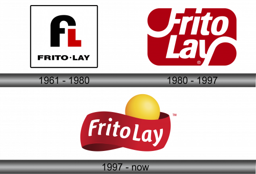
The logo captures attention with its stark simplicity and bold contrast. It features an arching black “f”, seamlessly integrating with a smaller, red “L”, against a white background. Below, “FRITO-LAY” stands proud in stark black letters, anchoring the design. This logo’s symmetry and color contrast convey a classic yet dynamic brand identity.
1980 – 1997
This evolution of the logo presents a fluid, red canvas that cradles the white, stylized text “Frito Lay”. The curvaceous backdrop suggests a chip’s contour, symbolizing the brand’s core product. This design boasts a modern and approachable feel, with the bold, white lettering popping against the red, creating a striking visual contrast. The registered trademark symbol confirms the brand’s established identity.
1997 – Today
The logo now introduces a playful element with a vibrant yellow sphere nestled in a red ribbon-like banner that reads “FritoLay”. The sphere evokes images of the sun or a crisp, round chip, enhancing the brand’s association with fun and flavor. The typography curves along the banner’s flow, softening the visual impact and inviting a sense of motion and joviality. The addition of the “TM” signifies the brand’s continued trademark registration and its unique market position.


