Deloitte Logo
Deloitte is an international group of companies, founded in 1845 and located in London. This is a giant company, which is providing a variety of services in the sphere of a professional audit, consulting of business management, advisory of risks which could face a customer company, as well as helping businesses with legal and tax tensions with other companies and governments. This is one of the largest companies, which branches and operations are spread across the whole world, as well as contented clients.
Meaning and history
As it is with many other brands, Deloitte’s history derives as a family business. It was established by William Welch Deloitte – an accountant and businessman, who gave the basis for the company’s development and growth into an international brand. And as it is with many other business-to-business companies, it has a very conservative policy in the logo design. Throughout its history, Deloitte renovated its logo only when it changed its name. Moreover, the Deloitte logo itself appeared over a hundred years after the company was founded.
What is Deloitte?
Deloitte is a world leader in the sphere of professional audit, consulting, as well as business, legal, and tax advisory. The company was launched in 1845 and is located in the United Kingdom. At that time it was rather a small company helping businesses with various issues. It was held by the Deloitte family, after which surname the company was called. Now, this is one of the largest and most successful companies, which provides such professional services across the whole globe, while their branches are spread in many countries of the world.
1960 – 1972
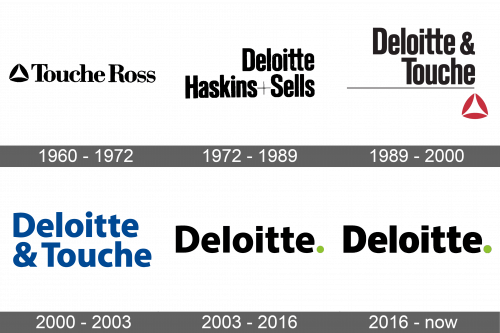
The first logotype of the brand depicted its first name – Touche Ross. It had a strict typeface with prominent and thin serifs. To the left side of the nameplate, they drew three ovals in such a way that they formed a triangle with the empty inner parts but fat sides. The logotype didn’t have any background, and the whole composition was painted black.
1972 – 1989
The new redesign showed the new name of the brand – ‘Deloitte Haskins and Sells’, written in a two-line inscription. It was a nameplate without any graphical emblems or images. The script used in this wordmark had a sans-serif style with the black letters of a typical font. The ‘+’ sign, located between ‘Haskins’ and ‘Sells’ words, was drawn in two very thin lines.
1989 – 2000
The logo, we observe an older iteration of Deloitte’s branding, which is characterized by a more classical and formal appearance. The company’s name, “Deloitte & Touche,” is prominently displayed in a serif font. The choice of a serif font links the design to values of reliability and respectability, often associated with longstanding institutions. The word “Deloitte” is given precedence by its larger font size, drawing immediate attention. Underpinning the text is a slender black horizontal line that adds a grounding element to the composition. The logo is completed with a geometric figure below this line, a red icon resembling a tetrahedron, which introduces a contemporary edge to the design.
2000 – 2003
The name was changed again, so there was time for a new redesign of the logo. The nameplate with the ‘Deloitte & Touche’ inscription was written in two lines. The brand design team decided to pass the classic black and white color scheme and used a sea-blue shade. The font also endured a large renovation: now there were simple and clean forms of the sans-serif letters. All this added a stable and comfortable mood to the Deloitte corporate image.
2003 – 2016
This logo encapsulates a refreshed and modernized identity for Deloitte. It simplifies the visual elements to the bare essentials, presenting only the company name “Deloitte” in a clean, sans-serif typeface. This font choice reflects modernity and accessibility, leaning into a trend of minimalistic corporate design. The only embellishment is a small green dot that sits at the end of the name, a playful nod to precision and a subtle hint of innovation. This minimalist approach strips away any additional graphics, including the previous logo’s red tetrahedron and the dividing line, resulting in a logo that is versatile and scalable, suited to the digital age where clear and immediate brand recognition is paramount.
2016 – today
The renaming of 1993 meant a new logo. It depicted a black ‘Deloitte’ word with a font having slightly straightened lines in comparison with the 1989 variant. A special feature of the logo was a green dot at the end of the nameplate. It added a dynamic mood to the mainly black wordmark.
Font
The font used in the logotype has extra bold lines. It’s a modern typeface with fewer gaps between sans-serif letters, which have clear and smooth lines, showing the simplicity and trustworthiness of the company.
Color
The coloring of the name is black, while the dot is painted green. However, there are versions of this logotype with the green background, white name, and black dot, but they’re rather secondary.


