Diet Coke Logo
Diet Coke is the variation of the beloved Coca Cola, except with no sugar or calories in it. It was one of the first sugar-free sodas to be completely free of this ingredient. Instead, they sweeten these beverages with aspartame. Interestingly, the Diet Coke is considered a separate brand from Cola proper.
Meaning and History
Diet Coke was introduced in 1987 during the stage when Coca Cola tried to rebrand as ‘Coke’. Although the big company later changed that decision, the name they made up for their diet variant stayed. They tried to change it to ‘Coca Cola Light’, but it surprisingly reduced sales. So, ‘Diet Coke’ stuck.
1982 – 1987
The first logo was basically the Cola’s ‘Coke’ logo from that time, with the word ‘diet’ attached above. The former was a collection of red slab-serif letters, while the latter was attached to its top and written in completely the same style, but fully in lowercase. The last touch was the usual red ‘Cola wave’ below.
1982 – 1987
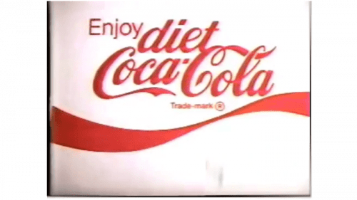
The alternative logo was the same idea, but with their usual ‘Coca Cola’ inscription. They designed this one in exactly the same colors and with the same positioning, but obviously in a different style. The ‘diet’ part above was now written with cursive writing. And they also added the thin word ‘Enjoy’ to the left.
1982 – 1987
The third alternative was the same as the very first logo, except without the ‘wave’ below. Instead, they decided to add shade lines behind onto the white background behind.
1987 – 1994
They mostly reused the very first logo for this one, except the letters became sharper. Instead of the slabs on the tips, these now had more fluid and thinner serifs. Additionally, the entire structure was tilted to the right. Lastly, the good old ‘wave’ now went right through the blank space inside the letter ‘e’ in ‘Coke’.
1994 – 1997
In an interesting combination, the main 1994 logo had the old slab style for ‘Coke’, but the ‘Diet’ part had a cursive style again. This time, though, they gave it the first capital letter and a smaller wave stroke beneath.
1994 – 1997
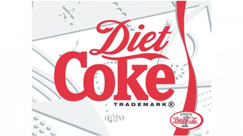
The second, alternative emblem was largely the same, but they added the vertical wave to the right and filled the white background with grey bubbles and scratches to make it seem like ice. The black word ‘trademark’ also was placed right beneath the last two letters in ‘Coke’
1994 – 1997
The third logo in the year was just marginally different. They removed the scratched background and added new black inscriptions: ‘enjoy’ to the left and ‘registered trade mark’ where the former ‘trademark’ has been’. The entire logo was then framed with a red square shape.
1994 – 1997
The simplest of all, they simply took the first 1994 emblem and shuffled the words into one line.
1997 – 2002
In 1997, they decided to color the ‘Diet’ from the previous attempt (one of them) black and put an outline of an iconic Cola glass. The stroke between the two words disappeared.
1997 – 2002
It’s an alternative emblem without the glass.
2002 – 2007
This year, they mostly reused the previous designs, but played with the positioning. The first variation puts ‘Diet’ right over the center of ‘Coke’. The colors are also paler.
2002 – 2007
The other one has a much smaller ‘Diet’ part put in the top right corner, while the red letters are given a bit more depth.
2007 – 2017
It’s the same logo as before, except both words are much more flat now and have no volume anymore.
2017 – today
Again with the previous design attempt, but this time they replaced the black in ‘Diet’ with red.
Emblem and Symbol
Diet Coke has been consistently issuing several alternative logotypes for the same period of use. That being said, not all of them are used equally. Some were only utilized for soda machines, and others were ever only seen on the cans and bottle labels. There are also many minor logos that weren’t used extensively.


