Dodgers Logo
The professional baseball team now known as the Dodgers was established in Brooklyn, NY, in 1883. Today, the hub of the team is Dodger-stadium in Los Angeles. Throughout their history, the Dodgers have won The World Series six times and became the champion of the US National League for 21 times.
Meaning and History
![]()
At first, the club bore the name of Brooklyn Grays. After some time, they instead opted for ‘Dodgers’, a more sport-oriented name. The official history of this name is that the term ‘Trolley Dodgers’ was increasingly associated with the team because Brooklyn was a home of dangerous trolleys that had to be dodged by the bystanders constantly.
1899 – 1901
![]()
The initial emblem of the team depicts the impressive letter ‘B’, executed in the gothic font, of the red color.
1901 – 1909
![]()
Two years later, the team changed the color palette of its emblem to the blue.
1909 – 1910
![]()
The impressive character ‘B’ was changed once again in 1908. This time, it gained less impressive font, but gothic features were still being in use.
1910 – 1911
![]()
The team continued its experiments with the letter ‘B’, and put it in the rhombus figure.
1911 – 1912
![]()
A year after, the rhombus gained the cross lines on its corners.
1912 – 1914
![]()
For some reason, in 1912 they returned the 1910 ‘B’ again.
1914 – 1926
![]()
As the time passed, the team decided to settle on some variant. The choice of brand designers turned to the 1909 version, but with a few modifications, such as bolder style and color, as well as shortened endings of the letter’s rear. This variant was in use until 1926, when the team continued the experiments with the brand mark.
1926 – 1928
![]()
The 1910 version returned as the primal emblem of the team.
1928 – 1929
![]()
The sports command decided to change their emblem once again. This time, the familiar ‘B’ with bold font and shortened tails, was put in the red circle.
1929 – 1930
![]()
The circle was removed, and the character had got the very bright blue color with a red outline.
1930 – 1931
![]()
Once again, the letter color was changed. This time, the whole character became dark red, and the outline was executed in sea-like blue color.
1931 – 1932
![]()
The letter’s style was changed once again. It gained the hard angular font and was drawn in a very bright blue color with an outline of a deep dark blue outline.
1932 – 1937
![]()
In 1932, they returned the classic emblem they had in 1908.
1937 – 1938
![]()
The strong angular ‘B’ was placed as the primal emblem once again, with a few modifications. First, the letter was a bit elongated and became wider, and the second is the letter gained the deep blue font.
1938 – 1952
![]()
As the team changed its name in 1932, it started to think about the change of logo as well. The first variant of the brand logo with an expressive inscription ‘Dodgers’ and a wavy underline was introduced in 1938.
1952 – 1958
![]()
The same inscription was rotated to its normal flat position and was placed over the orange rhombus in the version of 1952.
1958 – 1968
![]()
Time passed, and the logo changed too. Above the blue logotype of 1938, there was put the flying ball.
1968 – 1972
![]()
One more time, the logo had a change. Now, the logo was bolded, and its color was darkened.
1972 – 1979
![]()
1972 logo is the darkest of all. The following logotypes tend to become brighter.
1979 – 2012
![]()
Another version of the Dodgers’ logo appeared and was a bit brightened.
2012 – Today
![]()
Finally, the current logotype depicts the bright blue inscription and the flying ball over it.
Emblem and Symbol
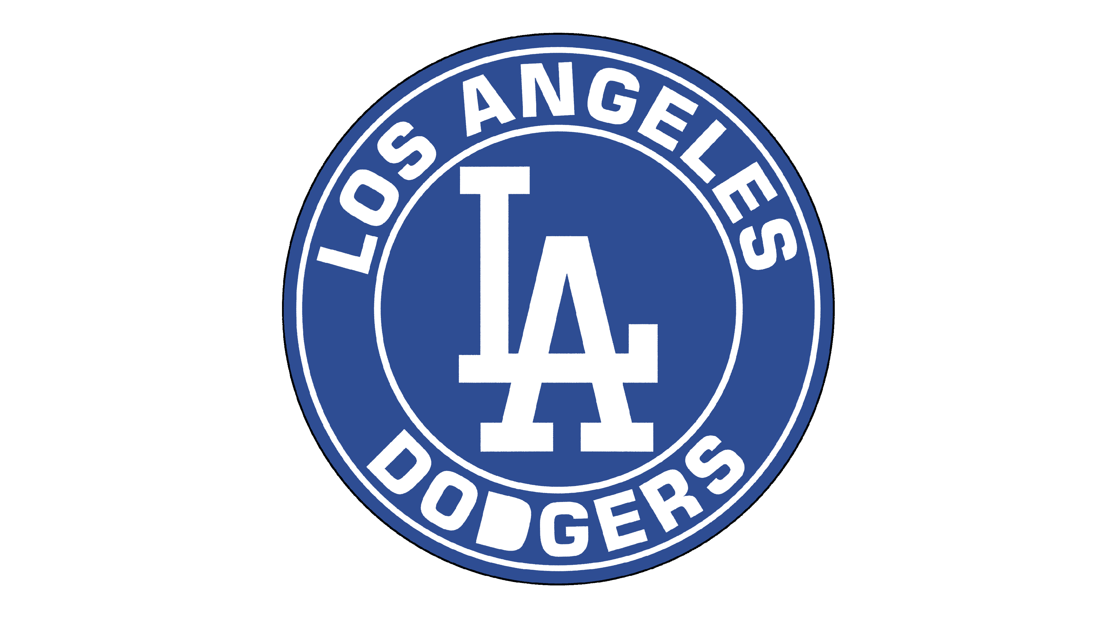
There is another logotype used by the tam – a monochrome mark that depicts the letter ‘L’ intertwining with an ‘A’. Together, they form one symbol, probably inspired by the Yankees’ NY-mark. Likewise, this mark is in use on some items from the team’s merchandise, such as caps, hoodies, T-shirts or watches.