Duolingo Logo
Duolingo is an American IT company, founded by a Carnegie Mellon University professor Luis von Ahn and his former student Severin Hacker. In 2011, Duolingo has developed an eponymous online educational program. It allows users to learn languages via spaced repetition method, which uses flashcards to work. The cards with the new and harder words are shown more often to a user than those with easier words. This method is modified by a special system, reflected in the name: the user has to choose two languages he or she wants to use during the process, such as the mother tongue, for instance, and some second language to learn.
Meaning and history
![]()
On 30 November 2011, Duolingo had developed a closed beta version of its software, after two years of research, programming and checkout by Luis von Ahn and Severing Hacker. They named Duolingo so because they aimed to create a tool serving, built on dual model: all words and sentences are offered in two languages the user chose to use.
The starter audience was about 300,000 people. The platform launched the public version a year later. By the summer 2013, the application had overgone a barrier of 5 million active users and received the first position in the list of free learning programs in Google Play. In the years to come, the company was occupied attracting funds, clients, and adding new languages to the soft, so today it has a half of a million active customers.
What is Duolingo?
Duolingo is one of the most popular language learning tools, programmed in 2011 by Luis von Ahn and Severin Hacker. . The educational process in the app is done via flashcards, presented in two languages chosen by the user. The cards, showing easier words, are shown more rarely than those with more complicated ones. It allows the student to remind the words faster and easier. Here are some numbers: now, Duolingo has 500 million active users, 100 programs on 40 languages.
2010 – 2011
![]()
An owl, named Duo, was always a part of Duolingo brand identity. It appeared in the original logotype, standing on its legs and inviting people with its right wing. Originally, the owl image was brown with some white lines on it. The eyes and nose were stylized as three letters combining the word ‘duo’. Below the bird, they wrote the nameplate in lowercase letters. The part ‘duo’ was black, and below it there is a green semicircle, reminding of a smile. The ‘lingo’ part is bright gray.
2011 – 2019
![]()
2011 – 2012
![]()
When the application was officially released, the language learning brand has received a refreshed logotype. The largest change affected the coloring: the elements of the logotype were repainted green. Also, the bird now didn’t make its inviting gesture, and just stood, awaiting.
2012 – 2013
![]()
In the 2012 logotype, the Duolingo artists updated the brand’s signature, modifying the owl. It became more volumetric and detailed. The wings were elongated, and the feathers became visible. Moreover, the ‘d’, ‘u’, and ‘o’ characters, previously featuring eyes and beak, were replaced by the actual parts of an owl’s head. The bird’s coloring was made gradient bright green to darker green.
2013 – 2019
![]()
The owl appearance was changed again in the logotype of 2019. It became cartoonish, its eyes were wide open, and it has spread its wings wide as if a friendly bird invited everybody for a hug or to learn languages with Duolingo. This message can be found in the way the owl stands: orange ovals, symbolizing the legs, were distanced from each other, and one was above the other. It looked like this hospitable owl stepped forward to the people.
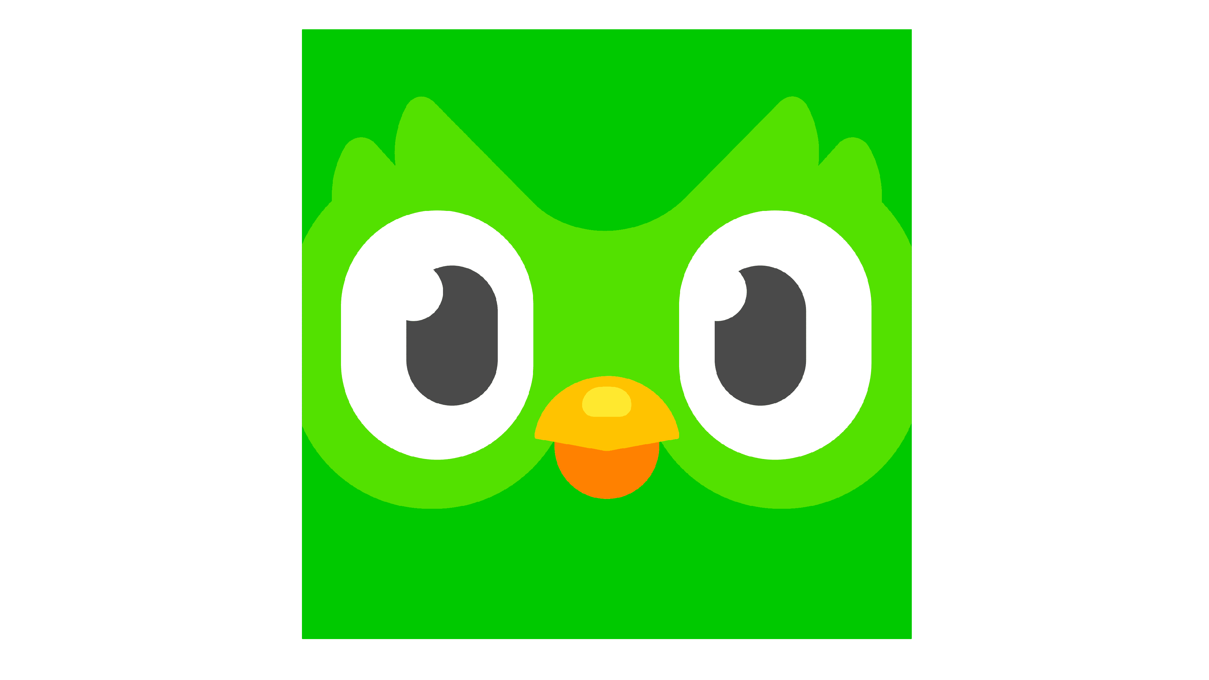
2019 – today
![]()
In 2019, Duolingo celebrated its 8th anniversary. It was then accompanied by a complete refreshing of its logotype and whole visual identity, including the Duo’s appearance and the typeface used to write the nameplate. Foremost, they introduced a new appearance of the owl, making it 2D, and featuring it from another perspective. If previously Duo made a step forward, inviting the audience for a hug and to learn languages, now it stands still with no gestures, full of inspiration, interest, and joy and translating these emotions to people.
As for the name caption, so it received a few changes too. The letters, although staying lowercase, have gotten small cuts at the tips. The ‘g’ character is completely redrawn as ‘8’ number with a small curl at the top.
Font

The typeface, introduced in the 2019 nameplate, doesn’t have a lot similar to the previous one.
The original script is named DIN Round Pro Font. It displayed lowercase sans-serif style with narrow intervals between the characters. They were streamlined and rounded.
The current font is named Feather Bold. It has small cuts at the ends of ‘d’, ‘u’, ‘n’, and ‘g’ characters, while the ‘i’, and ‘l’ letters became not as streamlined and straight as before.
Color
In the corporate logotype, the brand design team of Duolingo has given a priority to green shades. The only non-green elements are the owl’s legs, which are orange. The logotype can also be placed on blue background.


