F1 Logo
Today, F-1 is recognized as the best racing events in the world of motorsport, with the largest budget and the number of fans. This is not only an exciting show but also a testing ground where manufacturers introduce their ideas before rolling them out into mass production. Currently, the Formula-1 World Cup is held annually. The racing season consists of a number of stages-Grand Prix (translated from French as “Big Prize”), which are held on specially built or street tracks around the world. The racing calendar is usually approved a few months before the start of the next championship. The racing season begins in the spring and ends in the fall.
Meaning and History
The history of F-1 championships originates from European championships during the Grand Prix car races, which were held in the 1920s and 1930s. However, not a single authorized regulation or set of established rules were used to conduct these races. The FIA drew up the Formula-A rules, which were later renamed Formula-1. The rules were put into effect in 1947, in accordance with which Grand Prix were carried out. Accordingly, the name “Formula” denotes a set of rules that all participants have to comply with and a set of technical requirements for racing cars. The number “1” indicates the highest class of competitions. The first F-1 races began in 1948, while the first competition with Grand Prix points was held two years later.
What is F1?
Formula 1 or F1 is the most prestigious and popular class of international car races conducted since 1950. Royal races is the second name of F-1 since the budgets of the top teams reach several hundred million dollars. No other sport incurs such costs.
1985 – 1986
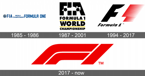
The original logo was quite elaborate and featured the full name of the races. It read “FIA World Championship Formula One”. All the letters were blue and uppercase. The phrase “World Championship” was done in two lines using smaller lettering to be the same height as all the other letters. There was a round emblem on the left with the globe in the center and “F.I.A” spelled out across it in white with a blue ribbon as the base.
1987 – 2001
This version had a much bolder look. The new logo had several lines, with “FIA” printed on the upper line. It featured a silhouette of a white racing car with black wheels, which were positioned in such a way that they replaced the horizontal lines in “F” and “A”. The next three lines spelled out “Formula 1”, followed by “World” and “Championship”. They all used the same font and black color, but the size of the letters was adjusted to make all the words the same length as the first line. They were separated by two bright yellow lines, which added a striking contrast and captured the attention right away.
1994 – 2017
The new logo is more minimalistic but not less striking “F1” is done as a combination of an italicized letter “F” and red speed marks for “1” with a straight line on the left and spikes for marks going to the right. Underneath, it spelled out “Formula 1” in black, italicized letters of a much smaller size.
2017 – Today
Something very striking and intriguing was presented as a logo of F-1 in 2018. It was just a red inscription “F1” done in a very interesting way. The letter was much wider and it was tall. It was just two lines drawn very close together and separated by a thin white line. The fact that the letter and number were italicized, it looked as if the whole emblem is just a portion of some racing track. The designers wanted to show the dynamics and energy of racing.
Font and Color
With an exception of the first logo, which was blue, Formula – 1 used bold colors for its logo. There was a combination of black, white, and yellow, which was replaced by a black, red, and white color palette. The latest logo featured a red color with just a bit of white. These are colors of power, luxury, strength, passion, and energy, which are all more than applicable to the F-1 car races. When it comes to font, it changed as car racing has evolved. However, there was always something geometric about the letters. Straight lines and corners were beautifully accented by smooth curves that can be associated with race tracks.
