FedEx Logo
FedEx is an international corporation that delivers cargo across all over the world. The company was founded in 1971 in United States and went through the way from an air cargo transportation company connecting 20 cities in America to the corporation which provides the parcel and courier services all over the world
Meaning and History
The brand came to be in 1971, and it was initially known as ‘Federal Express’ – hence the modern name. Nowadays, the corporation is amongst the biggest and most influential in the US. If you want something deliver, most of the time you’ll pick them as your delivery service.
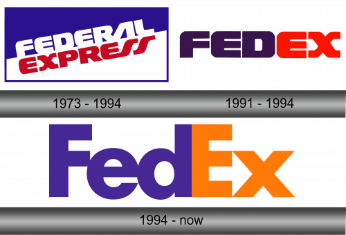
1973 – 1994
The first logo depicted the company’s full name, Federal Express, written in two levels on the rectangular background made in two bright-colored sloped halves. The white ‘Federal’ word featured on the dark blue part while the red ‘Express’ was placed down on the white one. The typeface was represented in the stylish and eye-catching letters.
1991 – 1994
The corporation made the experimental logo which mixed details to help it figure out how to develop its brand’s strategy. The logo had got the white ground-color. This feature will stay with the company up to nowadays.
The inscription represented the shortened name of the company – FedEx, and was colored in purple for ‘Fed’ and red for ‘Ex’. Although it didn’t have some modern brand features of the company, this logo became rather familiar.
1994 – Today
This logo was a major modification of the logo of 1991, with clear and straight letters which turned to the minimalism and simplicity. Basically, the colors changed to brighter variations of what they were in the previous stage. That’s about it, really.
Emblem and Symbol
There are also additional emblems that resemble the contemporary FedEx logotype but change the colour of the second part of the name. They are used for stuff like freighter transportation (with scarlet), ground delivery (green), and more.


