Fidelity Logo
This largest mutual funds and brokerage company has been operating from its headquarters in the US since the times of World War 2. What was initially a small mutual fund company grew into an international establishment that is considered to be one of the largest across the globe. Its first global location was established in Ireland in the 90s. Individuals and institutions love this company for its amazing investment choices. People can safely save for retirement or make long-term investments with this institution as it has a long history to prove just how good it is.
Meaning and History
Founded in the mid-1940s, this company has been offering brokerage and other services to investors in the US. It was also one of the first brokers to transfer its services online. Over the years, the company expanded its services globally. Currently, the investors can access numerous tools and high-quality resources for personal education. The company had been established by the Johnson family, with Edward Johnson II being the first owner. The family still has a majority share in the company and the granddaughter of the founder has been appointed as the CEO in 2015.
What is Fidelity?
This is a financial services company. Fidelity Investments Inc. has clients from all over the world and the amount of assets it is responsible for is very impressive. If one seriously approaches the investment, this company is definitely worth the consideration.
1993 – 2011
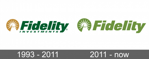
The logo featured the name of the company written in green color, which is associated with prosperity and abundance of wealth. The word “Fidelity” is written in bold with clean lines and sharp corners. The letters are also slightly italicized. In a much smaller font and with wider spacing between the letters, the logo states “Investments”. The word is placed right under the first word and positioned in line with the end of the last letter “Y”. The name is accompanied by a round emblem that has a pyramid with a sun with many rays behind it. The silhouettes are done in white, while the gold color is used for background and to give the pyramid a 3D feel. This element has several interpretations, including association with Freemasonic symbols and the Great Seal of the US.
2011 – Today
Along with its expansion internationally and the new name that reflected this expansion, the company has redesigned its logo. The change was not drastic as the company kept the well-recognized round emblem. It only took the “Investments” out of the logo. The “Fidelity part stayed unchanged. There was also a change in colors, as the word itself and the background of the emblem were white. A different shade of green was used for the background as well as for drawing the sun and pyramid.


