Adobe Flash Logo
Adobe Flash is a versatile tool used to create various illustrative products, such as presentations, animations and even games. For years, it’s been the generic first instrument you would use to create any of that. However, by the end of 2020, Flash has been closed down.
Meaning and History
Flash is a kit of many different tools, and because the demand for something of this sort has been ever since personal computers became a thing, Adobe Flash has a very rich history. It’s been launched in 1996 under the name of Future Splash, and then changed the name to ‘Flash’ that very year.
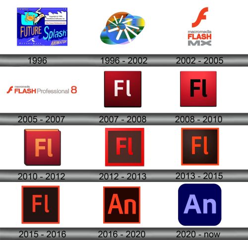
1996
Flash was actually created by the company called Future Wave, hence the first name.
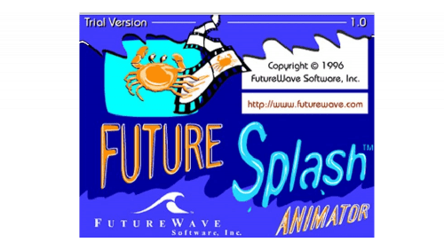
The first logo was basically a rectangular blue banner with lots of text on it. Notably, there were words ‘Future Splash’ in thin warped text, a few words describing what this toolkit even is – such as ‘Animator’ in the bottom right – as well as weird elements, such as a crab in the top right corner.
Generally, the color palette was orange and blue on this stage.
1996 – 2002
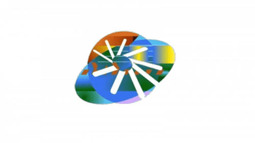
That very year, Splash was bought by Macromedia, which renamed it Flash and gave it a new, more concise logo. And what a logo that was – a circle penetrated by a tilted oval, both sprinkled with basically all colors in existence to resemble a drawing palette.
They also put a collection of white lines in the middle that faced clockwise and also slightly warped closer to the top. This element likely hinted at the digital nature of the toolkit, seeing how it resembles a loading symbol.
2002 – 2005
In 2002, Macromedia gave Flash a new logo that would finally incorporate the software’s name. It was a big orange lowercase ‘F’ followed by several text elements one below the other. The ‘F’ was followed by the company name, ‘Macromedia’, in grey lowercase.
That one was followed by the toolkit’s name, ‘Flash’, in orange uppercase, and in the very bottom were the letters ‘MX’ in grey uppercase. What ‘MX’ meant is unclear.
2005 – 2007
By 2005, Adobe bought Macromedia, but Flash was nominally the product of the latter.
Regardless, they rearranged the logo. The icon, ‘Macromedia’ and ‘Flash’ were now piled up on the left in precisely the same design, while on the right the right the product was proclaimed ‘Professional’ in light grey. They also put the digit ‘8’ there to signify that it’s the eighth version.
2007 – 2008
2007 saw the first use of the iconic square icon. The letters ‘Fl’ were colored white and put in the middle of a red square. Notably, it was heavily shaded and given a lot of gradient, especially in the bottom.
Since 2007, every major version had its own logo.
2008 – 2010
The letters in the middle turned black, and the red on the square turned brighter, even if the shading didn’t really diminish.
2010 – 2012
The 2010 logo was styled as a book. The letters turned orange, and the red part also turned a bit more saturated. The most notable thing is the increase of volume. The basically added depth to the logo and tilted it forwards a bit. The resulting image looks like a book with orange pages.
2012 – 2013
The coloring changed again in 2012. This time they made the letters red, the background brown, as well as added the red frame onto the edges of the shape itself.
2013 – 2015
In 2013, the red parts turned orange, as did the frame on the edges. It also grew rather thinner. It seems they forgot the illumination effect back in 2012, but returned it in this iteration.
2015 – 2016
Nothing changed here, except they got rid of the gradient at last.
2016 – 2020
In 2016, the changed the words to ‘An’ instead of the ‘Fl’, as well as made the coloring overall more saturated.
2020 – today
This time, they opted for a blue color palette. The letters became wider and turned light blue, white the rest of the square switched to the dark blue. The frames were dispensed with, but the edges became notably rounded.
Emblem and Symbol
In addition to Adobe Flash, there is a piece of software called Adobe Flash Player. It’s closely associated with the former, but the two are often used interchangeably. Bottom line is, the icon of the AFP – a lowercase ‘F’ set against squares of varying colors (or sometimes circles) is constantly mistaken for Adobe Flash logo.
