Microsoft Word Logo
Microsoft Word is an iconic word processor released by Microsoft in 1983. Word has been a staple of digital writing and editing for millions of people worldwide for several decades now. It’s primarily used to comfortably create digital text and enrich it with various extensions, links, graphs, spreadsheets and more.
Meaning and History
1983 – 1987
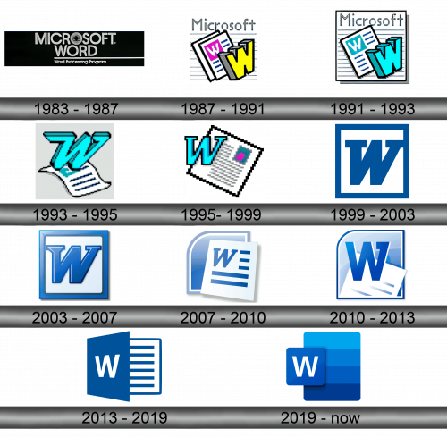
Originally, ‘Microsoft Word’ was written in two lines using tall black letters, all uppercase. Except for a ‘digitized’ letter O, they were more-or-less normal and simple. The only other element was ‘word processing software’ written in smaller letters below the main thing and separated by a long line from the latter.
1987 – 1991
The 1987 logo was the first real emblem this tool had. It featured a pixelized capital W colored yellow and put next to a pair of pixelized sheets of paper. The closer one had a purple square set in the corner with a white W fitted in its middle. There were also multiple horizontal grey lines behind the main thing, in addition to a pixelized ‘Microsoft’ above.
1991 – 1993
They actually used pretty much the same logo, except they turned both yellow and purple into turquoise instead, got rid of one of the ‘sheets’ and framed the whole logo (name and all) in a black square.
1993 – 1995
They used the same color palette for the 1993 iteration, although it was a different design. There was now a taller serif W standing atop a more flexible sheet of paper.
1995 – 1999
In 1995, they opted instead for a 2D, tilted letter W using the same turquoise look. It was now just a small attachment to a big, square sheet of paper with black framing + some pixel text and imagery set inside it to signify what the primary purpose of this tool is.
1999 – 2003
The 1999 emblem is the first in the line of iconic, recognizable Word logotypes. They actually use a similar letter W as the one they used in 1995, except this one is slightly thicker, more streamlined, not pixelized and dark blue. It then adjoins a square frame colored the same way, with all the negative space inside covered in white.
2003 – 2007
It’s the same emblem, but with an additional glint effect emanating somewhere from top right, while the central letter is also moved closer to the middle of the emblem.
2007 – 2010
The 2007 logo is a slightly new approach. They use the same effects and style they worked out for the 2003 emblem, except slightly bleached the colors. The central part is a white sheet with blue lines and a blue W like on the older logotypes. Except, the W here is the same design they used in the 1999-2007 period.
Moreover, they added a blue ‘folder’ symbol behind this central piece.
2010 – 2013
For the 2010 version, the designers decided to use the folder symbol as stage for all the other symbols. The big W was put near its middle and written with a slightly different font than before – a straight, everyday font with a single serif sticking inward out of the right line.
The bottom part of the folder is occupied by a sheet of paper – much like the ones seen before, but strongly illuminated and simpler.
2013 – 2019
All the Word versions since 2013 used this logo – a rotated blue square with a simple white W inscribed onto its middle. A white square with blue framing and lines all over it also stuck out of its side, making it again a combination of a folder and a sheet of paper.
2019 – Today
In 2019, they used the same white W, except thinner, and put it onto a much smaller blue square – now lighter and without the perspective it had before. It was attached to the left side of a tall rectangle, divided into 4 equal parts from top to bottom. It was a gradient of color blue, turning from palest above to darkest below.
Emblem and Symbol
The ‘doc.’ and ‘docx.’ format of files (the Microsoft Word files) have their own icons. The Word creations you have on your desktop usually have a current Word logo stitched to the side of a sheet of paper with a folded corner. Each logotype represents a new version of Word, and icons change according to a new version.

