Power BI Logo
Power BI is a business analytics tool developed by Microsoft. It enables organizations to visualize data and share insights, aiding in data-driven decision-making. Power BI caters to diverse markets globally, spanning various industries such as finance, healthcare, and retail. It is owned and operated by Microsoft, integrated into its suite of business software solutions.
Meaning and history
Power BI, developed by Microsoft, has a rich history dating back to its inception in 2013. It emerged as a business intelligence and data visualization tool designed to help organizations make data-driven decisions.
Power BI originated from Microsoft’s earlier ventures into business intelligence, including tools like SQL Server Analysis Services and Power Pivot. These technologies laid the foundation for Power BI’s capabilities.
The initial release of Power BI in 2013 was a standalone Windows application. It allowed users to connect to various data sources, create interactive reports, and share them with others. However, it was limited in terms of platform availability.
In 2015, Microsoft introduced Power BI as a cloud-based service, expanding its reach to a broader audience. This move marked a significant shift towards cloud computing and modern data analytics.
Over the years, Microsoft continued to enhance Power BI with regular updates and new features. It integrated with other Microsoft products like Excel and Azure, making it a central tool for data analysis and visualization in the Microsoft ecosystem.
Power BI’s mobile capabilities also improved, enabling users to access reports and dashboards on the go. This accessibility contributed to its growing popularity among businesses worldwide.
In 2017, Microsoft introduced Power BI Premium, offering dedicated cloud resources for larger organizations with increased data needs. It allowed enterprises to scale their analytics solutions more effectively.
2013 – 2016
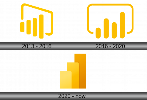
The company’s logo always remained devoid of any textual elements, underscoring the service’s seriousness and its deviation from traditional software. Initially, it featured a outlined screen alongside a comparative graph. The screen assumed the shape of an open curve that formed a recognizable rectangular outline resembling a PC or laptop monitor. Positioned at the bottom were four columns of varying heights, with the leftmost being the shortest and the rightmost being the tallest. All corners exhibited rounded edges, and the curve displayed seamless transitions, instilling users with a sense of complete security.
2016 – 2020
The designers opted for a straight orientation of the screen, a departure from its previous sideways position, and slimmed down the bezel’s thickness. Notably, the negative space forming the display was considerably wider than before. While retaining the smooth corners, the line’s extremities were trimmed and featured a sleek edge. The graph’s creators further rounded the columns, with varying heights and an interleaved arrangement, devoid of a distinct pattern. Additionally, the logo’s color palette experienced a lightening effect, transitioning from dark yellow to a soft, pale gold hue, introducing a subtle refinement to its visual identity.
2020 – Today
The present logo bears no resemblance to its inaugural counterpart, having undergone a substantial reduction to achieve a minimalistic aesthetic. Gone is the frame simulating a display, completely removed by its designers. What endures from the previous iteration is solely a bar chart, comprised of three prominent elements. These elements take the form of vertical rectangles distinguished by their rounded corners. Each rectangle is adorned in a distinct hue, ranging from a delicate pale yellow to a deeper, earthy sand tone, emphasizing the logo’s simplified yet vibrant visual identity.


