Flipkart Logo
Flipkart is an online retailer. As the company’s reputation developed, this online store prospered and expanded its offerings. The business started to offer a variety of different products, such as phones, music, and movies. Among its subsidiaries are Myntra, PhonePe, eBay, Jeeves, and Jabong. Additionally, the business introduced its own “DigiFlip” goods in India, which feature laptop bags, tablets, and flash drives.
Meaning and History
The service started as a modest online bookshop in India in 2007, and it has since expanded to become one of the nation’s largest online markets. Despite sharing the same last name, the founders Sachin Bansal and Binni Bansal are unrelated. As e-commerce expanded in India and transformed the retail sector, Flipkart steadily expanded its selection of goods by adding new product categories. This was also influenced by Walmart’s 2018 acquisition of Flipkart, which was the largest online e-commerce takeover ever. As a result, 77% of the site is currently owned by the US retail giant. The company’s name is a wordplay derived from “flipping stuff into a shopping kart.”
What is Flipkart?
India’s top eCommerce platform is known as Flipkart. The platform was able to expand its product categories from only books to millions of things with a wide range of subcategories.
2007 – 2010
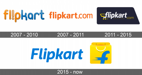
The original logo was colorful and creative. It featured the name of the company in all lowercase letters. The unique feature of this company was the font it used. All the letters were of different heights and had smooth, rounded strokes. The first half of the word was done in a muted orange color, while the second featured a blue. To add even more interest, the designers flipped the “i” and made the center white.
2007 – 2011
This version is the name of the company printed as a web address. The company kept the orange but made it much brighter and more saturated. The bright color and the web address should have surely attracted more visitors to the platform. The font was changed and all the letters were now more aligned. Instead of the curved lines, the terminals were cut at a diagonal, which added some dynamics.
2011 – 2015
Since the name of the company has a “cart” in it, there is a small yellow cart tacked on the tail of the “F”, which serves as the base. The name, with “.com” added in a smaller font slightly lower, is the main element of the logo. A dark blue trapezoid shape in the background allowed the white letters and yellow elements to pop.
2015 – Today
An updated version, first of all, had a white background. “Flipkart” was written using a different font and with the first letter capitalized. It was done in a light blue color, which reminded of the original color palette. The yellow shopping cart was replaced by a large shopping bag. It was placed on the right and had a lowercase “f”, which had streaks on the left for some dynamics, on the front. The logo had the name of the company associated with a fast and convenient shopping experience.
Font and Color
The original version used a Dundee RR Condensed Extra Bold font as a base to make its own custom wordmark. The second logo featured a font similar to Riona Sans Bold Italic designed by Mika Melvas. It has more rounded and smooth lines compared to the original logo. The company used a white, blue, and yellow color palette, although the blue has changed its shade. The blue gives an impression of a reliable and trustworthy company, and the yellow creates a positive and happy mood.

