Foster’s Logo
Foster’s Lager is perhaps the most successful Australian beer currently sold. It’s a pale lager of about 4-5% of alcohol in it, brewed in Melbourne. Unlike many of its peers, it’s successfully sold throughout the world under various companies, although it is owned by the Japanese from Asahi Group.
Meaning and History
The company responsible for Foster was created in 1888 by the two US emigrants, the Foster brothers. The production of beer started the year later, and it quickly grew to be a popular drink in Victoria and other parts of Australia. Later on, it was bought off by the Japanese company Asahi Group Holdings.
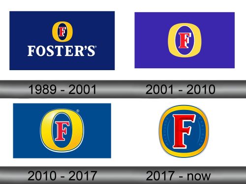
1989 – 2001
The first logo adopted in 1989 displayed a wide blue rectangle with several elements in its middle. One of them – the iconic emblem of Foster’s – is a wide letter ‘O’ colored in yellow. In its center, they put the red ‘F’ with a white outline. Beneath this symbol, they’ve written the name of the brand in big serif letters of the color white.
2001 – 2010
The 2001 logo instead centered on the ‘F’ symbol and nothing else. They left some background in the form of a purple square for it, but that’s as far as it goes.
2010 – 2017
In 2010, they polished the old logo, gave the background a new blue look and added more volume to everything. Naturally, it meant more glint and shading in strategic places, as well as additional white outline for the ‘O’.
2017 – today
The 2017 design basically made the ‘O’ much slimmer and the ‘F’ slightly slimmer. They also made all the colors darker and introduced thin pale inscriptions on the interior of the ring that said ‘Melbourne’ and ‘estd. 1888’.
Emblem and Symbol
Alongside the new lager emblem in 2017, they also introduced a new company logo. It used mostly the same background, but said ‘Foster’s’ in much the same style as the ‘F’ from the emblems, but all colored in silver. The minor variation of this one has the same writing, but blue and with the same ‘O’ from the emblems instead of the second letter.


