Grant’s Logo
Grant’s is a well-known Scotch whiskey introduced in the 1880s. The whiskey got its name in honor of its founder. The brand belongs to the category of the best-selling in the world. The brand logo has remained practically unchanged throughout the entire period of the drink’s existence. The changes were applied only once.
Meaning and history
1950 – 1980
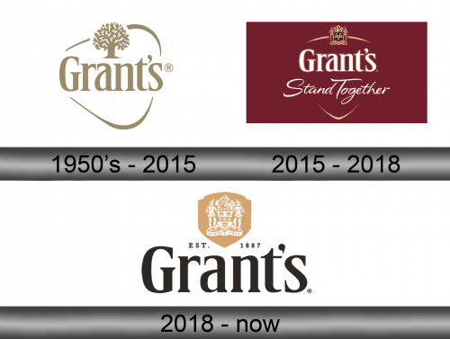
The first Grant’s logo was created in the 1950s. The author was one of the German designers. The idea for the logo came about thanks to the use of triangular bottles by the Grant family. it was this figure that was used as the basis for the composition – a triangle with rounded corners. In the center, the name of the brand was spelled out in large letters, below – the motto used by winemakers in those days. All inscriptions and lines were presented in a single color scheme – an eye-catching light brown color, close to gold.
The font chosen for the lettering is perfectly balanced. This is ensured by a certain thickness of lines, grace of serifs.
2015 – 2018
In 1980, the familiar design of the logo was changed. The symbol, even after the adjustments that have taken place with it throughout the entire period of its existence, is distinguished by the simplicity, elegance of each line.
Grant’s Logo is presented in one color – austere and laconic gray-brown. In the center of the composition is the name of the whiskey brand – “Grant’s”. Above, between the third and fourth letters, is the main symbol of the brand’s family – a majestically sprawling oak tree. The whole composition is enclosed in a triangle with rounded edges.
The visual style of the brand is fully reflected in the lines of the logo. This is a prime example of traditional elegance, where unnecessary details are eliminated. The color palette is characterized by a special, unique style and tranquility. It reflects the high quality of the product and the strong connection of the brand with its roots.
2018 – Today

The 2018 logo uses the same name inscription as its predecessor. It also kept the coat of arms (now white within the golden framing), but nothing else. There’s also a little writing ‘est. 1887’ huddled in the middle of the composition.


